04-19-2013, 07:45 PM
Hey guys!
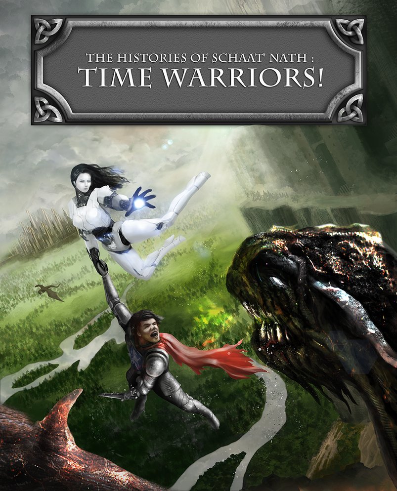
This was my entry for the Bloodsport 13 competition. I was quite satisfied how it turned out but obviously it would need some more work on it.
I would like it to have more balanced composition, more clear hierarchy of focal points, balanced contrasts and overall to kick it up a notch.
I also feel it needs more energy and some details that would enhance the feeling of action/battle.
I would like to get some constructive advice on how to improve the piece.
Any paintovers would be much apreciated.
Thanks


