05-27-2013, 09:21 PM
Thank you Sula. Also thanks for the inspiration! You're working so hard, you're a great role model ;)
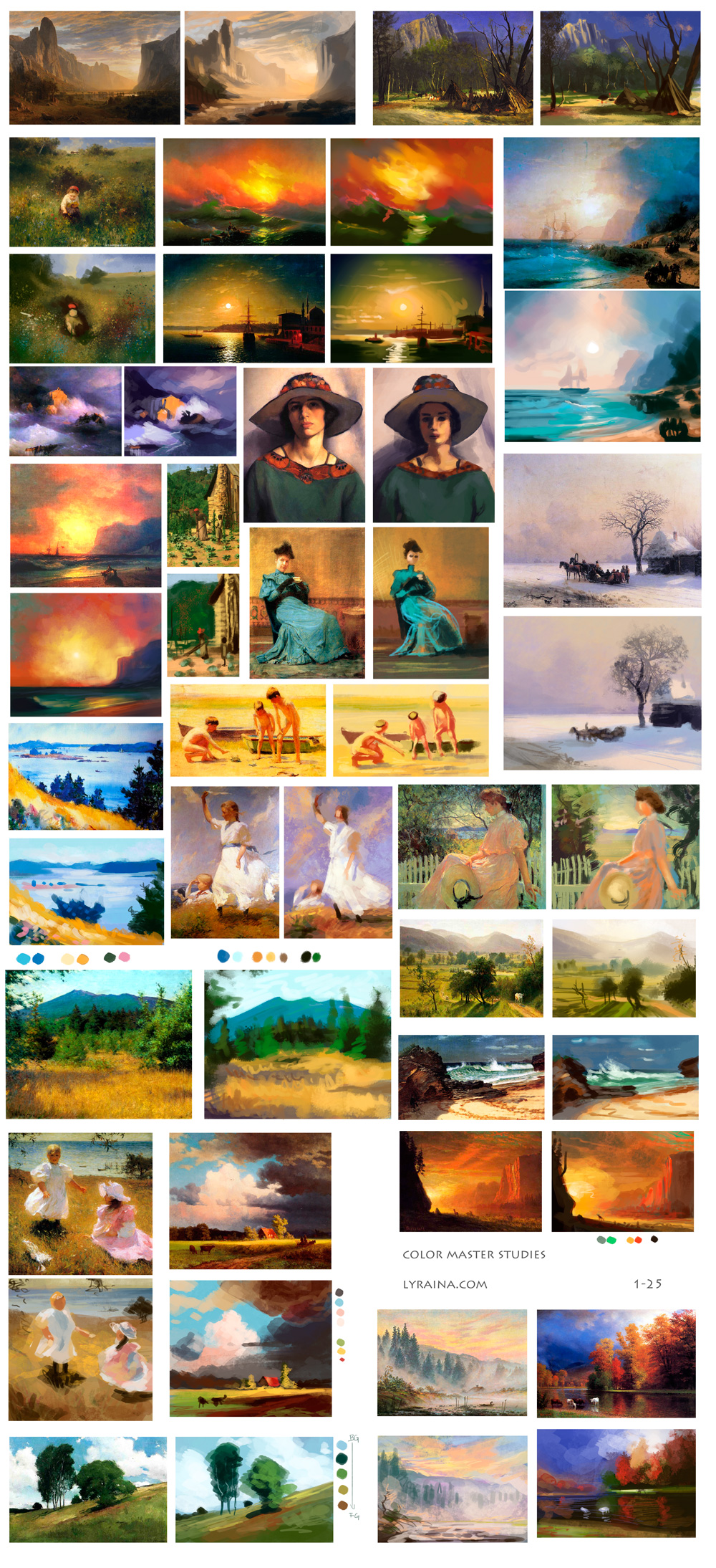
Another batch of master studies - this time, it's all about color. I feel like the value studies were more valuable, even though the color ones were harder to do. Not to say I didn't learn anything though!

What did I learn:
- Figure out why skintones look so ugly and digital when using certain reds, yellows and oranges (even thogh the original seems to use them, too)
- Find a way to paint with a different base color showing through (resulting in 2 colors at the same spot, refreshing the eye)
- Practice low contast/low value range paintings
- Rotate and re-use colors within one painting
- Be more bold with color choices
- Careful with choosing blues (violet-blue vs. cyan-blue)
Another batch of master studies - this time, it's all about color. I feel like the value studies were more valuable, even though the color ones were harder to do. Not to say I didn't learn anything though!

What did I learn:
- Figure out why skintones look so ugly and digital when using certain reds, yellows and oranges (even thogh the original seems to use them, too)
- Find a way to paint with a different base color showing through (resulting in 2 colors at the same spot, refreshing the eye)
- Practice low contast/low value range paintings
- Rotate and re-use colors within one painting
- Be more bold with color choices
- Careful with choosing blues (violet-blue vs. cyan-blue)


