05-31-2013, 09:13 PM
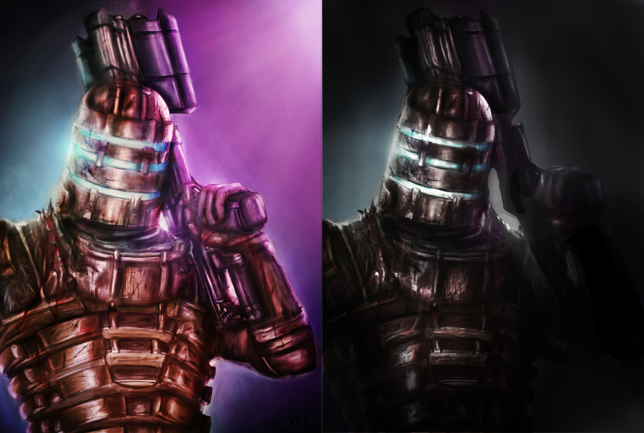
Did a paintover for you. (well actually it was more of an image adjustment than painting) Basic things were too much contrast in value and too much saturation in colour if you were going for realistic grunge. I think you could pay more attention to your rendering of the basic forms and volumes to get them to work within perspective of the piece. Things are looking quite flat in several areas. Think about painting around forms to get them to look more 3D. A way to do this is to control your edges and think about using a combination of hard edges to showcase silhouette and softer edges in places wrapping around forms to show that they are going back into the distance.
You chose a comp that cuts down the figure quite abruptly using one edge of the canvas and it's probably not ideal. I tried to use vignetting and lighting focus to improve this somewhat without having to repaint the figure in a better comp, but if I was working on this I would redo the entire composition to show more of that side of the figure as well or use a crop that isn't so brutal maybe.
Hope that is useful.


