06-30-2013, 08:47 PM
Hi Budgie! Nice sketchbook! Your works in pencil looks marvelous! I love your gesture drawing this pages with ~60 small rectangles containing small poses looks sweet, you can grab gesture in few lines and that's something :)
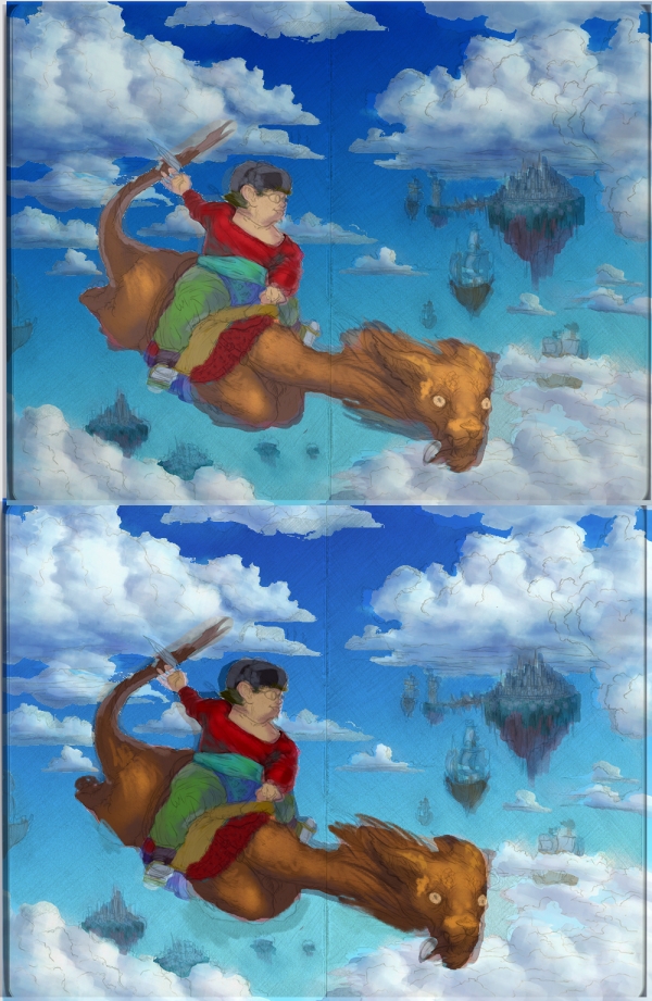
Your last pencil drawing with boy riding dragon is astonishing it's piece of art by it self. But I can't say that colors you picked work well. First of all you already going into so small detail on blouse while picture as a whole isn't established. Values, color palette, you will hear that many times but it's sacred to work from big to small any shortcut will only make your work look bad or extend the time you will spend on it. How I said the sketch is awesome and I only wish your digital continuation of it would be on the same level of awesomeness :)
The sky isn't flat color, it's brighter closer to the horizon,
Clouds are translucent so they will have more saturated shadows. In your pic they grab some of the green color and I don't know why, to grab color of the fields they should be really close to ground but the scene looks like high in the sky.
The floating islands don't grab air perspective at all.
Also the colors of boy aren't harmonious they clash really badly. Here's something from Loomis Creative Illustration
"All colors become a source of reflected color when in light and will reflect themselves into lesser light. All colors in shadows become recipients of other reflected color and will change accordingly. This means that you must consider each plane of the shadow area and whether it would catch the color of something else. This not only makes the units of your picture seems to belong together, it also produces harmony between your color masses. Any two colors will be harmonious when one or both contain some of the other."
Here's my fast overpaint. Top picture have equaled colors by mixing surrounding ones. And bottom is just fast value correction so between boy and sky is stronger contrast. Overall I would think through colors of boy and dragon to be more appealing, but I leave that to you :D Hope It's helpful! :D


