07-17-2013, 07:24 PM
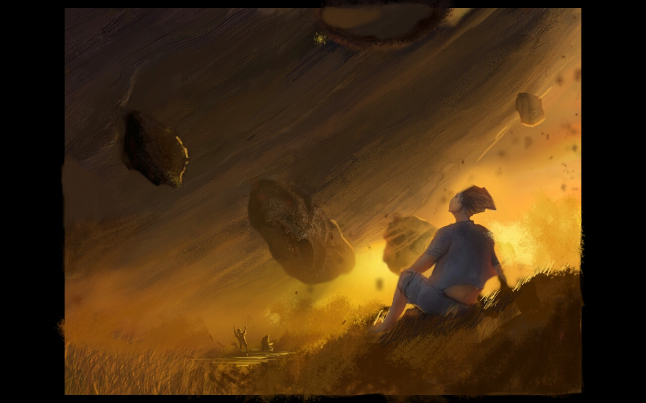
Love the atmosphere and mood. I think compositionally you could improve things by having the figure on a third focal point and really using the curve of the planet thing to drive the comp. You have a bit of a horizontal band going on with the floating rocks so I moved them around a bit. Also moved the smaller figures to coincide with the curve of the planet and tried to add a bit of depth with some detail in the ground and using overlap of layers. with floating things sometimes it helps to fix them in space by throwing their cast shadow on things as it can be hard to fix nail them by value alone. hope I got the gist across. I think you can do even cooler things by playing with values of the floating rocks to really play with the depth of them.
With a piece like this its success hinges on how you handle depth and scale. Oh and I like the craters better too. I did this paintover on a tablet so not sure how it looks for real.

With a piece like this its success hinges on how you handle depth and scale. Oh and I like the craters better too. I did this paintover on a tablet so not sure how it looks for real.


