08-08-2013, 06:28 PM
The details looks really awesome, armor design is great, and I think feathers looks feathery enough.
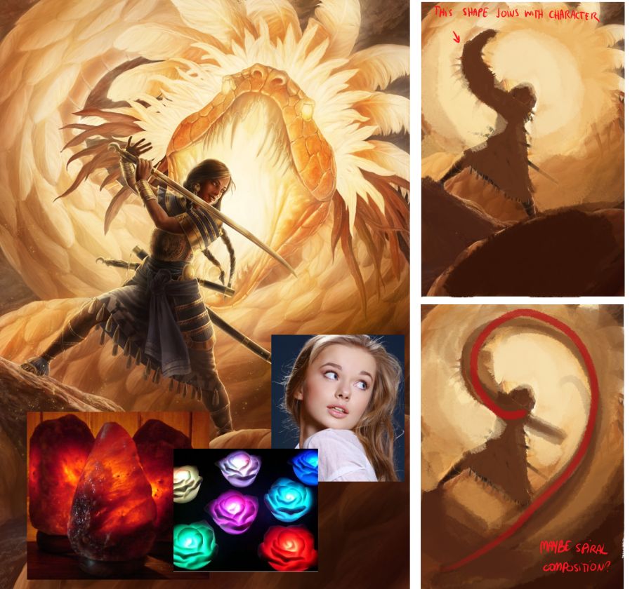
I don't kind of see exactly how the serpent is glowing, it's not readable for me. Overall to show the glow I would make stronger contrast. Also remember what is light doing with translucent surfaces, color close to the lighten edge is more saturated. Check references like glowing toys and lamps how saturated they are. I would also use halo effect common in sunset photos http://www.merlinstudios.co.uk/files/red...ngle12.jpg Sun is so hot that camera can't distinguish exact color of horizon so make it lighter around sun. She could besides reflections on face and arm have lighter spot here. The fragment of the skirt behind her is in light and should be passing light through. The first plan could be in shape that would guide eyes to the serpent head. Her face expression doesn't suggest that she struggle in battle and she doesn't look behind here (she's just looking to the right) her eyes should be open wider like in reference

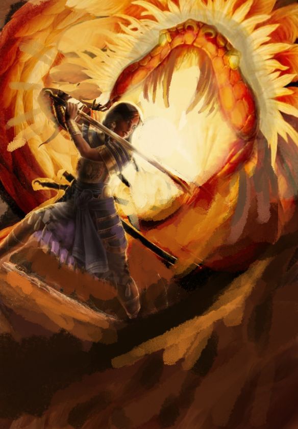
I tried to push it much further so you can decide how far you can go with it :D In my personal opinion I don't feel the danger of the battle, also the girl armor is so detailed and serpent head is so interesting too that I would made both bigger instead of filling empty spaces with not so interesting background.

I don't kind of see exactly how the serpent is glowing, it's not readable for me. Overall to show the glow I would make stronger contrast. Also remember what is light doing with translucent surfaces, color close to the lighten edge is more saturated. Check references like glowing toys and lamps how saturated they are. I would also use halo effect common in sunset photos http://www.merlinstudios.co.uk/files/red...ngle12.jpg Sun is so hot that camera can't distinguish exact color of horizon so make it lighter around sun. She could besides reflections on face and arm have lighter spot here. The fragment of the skirt behind her is in light and should be passing light through. The first plan could be in shape that would guide eyes to the serpent head. Her face expression doesn't suggest that she struggle in battle and she doesn't look behind here (she's just looking to the right) her eyes should be open wider like in reference

I tried to push it much further so you can decide how far you can go with it :D In my personal opinion I don't feel the danger of the battle, also the girl armor is so detailed and serpent head is so interesting too that I would made both bigger instead of filling empty spaces with not so interesting background.


