11-06-2013, 10:43 AM
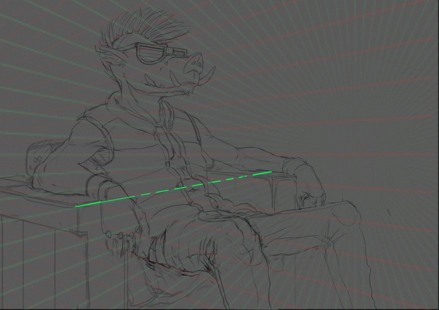
I like the sketch a lot. Great structure to the forms. I did a quick rejig. Basically just made the near leg larger and perspective warped it a bit to show more overlap and that it was coming forward more. Same thing to the near forearm. Check your perspective it's off in a few important places, figures need to be drawn in perspective too and this might help with your posing. Hope that helps


