12-13-2013, 08:53 PM
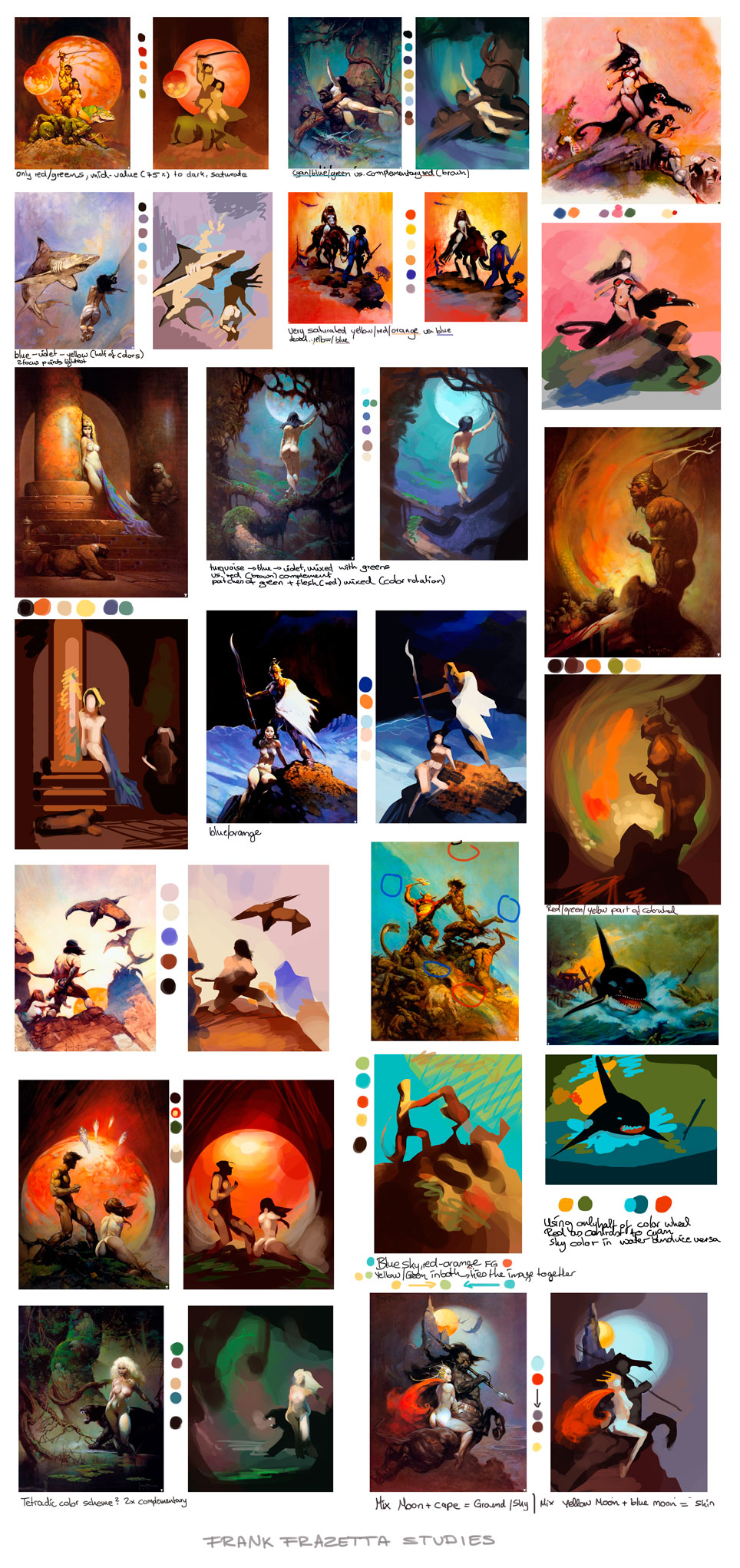
Dissecting Frazetta. This was even more useful than I thought it might be! Observations:
- He is using (very) strong color contrasts in almost every image (green vs. red, blue vs. orange) even if it's not immediately visible
- An exception seem to be greens, which he sometimes shifts slightly towards yellow instead of the direct complement to his red (maybe depending on mood of the image or to get a mossier look or warmer red?)
- Great effects with limited palette
- He's going all the way to black in huge parts of the image, but the lightest areas and strongest contrasts are reserved for the focal points
- He is not afraid of using VERY saturated colors. Not sure how he makes his decisions in this regard?
- Cluttering tiny pieces of complementary colors besides each other everywhere in the image
- Strong use of silhouettes agains background (value difference)
- Lower part of figures often melt together with the background (value/hue - often in the shadows)
- Contrasting colors of the backgrond are often picked up again in the skin (shadow vs light area), unifying the image


