01-04-2014, 09:28 AM
Hello everyone. I was recently working on an illustration when I decided that it just didn't have the ooompf I was looking for, and felt a little flat. I went back to doing more thumbnails and I think I came up with a much more interesting idea/composition.
The story in this piece is pretty simple- there's an evil looking glowing sword possessing a noble lady, and the swirling flames and flaming circles on the floor of the temple hint at its destructive power. Originally the illustration was more of a blasted looking landscape or burnt out ruin, but I didn't like how it turned out.
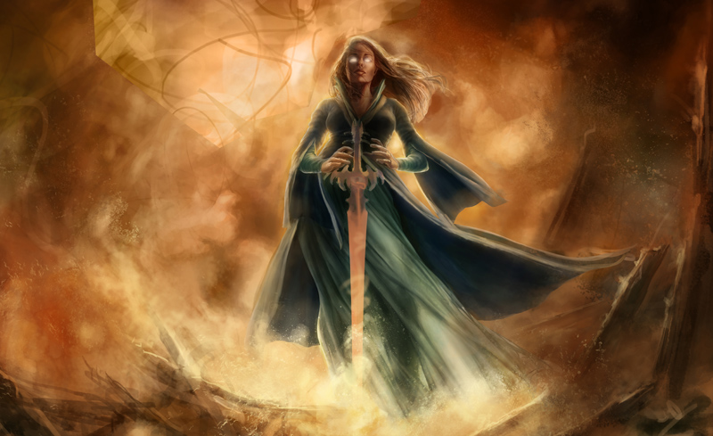
I like the idea of the lady being in a dark, evil temple/chamber much more than some flaming ruins or landscape, but what I'm not sure about is how much of the temple to show in relation to the figure. I have a group of thumbnails here- they're fairly similar- showing some different interpretations of the same scene. Some of the thumbnails have more of the chamber in it, others are tilted a bit more, some have columns in the foreground of the piece.
A-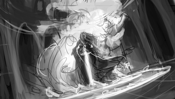
B-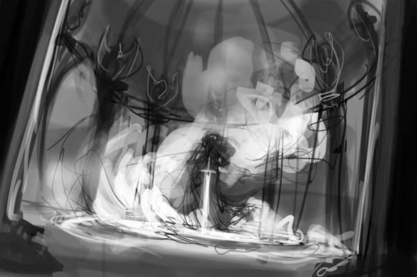
c-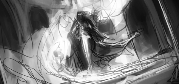
D-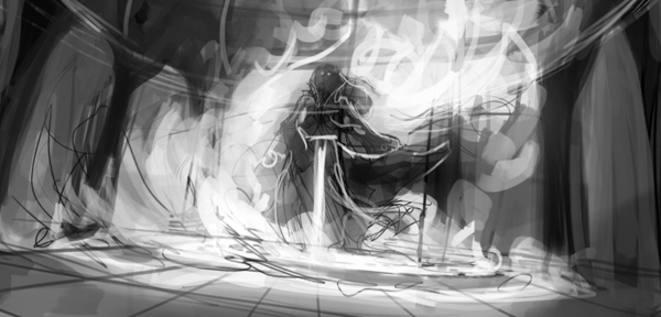
E-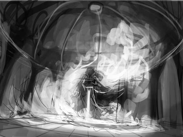
I feel like I have a pretty good idea of what general direction I want this piece to go in, there's just some smaller details I'm not sure about, so I thought I'd get some other people's opinions on it. Do any of these compositions strike you as being stronger or more dramatic than the others? Or do you think any of them could work?
Thanks for taking a look!
The story in this piece is pretty simple- there's an evil looking glowing sword possessing a noble lady, and the swirling flames and flaming circles on the floor of the temple hint at its destructive power. Originally the illustration was more of a blasted looking landscape or burnt out ruin, but I didn't like how it turned out.

I like the idea of the lady being in a dark, evil temple/chamber much more than some flaming ruins or landscape, but what I'm not sure about is how much of the temple to show in relation to the figure. I have a group of thumbnails here- they're fairly similar- showing some different interpretations of the same scene. Some of the thumbnails have more of the chamber in it, others are tilted a bit more, some have columns in the foreground of the piece.
A-

B-

c-

D-

E-

I feel like I have a pretty good idea of what general direction I want this piece to go in, there's just some smaller details I'm not sure about, so I thought I'd get some other people's opinions on it. Do any of these compositions strike you as being stronger or more dramatic than the others? Or do you think any of them could work?
Thanks for taking a look!


