01-23-2014, 08:20 AM
Bjulvar: Thank you! Yeah you should join us for the next round, we'll start in February and make a new thread for everybody who is interested :)
ramalooke: Haha thank you! Oh yes, I didn't do still lifes for quite a while. But I am moving in a few days and then I will have an unlimited amount of new objects to do still lifes from. Yay! :D
Doolio: Thank you! :D
meat: Well, just trying to get the most out of the time I have. This week is a bit slower though as life is going crazy on me right now. Thank you!
Nika: Thank you Nika!
alexfreitas: When I am doing color studies, I open a new document and throw in all images I want to study in that session.. then make a medium-grey box in the same size besides each image...that's the basic setup. Then I ask myself which color dominates the original painting, choose one from the color wheel which I think comes closest, and basically just try to recreate the image, color wise. I always choose the colors myself as this is the important part of the exercise - thinking about which hue and saturation the painter used to create the desired effect. It also helps to learn how colors look different depending on context - a grey placed beneath a strong orange will look really blue, even if it is not blue at all... sometimes even a desaturated orange will look blue in comparison to a strongly saturated orange. Those are the kinds of things I try to get from those exercises. When I am done with copying the painting/colors, then I will sometimes use the color picker to compare what I did (hue and saturation wise) to what the original painter did.. but only afterwards, to see how wrong I was.
If you are struggling with color and value, I suggest starting with just value exercises - trying to break down master paintings into their main values (3-5 value steps), and do color exercises later. I find it too hard to concentrate on color AND value at once in the beginning.
---
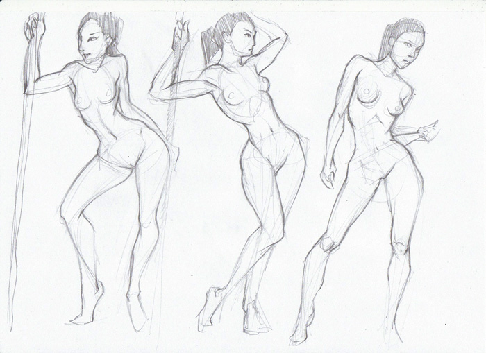
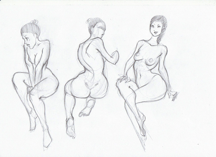
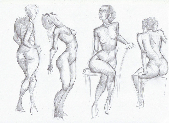
Life is going crazy on me right now so I will visit your sketchbooks later this week, when my head stops hurting and I can think clearly again, for now I will just dump some anatomy on you, before I box my scanner for moving!
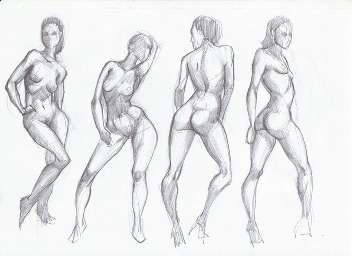
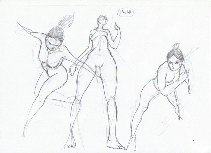
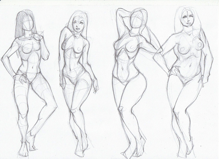
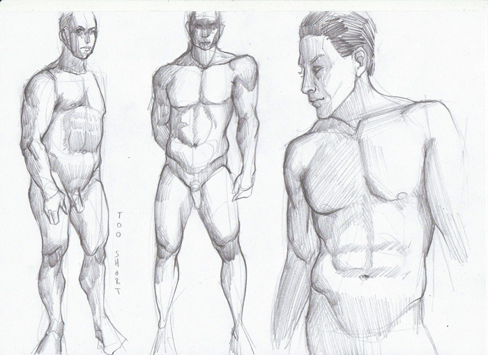
This week: Trying to exaggerate photo-referenced ladies which unfortunately ends in sexing them up, also don't know how to exaggerate guys.
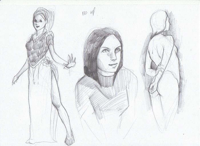
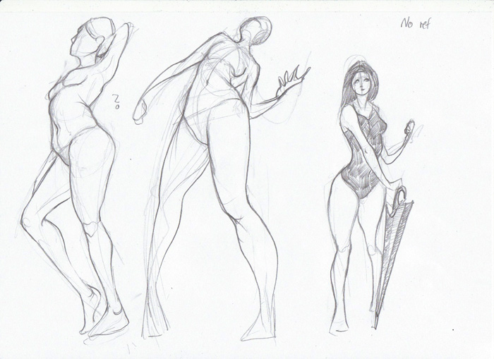
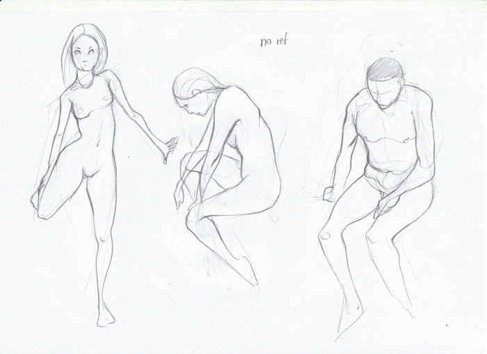
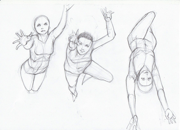
Some very painful sketches without ref, trying to put that foreshortening stuff to use.
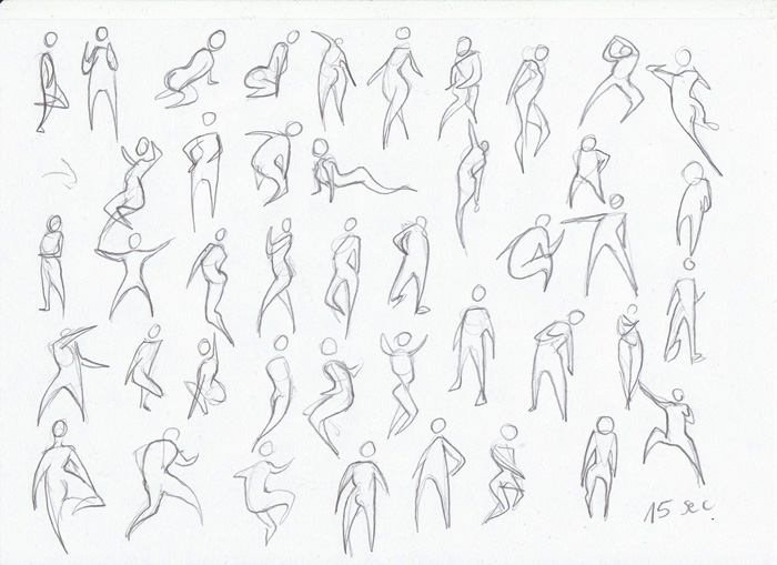
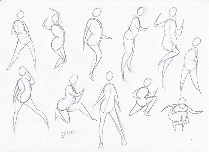
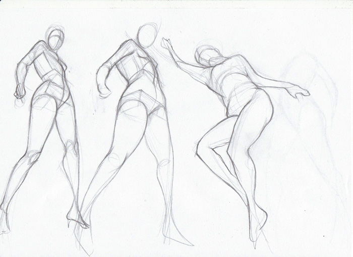
Some 15 (and 60) sec gestures. 15 seconds is crazy!!
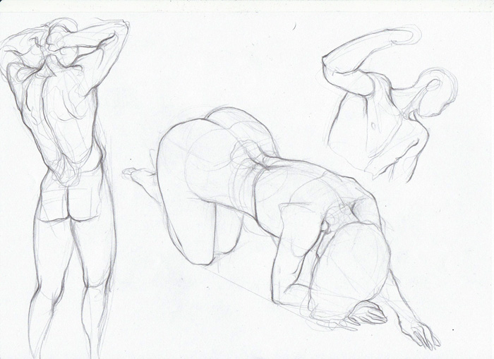
And some random anatomy things.
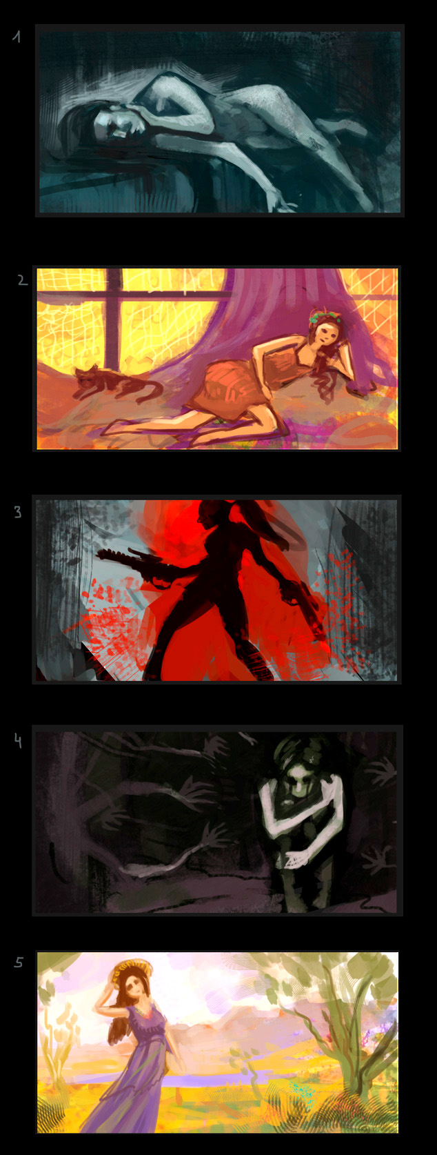
Oh and also, forgot these last time: Each thumb was supposed to reflect a certain mood/atmosphere through its use of color... not too happy with that, but it was an interesting challenge.
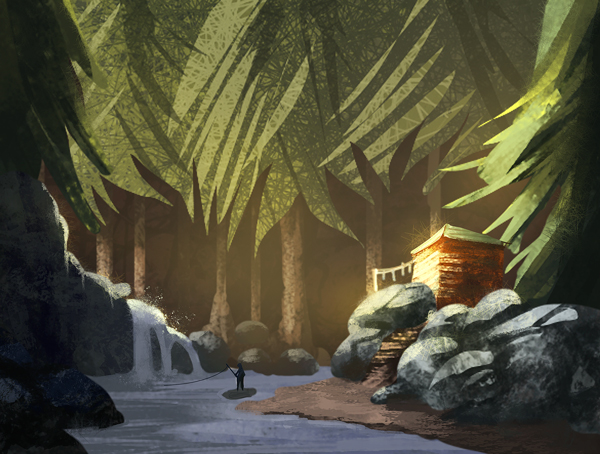
And a quick thing for fun and trying out a more graphic approach:

ramalooke: Haha thank you! Oh yes, I didn't do still lifes for quite a while. But I am moving in a few days and then I will have an unlimited amount of new objects to do still lifes from. Yay! :D
Doolio: Thank you! :D
meat: Well, just trying to get the most out of the time I have. This week is a bit slower though as life is going crazy on me right now. Thank you!
Nika: Thank you Nika!
alexfreitas: When I am doing color studies, I open a new document and throw in all images I want to study in that session.. then make a medium-grey box in the same size besides each image...that's the basic setup. Then I ask myself which color dominates the original painting, choose one from the color wheel which I think comes closest, and basically just try to recreate the image, color wise. I always choose the colors myself as this is the important part of the exercise - thinking about which hue and saturation the painter used to create the desired effect. It also helps to learn how colors look different depending on context - a grey placed beneath a strong orange will look really blue, even if it is not blue at all... sometimes even a desaturated orange will look blue in comparison to a strongly saturated orange. Those are the kinds of things I try to get from those exercises. When I am done with copying the painting/colors, then I will sometimes use the color picker to compare what I did (hue and saturation wise) to what the original painter did.. but only afterwards, to see how wrong I was.
If you are struggling with color and value, I suggest starting with just value exercises - trying to break down master paintings into their main values (3-5 value steps), and do color exercises later. I find it too hard to concentrate on color AND value at once in the beginning.
---
Life is going crazy on me right now so I will visit your sketchbooks later this week, when my head stops hurting and I can think clearly again, for now I will just dump some anatomy on you, before I box my scanner for moving!
This week: Trying to exaggerate photo-referenced ladies which unfortunately ends in sexing them up, also don't know how to exaggerate guys.
Some very painful sketches without ref, trying to put that foreshortening stuff to use.
Some 15 (and 60) sec gestures. 15 seconds is crazy!!
And some random anatomy things.


Oh and also, forgot these last time: Each thumb was supposed to reflect a certain mood/atmosphere through its use of color... not too happy with that, but it was an interesting challenge.

And a quick thing for fun and trying out a more graphic approach:
