02-05-2014, 05:00 AM
crackedskull: Mostly agree with what was already said - cool idea with the foreground, but try to push the 'elder' aspect as well as the swamp.
Jaik: I like the turtle theme! The willows are cool too, but try not only to think how it looks, but also how it works and how/why it developed the way it did. Root and bark legs are a nice idea, although the hind leg looks a bit nonfunctional so far. Does it have to mimic the turtle's foot? the shell already is a strong design hint, so you could saflely go more abstract and make it more root like or even something completely different. You could even add some foliage to those leg-trees. Just ideas, no real critique :P I'm looking forward to how you are going to implement the willows - growing on the shell, or coming out of it etc... with that design you have lots of cool possibilities to explore and build your own little ecosystem. Just always try to think how it is going to work (at least roughly) because I think this will make for a more believable design and help coming up with cool stff. What doesn't read well to me so far is that stuff hanging down besides the head - some kind of roots of another plant? Turtle ear-hair? Or hanging lichens? Looks a bit draped so far.
Bjulvar: Feel free to call me just Lyra, which is my original nickname anyway, but you're not the only one misreading that name. I just hope nobody is ever going to google Lyriana when looking for me...
You have some really cool design ideas, 5 and 6 have nice silhouettes! Although 6 looks a bit unbalanced with those little legs. The more humanoid designs are nice as well, I like the asymmetry of 7. Just try to not turn it into a shaman instead of 'elder'.
Kaffer: Nice dynamic sketches... I like the campfire approach which is something I was considering as well, although I feel like children would fit well into that composition as well. Would change the story behind the image, but also kind of emphasize the old age of the elder. Just an idea :)
---
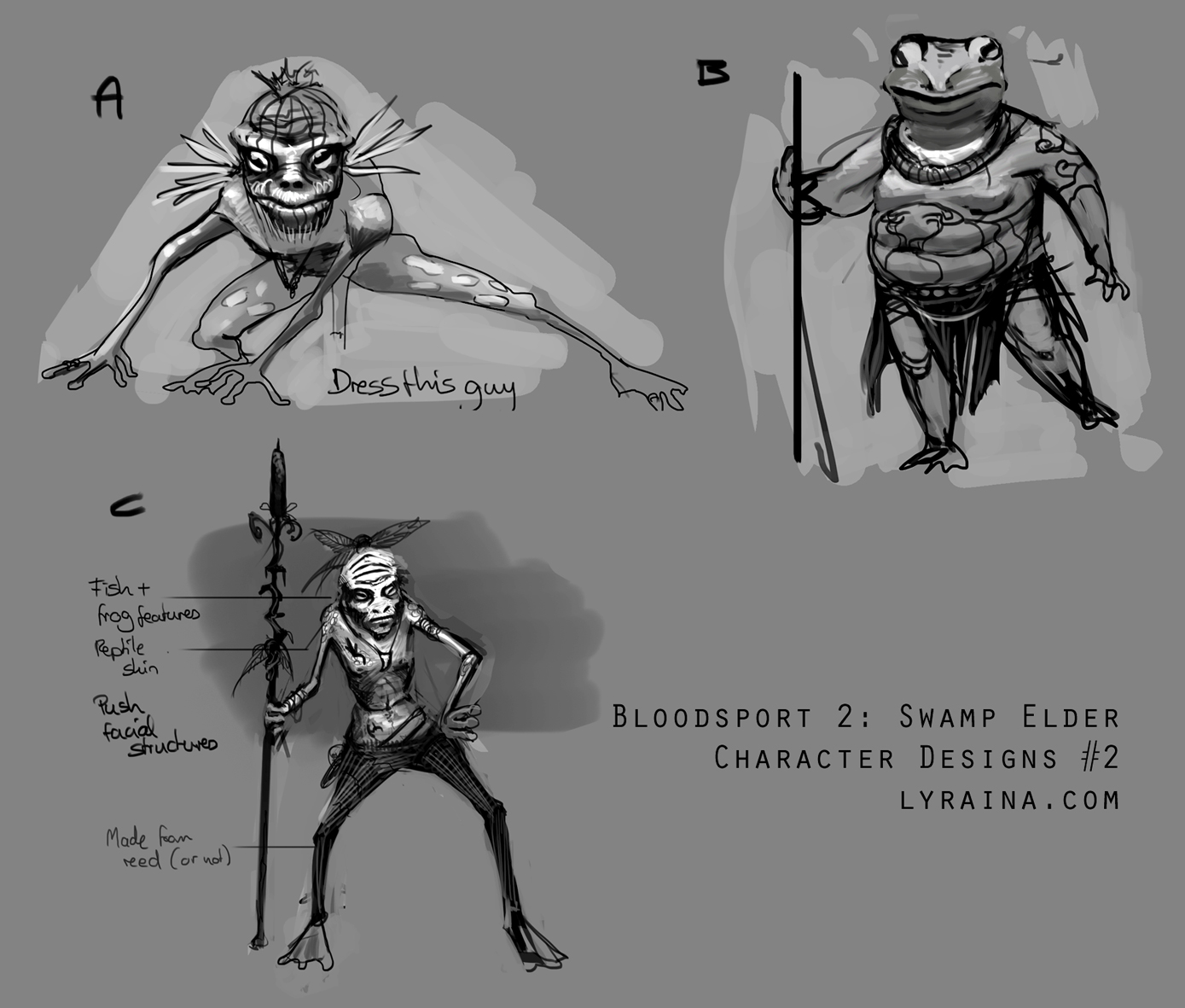
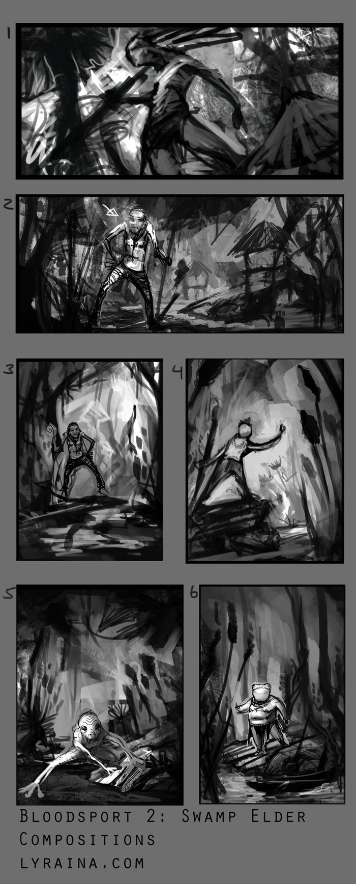
I fleshed out the designs I liked best so far, dropped anything wood related completely..don't think I like the fat frog guy, he just feels so generic. Like... a fat frog, in human form. I might do a hybrid of some froggy-thin-not-entirely-human character though. And then make it more interesting with...stuff. Also started on compositions. I never now how to decide how to continue D: Some are clearly weaker than the rest, but others just have pros and cons....


