02-06-2014, 06:23 AM
Jaik: Maybe repeat those mushrooms somehere in the design so it is not focused on just one area? Apart from that, while I love mushrooms, they kind of destroy the sense of scale... Yeah there is a human standing beside the head, but when I look at the image those mushrooms are a lot more prominent, and to me they don't look like human-sized mushrooms but regular... which kind of shrinks the whole elder. I like 3 and 5 for their balanced scale, 5 a bit more because the tilt enhances the scale of the elder. 7 is too centered for my liking, kind of boring. If I had to choose I'd go for 5, as this allows you to show off the elder as well as its environment, and allows to really show the scale with a bit of atmosphere etc. Looking forward to which one you'll choose :)
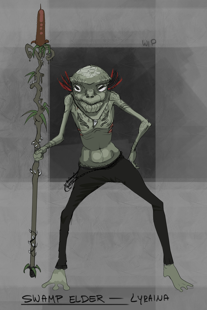
I didn't get much done today, so here is just a quick update on the design, still not happy. The outer gills will probably have to go. Maybe I will rework him again tomorrow or give the fat one another try...

I didn't get much done today, so here is just a quick update on the design, still not happy. The outer gills will probably have to go. Maybe I will rework him again tomorrow or give the fat one another try...


