02-11-2014, 08:04 PM
Hey guys!
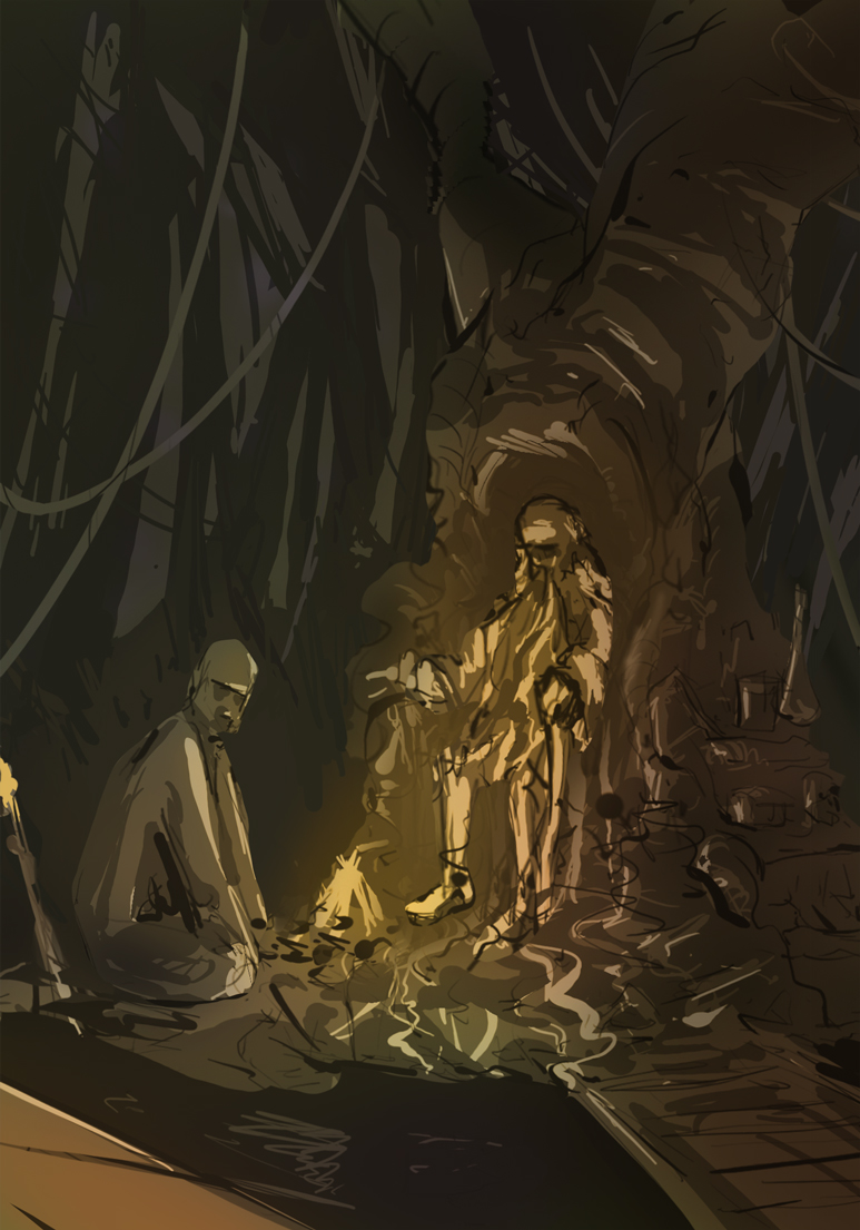
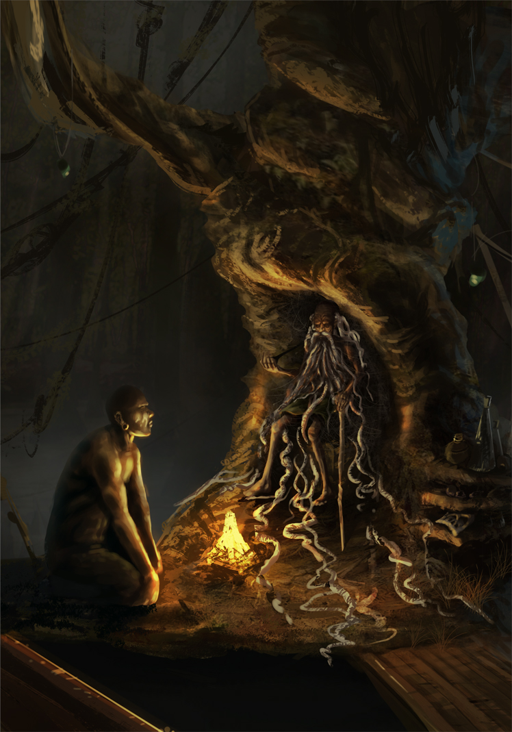
I haven't had internet yesterday, but made some progress nevertheless. I'll upload some progress shots as well. Glad to see everyone so invested in this!
Lyrania: Nice overall concept, the part I don't understand is the pose - somehow it doesn't convey the concept of what the title suggests IMO.. is he a gatekeeper of some sort? It kinda feels like if he was guarding something, standing in our way..
I love the way you make exploration sheets for yourself for vegetation etc. - I'd never be able to be that organized in a project, I'd just jump in, I think I'll actually try this approach sometime!
Crackedskull: I like the reptile-approach to this, I'd possibly try to embed him in the surroundings - like if he was so old he is immobile and kinda lives and breathes with the swamp. Now he kinda looks like a menacing creature who could just wreak havoc on the marshes if he wanted to. One more thing: The saturated purple in his eye might not be the best choice with such a greenish-yellowish palette. I think if you just made that part less saturated it would elevate the color scheme that instant.
Meat: I agree with the others, keep at it man, this whole thing was created for us to be able to learn through failures - it would be pointless otherwise :) The fact that you made such a huge and well structured design brief for yourself shows that you are invested in this so come at it!
Nous: Nice job there, the second thumb in the series with values has a really interesing lighting feeling to it!
Jaik: I might try to unify the palette in this stage, the colors can turn muddy easily as right now you'll focus on values I guess.. also there is a bit of disturbing tangent in the left part where a sharp rock meets the tree in the middle ground.
Ok so I went on with my initial sketch, I kinda liked that one, then put a moodboard together and started adding colors.. this video actually helped a lot:http://www.youtube.com/watch?v=9kQllLy_X4I&list=PLV2X3tgajVlFROS5fuIVKLGs78_fC4JTN I highly recommend it!
After I started rendering I made a line drawing of the Elder, and started painting under it. I also changed the crop and the other guy's pose beacuse I felt it's not appropriate. So right now it's 11 AM in Hungary so I'll dive in some studies and in he afternoon will keep at this again! :)


