02-17-2014, 09:59 PM
Hey guys! Been off in the weekend, had a blast chilling but its time to dive back..
Cracked: Nice level of detail on the Elder, that tree in the midground before his hand is a bit weird to me.. somehow it creates a tangent I think.. maybe because its the only tree we see, maybe some vegetation around would make it seem more natural.. possibly indicating where his body would continue in the BG would give a sense of depth, and make the cut-out less "obvious".. The overall mood is great, I love how the fog flows off his further arm!
Jaik: the amount of vegetation around is cool, it helps to bring us in the scene! Maybe separating FG-MG-BG would be worth a try, some athmospheric perspective maybe? It seems a bit flat to me.. its coming along nicely! (Oh and thanks a lot for the horizon line-tip, helped a lot!)
Lyrania: I like your colorful and stylized approach, and his pose improved I think (altough I don't really get the sense of him being old), its the composition that could be given some thought I think.. The main character seems to get lost in the whole (I think mine could be suffering from the same problem..) Also the direction of the light might appear differently on him, since he is being lit from the back, but light is from the side on him. Also, if the backlight was properly adapted on him, that might give him a strong rim light which would give him more focus.. I love the diverseness of the vegetation! Its obvoious you made some serious preparation work :)
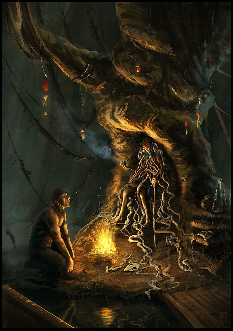
I made some minor changes to mine, I think I am calling this one finished. (Oh and Lyrania: Yeah, I tried to push the color contrast, we were thinking along the same lines there :))


