03-29-2014, 04:44 AM
Art.ful: Thank you, I will :D
meat: Thanks for the advice - I'll try to follow the form next time. The green thing seems to be called "Kohlrabi" in English as well (not only in German), I had no idea that this seems to be somewhat of a local veggi O_o http://en.wikipedia.org/wiki/Kohlrabi You're right about the white... I'll have to be more careful when taking a photo next time (or adjust afterwards). Thanks for the overpaint <3
Nika: Thank you Nika :)
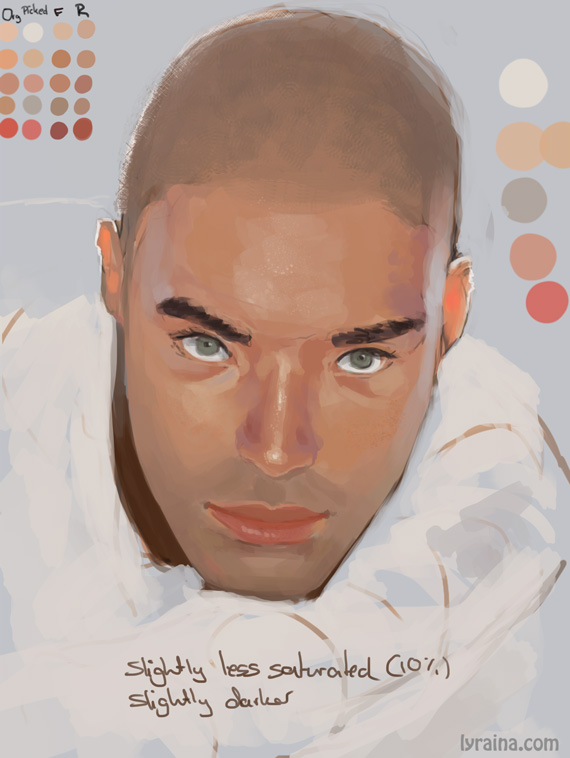
Yesterday I was tired to a point that I just wanted to slip down on the floor and pass out, but instead I let myself transistion into zombi mode and did some color studies with photos: no focus on rendering, but trying to find out discrepancies between what my zombi brain THINKS it sees, and what the photograph really says. So I picked some representative colors from my image in different stages (flat colors, rendered etc) and compared them to colors i picked from the photograph in terms of value, saturation and brightness. It's a quite insightful exercise. I tend to overestimate saturation (surprise...) and underestimate brightness levels (might be an artefact of my workstyle). It also made me realize how much I rely on "on canvas mixing" because I had some difficulties deciding on the flat colors. I usually always start with just a colored background/flat color and then build up & render layers of colors on top of that.

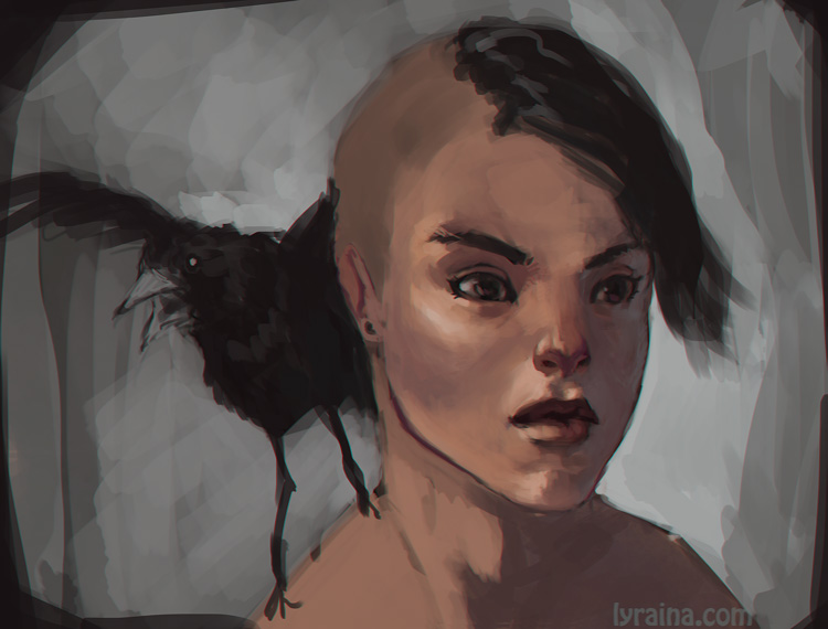
Also, application. Fun.
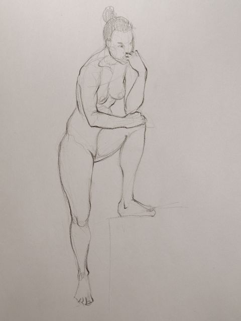
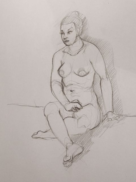
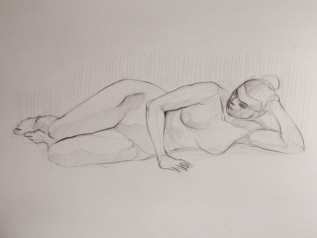
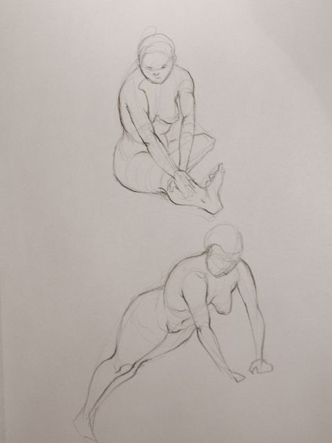
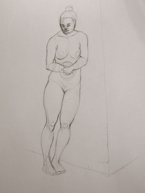
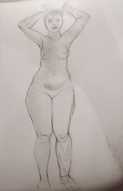
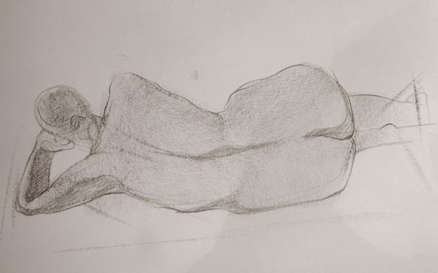
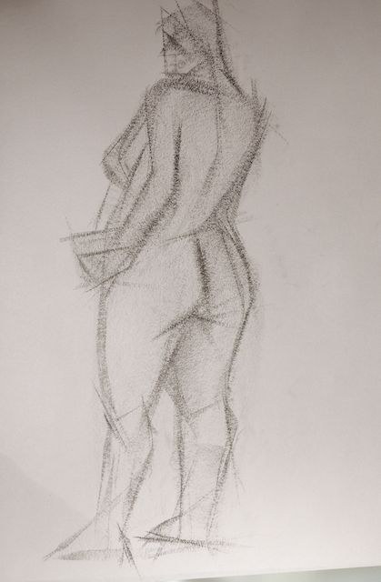
Life drawing. Not really satisfied. But this week's model was gorgeous <3


meat: Thanks for the advice - I'll try to follow the form next time. The green thing seems to be called "Kohlrabi" in English as well (not only in German), I had no idea that this seems to be somewhat of a local veggi O_o http://en.wikipedia.org/wiki/Kohlrabi You're right about the white... I'll have to be more careful when taking a photo next time (or adjust afterwards). Thanks for the overpaint <3
Nika: Thank you Nika :)
Yesterday I was tired to a point that I just wanted to slip down on the floor and pass out, but instead I let myself transistion into zombi mode and did some color studies with photos: no focus on rendering, but trying to find out discrepancies between what my zombi brain THINKS it sees, and what the photograph really says. So I picked some representative colors from my image in different stages (flat colors, rendered etc) and compared them to colors i picked from the photograph in terms of value, saturation and brightness. It's a quite insightful exercise. I tend to overestimate saturation (surprise...) and underestimate brightness levels (might be an artefact of my workstyle). It also made me realize how much I rely on "on canvas mixing" because I had some difficulties deciding on the flat colors. I usually always start with just a colored background/flat color and then build up & render layers of colors on top of that.


Also, application. Fun.

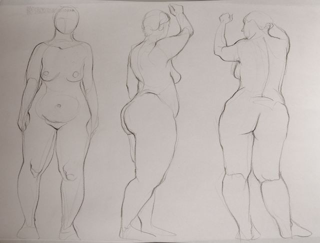
Life drawing. Not really satisfied. But this week's model was gorgeous <3
