04-09-2014, 04:27 AM
Jaik: To me the base colors look fine, maybe the bottom green is a bit too saturated, being a not-very-important element of the image/package. Value wise, I think it would read better without the greenish trees in the distance. Try how it looks if you let the sky touch the horizon and substitute the warm green of the ground with something less obtrusive?
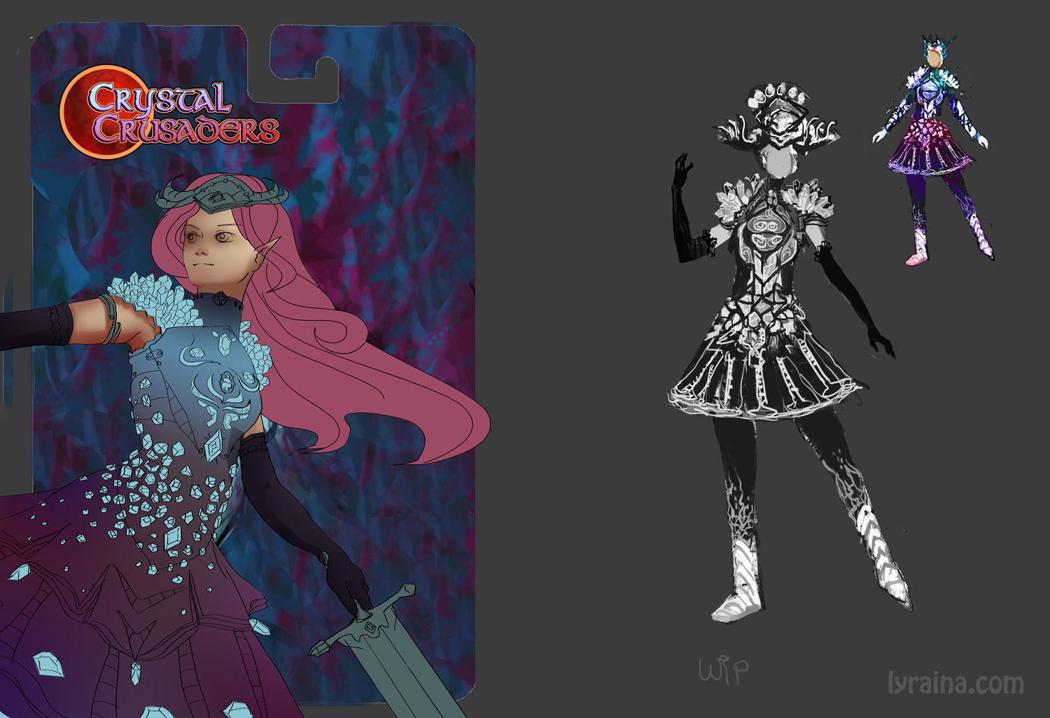
I redrew the lineart today, not much progress to show.. I'm really bad with digital lines :<

I redrew the lineart today, not much progress to show.. I'm really bad with digital lines :<


