04-24-2014, 04:17 AM
rmd: Thanks! I struggle a lot with color, so that means a lot to me :)
Kaffer: Thanks for the feedback. One day I'll hopefully get that anatomy stuff right. Background... for some reason I worked almost square on that one, so it is already cropped a bit - not enough it seems!
Jaik: Thank you! Yeah the mobility issue was a struggle - I was all the time torn between "make this look cool and fantasy" and "don't make it too restrictive/heavy/stupid". I'd actually love to wear a full set of armor one day :D
crackedskull: Thanks! Semi-out of comfort zone at least - not used to doing armor, but I think the scifi topic would have been even more tough. (but the armor studies suited me fine)
Blewzen: Thanks. Yeah, need to work on faces! D:
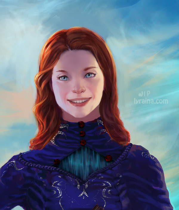
*sigh* Dear Photoshop, WHY do you have to crash despite me merging down most of the layers.. what do you want from me ;_; Anyway! It's Shallan time again. Are you bored of her yet? XD Changed the nose, reduced the length of the nose, reduced saturation (again oO), fiddled with the eyes (again). I don't think I'll get them any more asian looking as long as they have to stay blue. I think I'm done with her soon...?
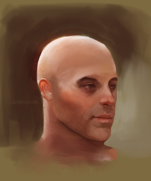
One thing that increasingly troubles me is the problem that I seem to be unable to paint faces that I would consider beautiful, or even pretty. While having "character" is nice and all, I think it's very important to be able to paint a default-pretty face (which then can be varied or uglyfied or whatever). Unfortunately I can't even tell what exactly I don't like in the faces I paint... not sure what to do about this, feature studies, studying more from reference, trying to break my habits/"style"..?
study
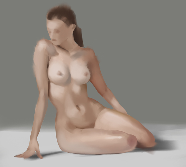
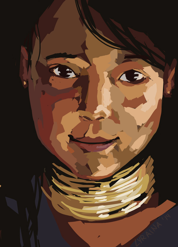
application
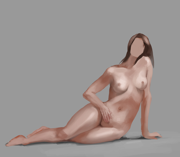
study
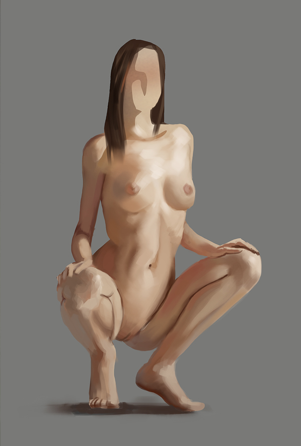
color comps for the magic box. Looking back at it now, I don't think my selection of reference images was good.
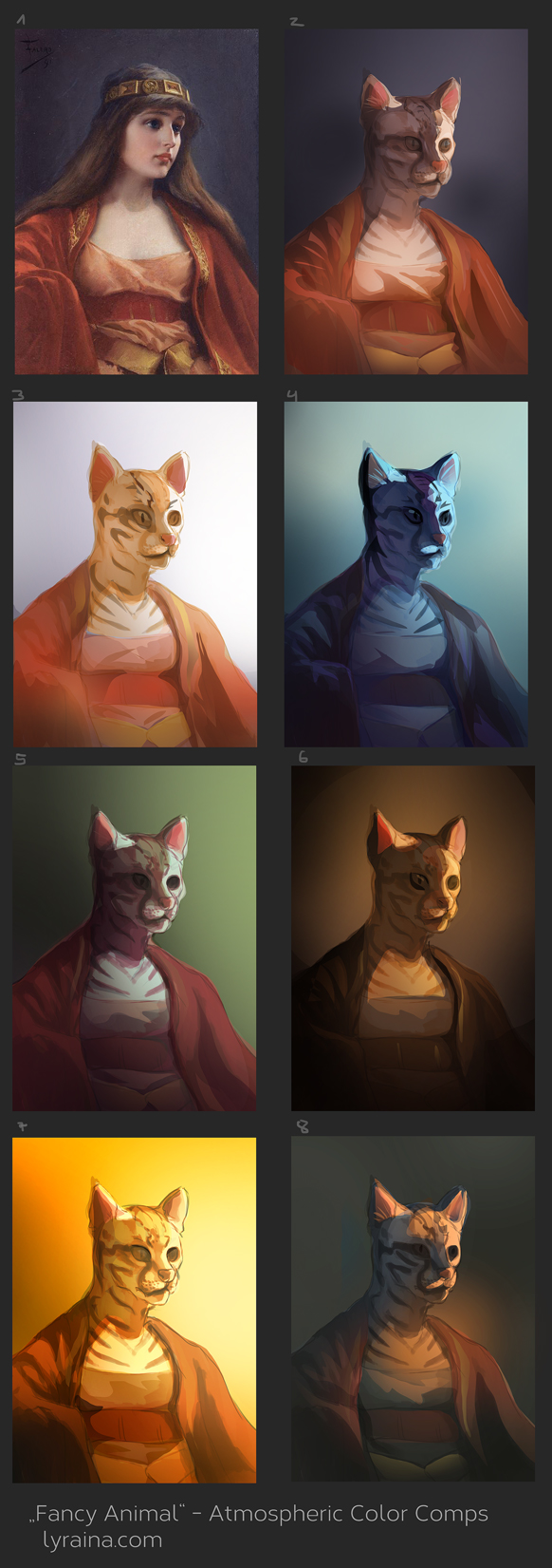
those were my refs
Kaffer: Thanks for the feedback. One day I'll hopefully get that anatomy stuff right. Background... for some reason I worked almost square on that one, so it is already cropped a bit - not enough it seems!
Jaik: Thank you! Yeah the mobility issue was a struggle - I was all the time torn between "make this look cool and fantasy" and "don't make it too restrictive/heavy/stupid". I'd actually love to wear a full set of armor one day :D
crackedskull: Thanks! Semi-out of comfort zone at least - not used to doing armor, but I think the scifi topic would have been even more tough. (but the armor studies suited me fine)
Blewzen: Thanks. Yeah, need to work on faces! D:
*sigh* Dear Photoshop, WHY do you have to crash despite me merging down most of the layers.. what do you want from me ;_; Anyway! It's Shallan time again. Are you bored of her yet? XD Changed the nose, reduced the length of the nose, reduced saturation (again oO), fiddled with the eyes (again). I don't think I'll get them any more asian looking as long as they have to stay blue. I think I'm done with her soon...?
One thing that increasingly troubles me is the problem that I seem to be unable to paint faces that I would consider beautiful, or even pretty. While having "character" is nice and all, I think it's very important to be able to paint a default-pretty face (which then can be varied or uglyfied or whatever). Unfortunately I can't even tell what exactly I don't like in the faces I paint... not sure what to do about this, feature studies, studying more from reference, trying to break my habits/"style"..?

study

application

study


color comps for the magic box. Looking back at it now, I don't think my selection of reference images was good.

those were my refs


