04-29-2014, 07:41 AM
Crackedskull: Thanks, I hope so ;)
pnate: Thank you! I can't really say much about the magic box so far, as I have only access to one month so far. Which has been nice because it introduced me to the lasso+gradient tool (with reduced opacity) technique, which I didn't think of before. Apart from that I also bought it because I feel like something like this course can be useful just for the assignments because assignments and deadlines are what keep me going if I am depressed/demotivated, so it is good to always have something to do. Also it makes me try out things I would not have done otherwise. A tutored course would be a ton better of course, but also a ton more expensive ;) From what I see coming up over the next months (more masking stuff, texturing, trees, environments...) I am excited however and think I'll be able to learn a lot for sure! Why don't you just give it a try and cancel if you don't like it? Payments are monthly, so you can stop any time.
Jaik: O_O Thank you for the explanation! Yeah, I just recently experimented with that desaturate/value etc issue after watching a video on the topic... so much to be aware of when working digital. I'm suddenly very glad that I have a beautiful mac screen :P
And yes, it totally makes sense, at least when I read your explanation and play with the rgb sliders at the same time, watching what happens.
Ursula: Yeah, I know that levels and ctrl-u are different (basically that the first is useful and the second ugly, haha), just for the first time actually tried to understand what exactly is happening there. What I was trying to find out was what the "correct" way to darken the colors on the gamut mask colors is, not sure how a traditional painter would do it - when experimenting with oils I avoided black (and white) as well so far, but when trying to stick to that gamut mask thing from Gurney, I don't think there is another way to darken colors? Adding a complement color to change the value would violate the gamut mask that was set up at the beginning.
The thought that in traditional media you can go darker with the help of other colored pigments, but not lighter is interesting, didn't occur to me yet...
It's interesting that you heard that masking is NOT the way to do - Gurney seems to use it a whole lot, so I concluded that it's a quite common tool to achieve harmonizing color schemes. Although I suspect that it is similar to any other helping tools (like perspective grids), once you used it for a decade or so you can do most of it in your head, adjusting on the go if neccessary.
I'll have a look at that app, thanks for the suggestion. Also, the new Coolorus is amazing O_O What an update (and even with upgrade discount, yay)!
Hypnagogic_Haze: Thank you! Yeah I love studying and learning and reading up on things and such ;)
warmup

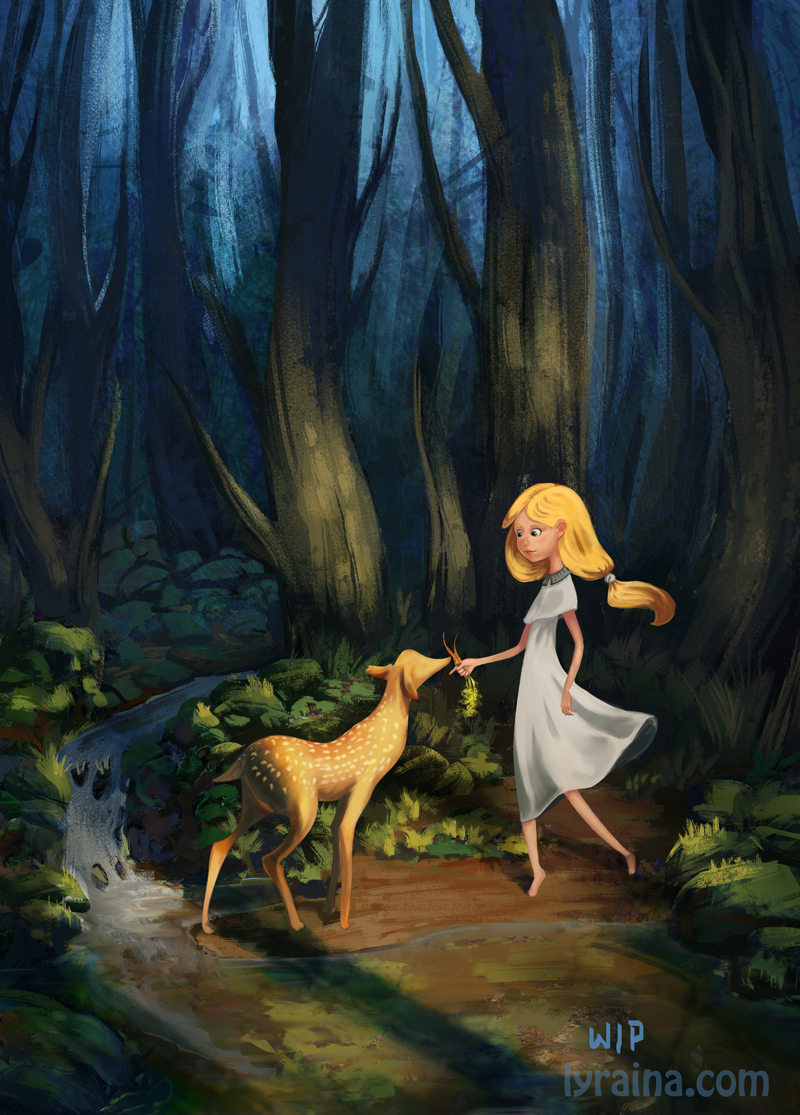
a very last minute decision to participate in the ifx monthly challenge. my attempt to do something which could be a children's cover, but might be too dark? Also, I'm soooo lost when it comes to stylization, I honestly have no idea what to look out for :P Apart from that, I try to push light/colors and a painterly/rough stlye.

pnate: Thank you! I can't really say much about the magic box so far, as I have only access to one month so far. Which has been nice because it introduced me to the lasso+gradient tool (with reduced opacity) technique, which I didn't think of before. Apart from that I also bought it because I feel like something like this course can be useful just for the assignments because assignments and deadlines are what keep me going if I am depressed/demotivated, so it is good to always have something to do. Also it makes me try out things I would not have done otherwise. A tutored course would be a ton better of course, but also a ton more expensive ;) From what I see coming up over the next months (more masking stuff, texturing, trees, environments...) I am excited however and think I'll be able to learn a lot for sure! Why don't you just give it a try and cancel if you don't like it? Payments are monthly, so you can stop any time.
Jaik: O_O Thank you for the explanation! Yeah, I just recently experimented with that desaturate/value etc issue after watching a video on the topic... so much to be aware of when working digital. I'm suddenly very glad that I have a beautiful mac screen :P
And yes, it totally makes sense, at least when I read your explanation and play with the rgb sliders at the same time, watching what happens.
Ursula: Yeah, I know that levels and ctrl-u are different (basically that the first is useful and the second ugly, haha), just for the first time actually tried to understand what exactly is happening there. What I was trying to find out was what the "correct" way to darken the colors on the gamut mask colors is, not sure how a traditional painter would do it - when experimenting with oils I avoided black (and white) as well so far, but when trying to stick to that gamut mask thing from Gurney, I don't think there is another way to darken colors? Adding a complement color to change the value would violate the gamut mask that was set up at the beginning.
The thought that in traditional media you can go darker with the help of other colored pigments, but not lighter is interesting, didn't occur to me yet...
It's interesting that you heard that masking is NOT the way to do - Gurney seems to use it a whole lot, so I concluded that it's a quite common tool to achieve harmonizing color schemes. Although I suspect that it is similar to any other helping tools (like perspective grids), once you used it for a decade or so you can do most of it in your head, adjusting on the go if neccessary.
I'll have a look at that app, thanks for the suggestion. Also, the new Coolorus is amazing O_O What an update (and even with upgrade discount, yay)!
Hypnagogic_Haze: Thank you! Yeah I love studying and learning and reading up on things and such ;)
warmup

a very last minute decision to participate in the ifx monthly challenge. my attempt to do something which could be a children's cover, but might be too dark? Also, I'm soooo lost when it comes to stylization, I honestly have no idea what to look out for :P Apart from that, I try to push light/colors and a painterly/rough stlye.


