05-24-2014, 04:35 AM
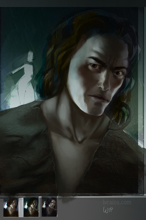
Kaladin update
Want to work on my compositions and bought 'Framed Ink', it is quite focused on movies though, so I am having trouble to translate it to my own work... did some screenshot studies from cinemasquid.com. I tried to do composition and colors at once, didn't work, so I did it in multiple steps instead. It's a funny feeling when perception first focuses on color, then suddenly switches to see values and forms.
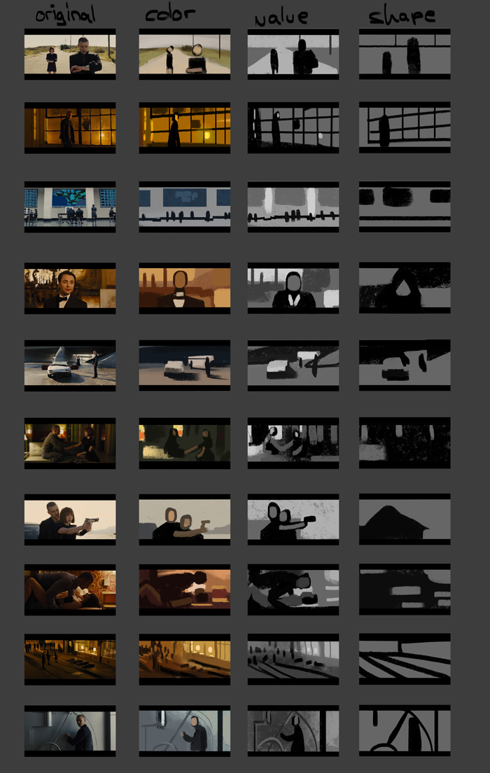
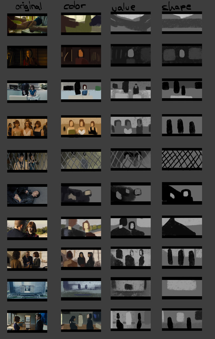
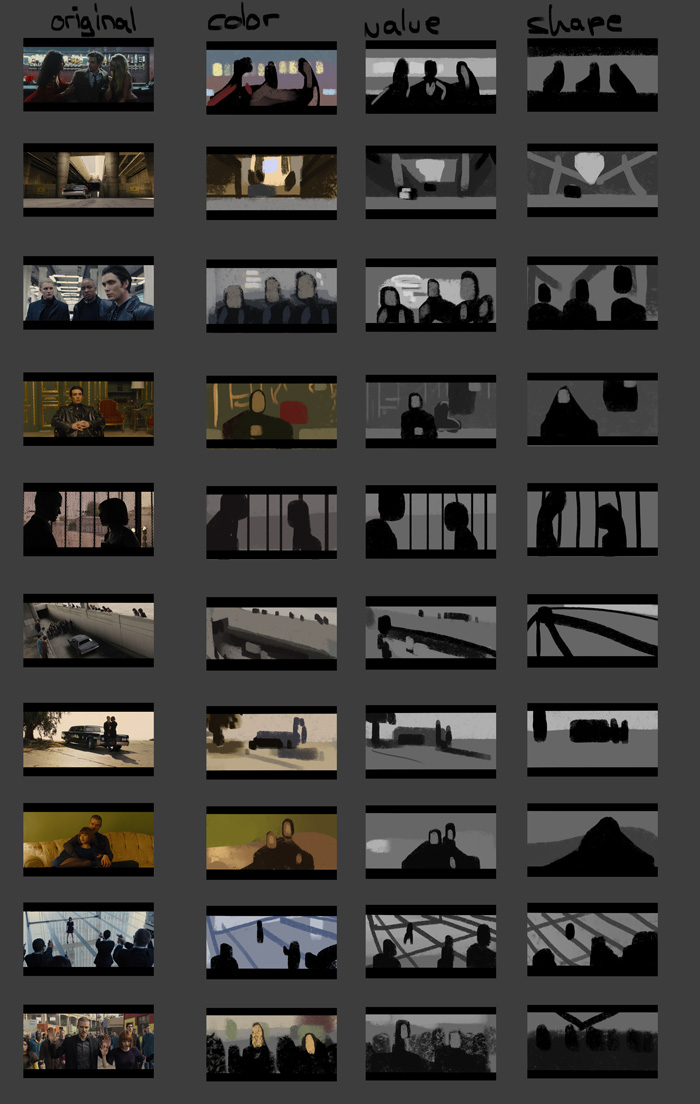
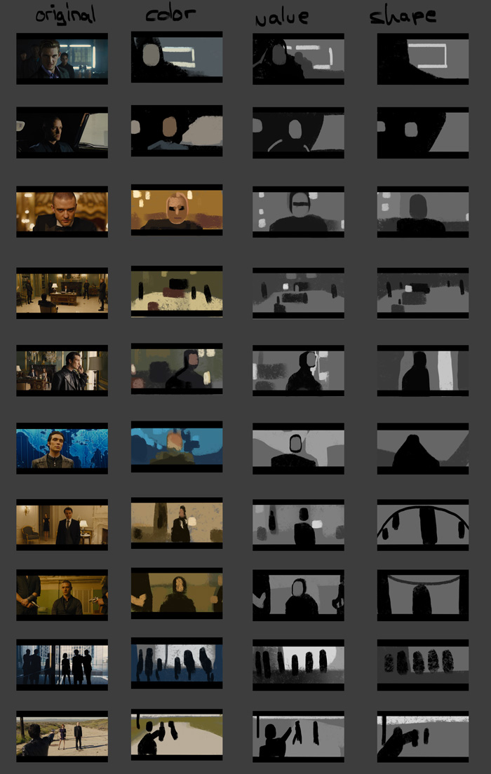
- every shot/scene has a strong color (temperature) tint, depending on situation, mood: cold blue/blacks with cold and pale yellows (feeling cold, sterile and as if people are going to be shot), sickly green-yellows, sometimes contrasted with warm red/gold (feeling uncomfortable), warm and golden yellows (feeling good), just warm tint with yellows or oranges or natural light (not sure how to feel about those).
- often lit by only one direct light source, coming directly from one side of the image, leaving selected faces in shadows
- brilliant use of soft curves and horizontals/verticals and diagonals for drama or stability
- diagonals: floor tiles, falling perspective lines (wide angle), perspective, tilted horizon/camera
- use background/design elements to introduce lines/diagonals/horizontals as needed (fence, ornamentation, shelf, ...)
- introduce asymmetry in subtle ways to create more interest (both in color, value and shape language)
- think about placement of figures and elements: how far to the side of the frame do you place something (and why), what does that convey? do elements get cut off while others don't?
- within each shot and color scheme, colors are very beautifully orchestrated even if this is not immediately visible like straight on orange vs. blue -> pleasing result without being "in your face"
- strong value contrasts (like lights in the backgrund) get balanced out very carefully (except in uncomfortable shots)

Want to work on my compositions and bought 'Framed Ink', it is quite focused on movies though, so I am having trouble to translate it to my own work... did some screenshot studies from cinemasquid.com. I tried to do composition and colors at once, didn't work, so I did it in multiple steps instead. It's a funny feeling when perception first focuses on color, then suddenly switches to see values and forms.


- every shot/scene has a strong color (temperature) tint, depending on situation, mood: cold blue/blacks with cold and pale yellows (feeling cold, sterile and as if people are going to be shot), sickly green-yellows, sometimes contrasted with warm red/gold (feeling uncomfortable), warm and golden yellows (feeling good), just warm tint with yellows or oranges or natural light (not sure how to feel about those).
- often lit by only one direct light source, coming directly from one side of the image, leaving selected faces in shadows
- brilliant use of soft curves and horizontals/verticals and diagonals for drama or stability
- diagonals: floor tiles, falling perspective lines (wide angle), perspective, tilted horizon/camera
- use background/design elements to introduce lines/diagonals/horizontals as needed (fence, ornamentation, shelf, ...)
- introduce asymmetry in subtle ways to create more interest (both in color, value and shape language)
- think about placement of figures and elements: how far to the side of the frame do you place something (and why), what does that convey? do elements get cut off while others don't?
- within each shot and color scheme, colors are very beautifully orchestrated even if this is not immediately visible like straight on orange vs. blue -> pleasing result without being "in your face"
- strong value contrasts (like lights in the backgrund) get balanced out very carefully (except in uncomfortable shots)


