08-21-2014, 06:27 PM

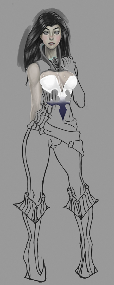
i spent 3 hours trying to convert the face from greyscale to color using photoshop tricks and eventually gave up. i went to bed and when i woke up i just painted over the face in color for 45 minutes with much better results. alot of times the traditional ways of doing things can be much better.

(08-19-2014, 08:00 AM)Tristan Berndt Wrote: It's nice to see some figure studies. Looking at them, I think you'd benefit from studying some constructive methods of drawing the figure. What you have now looks a little impractical for portraying a realistic anatomy. You're not constructing the major masses and things like the big ball at the elbow don't really exists. The part of the bone in that area is very angular and the surrounding muscles look like a squashed cylinder (or two cylinders fused together) if the arm is laid out flat. So a ball just isn't describing what's happening in the anatomy and because of that, it makes it harder to study and learn what is happening there. The only joints that where a ball would describe what is happening there is the shoulder socket and the thigh bone going into the hip (some might argue for the knee but that's really more like a hinge with a flat ball at the end. I hope I'm making sense.
I'd recommend studying Bridgman to gain a very strong sense of construction in the body and I think that's what you'd need to push your drawings further.
Another thing I'd like to say is that your dark grey background is crushing your values. It keeps you in this very limited range of values and you never push your way out of it. Toned canvases are great but only if you manage to lay in strong values on top of then. Try and push your values so when you (for example) paint scenes, can blur your eyes and see 3 (or so) levels that differ from light medium and dark. Right now you just have a medium/dark color that dominates everything and it's very crushing.
Check out something like what James Paick does here http://3.bp.blogspot.com/-b7Vbb0HE3JI/TW...Bcopy2.jpg where you can clearly see a well structured value system that reads very nicely. Even though it's a limited range, you can still separate the different levels of depth from light, medium and dark.
Having a good tonal composition is very important to your images so really try and push your values further. I think that would do a big difference in your work.
Anyway, hope this crit helps and I hope I don't sound grumpy. I just feel like I maybe could help because I used to have this problem and it wasn't easy to get out of and not have what I did look crappy, haha.
Keep on studying and keep working hard!
Thanks for the critique! I tried out lightening the tinted background and you were right the value range became much more expansive. on your point of the ball for the elbow joint, however, those are not meant to signify what kind of joint the area is they're just meant to signify that there is a joint there. It's really just a shorthand reference because speed is a factor in these timed figure studies. If I was trying to go for an anatomically correct skeletal structure you would be right in pointing that out as incorrect but that's not what I'm trying to do.


