08-17-2015, 09:31 PM
CRacked: haha, I thought it was a death trap before, ain't no way anyone is walking away from it alive with it jumping abouts the place.
Yo Chris, if you've eva got a few mins I wanna pick your brain, find out what construction your throwing down for your perspective sketches, you made them look so effortless. mine look soooo laboured.
Hey people, it's been a while. moved house again, started new job, squeezed in very little drawing.
I kinda abandoned my study scheduled/topics and just tried to fit in anything. worked out I ended up doing more finished drawings which gave me a chance to see where the study has gotten me this year.
so, self assessment (tax doesn't have to be taxing)
I have a good handle on perspective construction techniques so at the very least I can draw something that looks solid and three dimensional. I need to throw some artistry and stylz at it to make them sexy.
my sketching needs a lot of work too, I'm can draw well enough with the crutches of construction, but i'm failing when it comes to do anything more free. it's a skill I really need, it'll make a huge difference when I come to sketch rough concepts.
Design is my biggest hurdle, as far as I can tell my proportion and placement are good but I'm always left stumbling when it comes to designing the details and mechanics. I know so little about how things work that even using reference isn't much help because I don't have a solid grasp on the ideas behind it.
for the most part I prefer drawing more realistic stuff, so we might have different things come to mind when I say design because I'm not really pushing for any far out concepts (not yet anyway), i'm looking for believability, some kind of mechanical accuracy and to nail the design aesthetic of an era. oh, and to hit the basic principles of design, like yo shape, and proportion such and such...
stuff like this https://www.youtube.com/watch?v=Ydu_2bUgG78
Rendering and painting are not even on my radar at the moment, same for drawing more organic shitz. i need to figure how to work them back in
so yeah, i need to make a new study system based on this, hopefully in a few weeks i'll have a path I can trot merrily down.
now for the work (sorry for the long ramble, it's been a while)
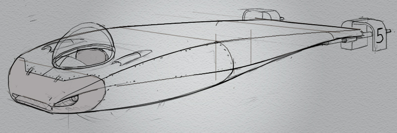
This sub is a good example of poor design, it started as an exercise of randomly applying XYZ techniques (like 2 curve combos, radii, projecting forms out, cutting into forms for the HowToDraw Book) so when it came time to detail it I was all kinds of lost. I think it'll always be better to start with a clear concept or design direction
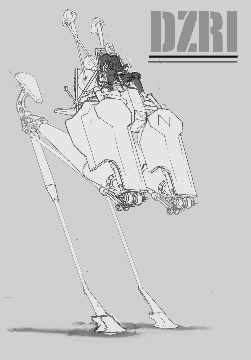
same again here, i thought I'd show the line drawing for the mech to show lack of good design detail. it could have been so much more interesting if the mechanisms and pneumatics were designed with any understanding of a real world equivalent.
the perspective construction on this was not the best too, if i were to do it again now the smaller details (ellipses mainly) would be drawn more accurately.
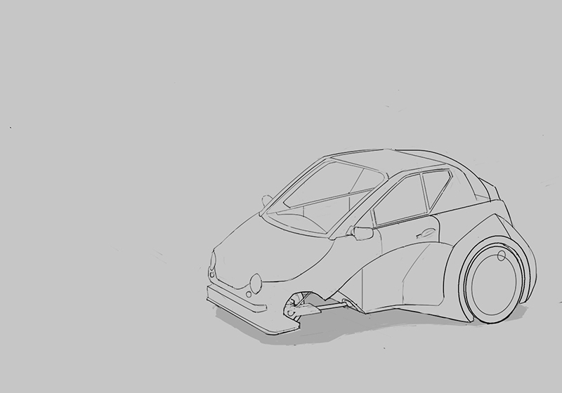
This is the first car I've ever drawn, it's trash, but I definitely think it's good first step. I don't have the same confidence drawing cars as I do with other things, it's a more specific set of drawing technique, more projecting on to curved surfaces and such. plus the design is whack, it was for a contest. a three wheeled car for 2016
meh, I'm happy enough with it and it sets me up nicely to for the next one
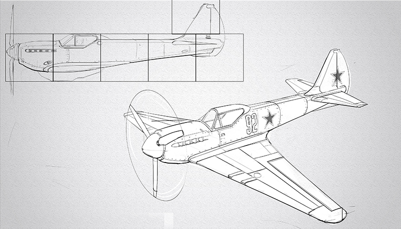
This plane is more recent, I tried to correct the problems I had with the last few draws. so before I started I researched a bunch of WW2 fighters, drew breakdowns for parts, looked a little into manufacture and the science (no way near enough mind) and designed options in orthographic views.
could used some lovin' but i don't think i can do any better than this ATM
Last one. I tried my best to mimic the Foundation term 1 work they do at FZD. not much design work went into this as it's a very heavily based on The Cincinnatian. The construction is different for the plane drawing, here i started with some boxes (trying to get the basic proportions) and just chopped away at and added to (the plane was drawn by projecting orthographic views and constructing cross sections).
I didn't quite achieve the same look, the line work is a little to phat in places which makes it look a little more cartoony, an it's missing some details. pretty close though, at a glance it might look like it came from the school... a very quick glance.
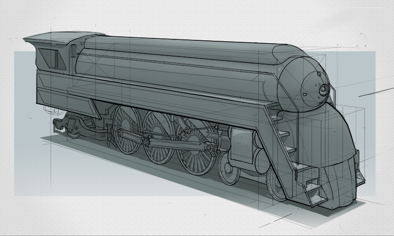
I posted it on deviantart, I got one reply and it was a request for it to be entered into the group "horseshitartofDA" felt like a punch to the old guts.
CYA
Yo Chris, if you've eva got a few mins I wanna pick your brain, find out what construction your throwing down for your perspective sketches, you made them look so effortless. mine look soooo laboured.
Hey people, it's been a while. moved house again, started new job, squeezed in very little drawing.
I kinda abandoned my study scheduled/topics and just tried to fit in anything. worked out I ended up doing more finished drawings which gave me a chance to see where the study has gotten me this year.
so, self assessment (tax doesn't have to be taxing)
I have a good handle on perspective construction techniques so at the very least I can draw something that looks solid and three dimensional. I need to throw some artistry and stylz at it to make them sexy.
my sketching needs a lot of work too, I'm can draw well enough with the crutches of construction, but i'm failing when it comes to do anything more free. it's a skill I really need, it'll make a huge difference when I come to sketch rough concepts.
Design is my biggest hurdle, as far as I can tell my proportion and placement are good but I'm always left stumbling when it comes to designing the details and mechanics. I know so little about how things work that even using reference isn't much help because I don't have a solid grasp on the ideas behind it.
for the most part I prefer drawing more realistic stuff, so we might have different things come to mind when I say design because I'm not really pushing for any far out concepts (not yet anyway), i'm looking for believability, some kind of mechanical accuracy and to nail the design aesthetic of an era. oh, and to hit the basic principles of design, like yo shape, and proportion such and such...
stuff like this https://www.youtube.com/watch?v=Ydu_2bUgG78
Rendering and painting are not even on my radar at the moment, same for drawing more organic shitz. i need to figure how to work them back in
so yeah, i need to make a new study system based on this, hopefully in a few weeks i'll have a path I can trot merrily down.
now for the work (sorry for the long ramble, it's been a while)
This sub is a good example of poor design, it started as an exercise of randomly applying XYZ techniques (like 2 curve combos, radii, projecting forms out, cutting into forms for the HowToDraw Book) so when it came time to detail it I was all kinds of lost. I think it'll always be better to start with a clear concept or design direction

same again here, i thought I'd show the line drawing for the mech to show lack of good design detail. it could have been so much more interesting if the mechanisms and pneumatics were designed with any understanding of a real world equivalent.
the perspective construction on this was not the best too, if i were to do it again now the smaller details (ellipses mainly) would be drawn more accurately.

This is the first car I've ever drawn, it's trash, but I definitely think it's good first step. I don't have the same confidence drawing cars as I do with other things, it's a more specific set of drawing technique, more projecting on to curved surfaces and such. plus the design is whack, it was for a contest. a three wheeled car for 2016
meh, I'm happy enough with it and it sets me up nicely to for the next one

This plane is more recent, I tried to correct the problems I had with the last few draws. so before I started I researched a bunch of WW2 fighters, drew breakdowns for parts, looked a little into manufacture and the science (no way near enough mind) and designed options in orthographic views.
could used some lovin' but i don't think i can do any better than this ATM

Last one. I tried my best to mimic the Foundation term 1 work they do at FZD. not much design work went into this as it's a very heavily based on The Cincinnatian. The construction is different for the plane drawing, here i started with some boxes (trying to get the basic proportions) and just chopped away at and added to (the plane was drawn by projecting orthographic views and constructing cross sections).
I didn't quite achieve the same look, the line work is a little to phat in places which makes it look a little more cartoony, an it's missing some details. pretty close though, at a glance it might look like it came from the school... a very quick glance.

I posted it on deviantart, I got one reply and it was a request for it to be entered into the group "horseshitartofDA" felt like a punch to the old guts.
CYA


