Posts: 60
Threads: 3
Joined: Feb 2015
Reputation:
14
I'm working on a very particular set of skills
We gots
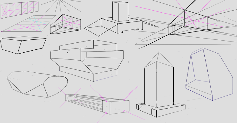
Perspective: working through Scott Roberson’s How To Draw.
Rendering: working through How to Render, also referencing James Gurney’s Colour and Light.
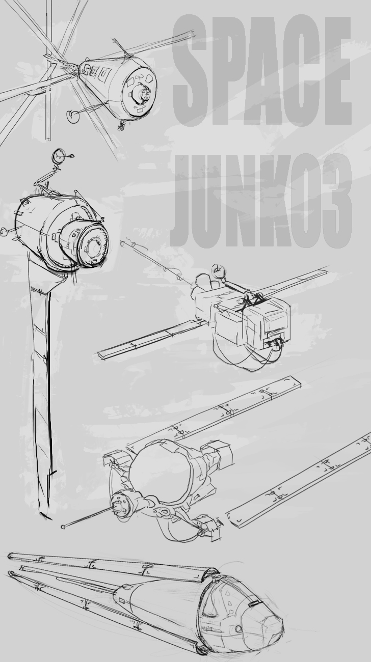
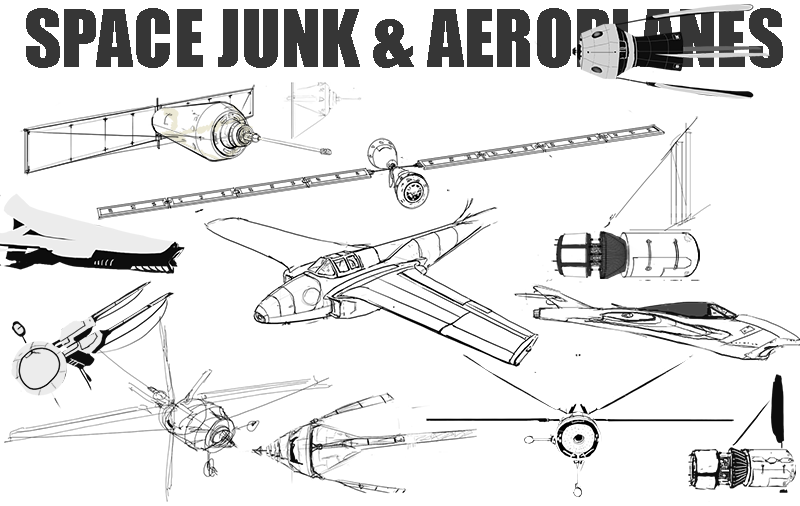
Design sketching/ tighter line work: mostly planes and space junk at the moment.
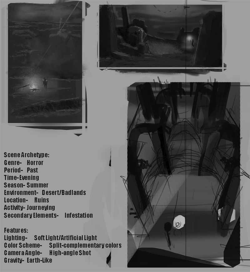
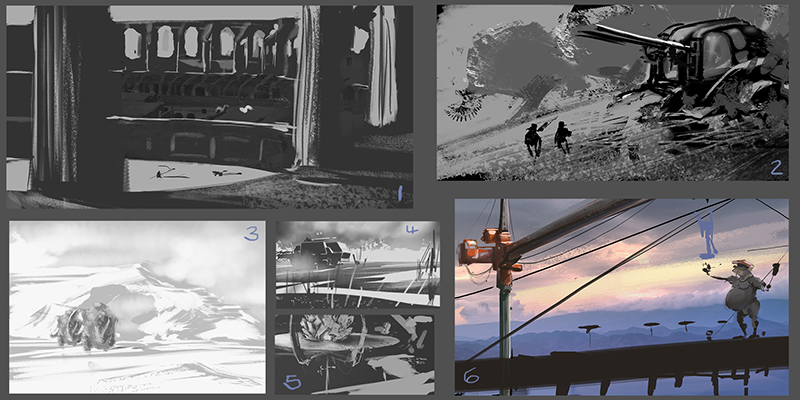
Composition: using spit paint topics to practice composition, tryin to apply stuff from Marcos Mateu-Mestre’s Framed Ink and Bruce Block’s The Visual Story.
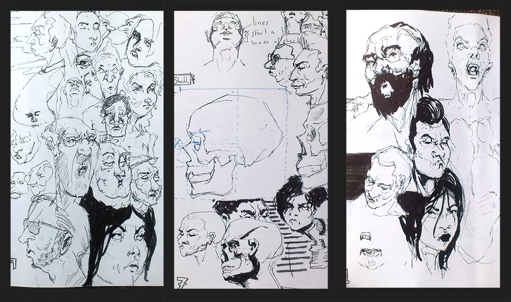
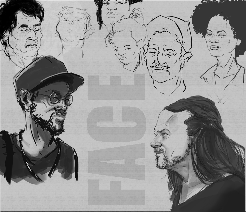
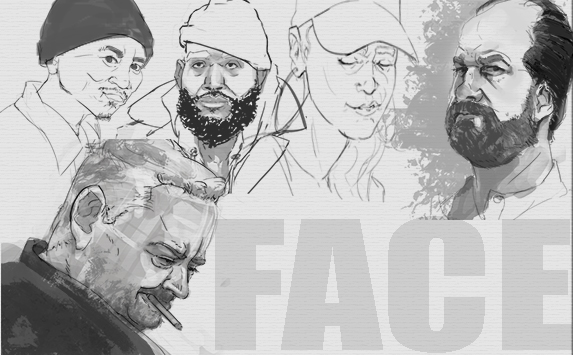
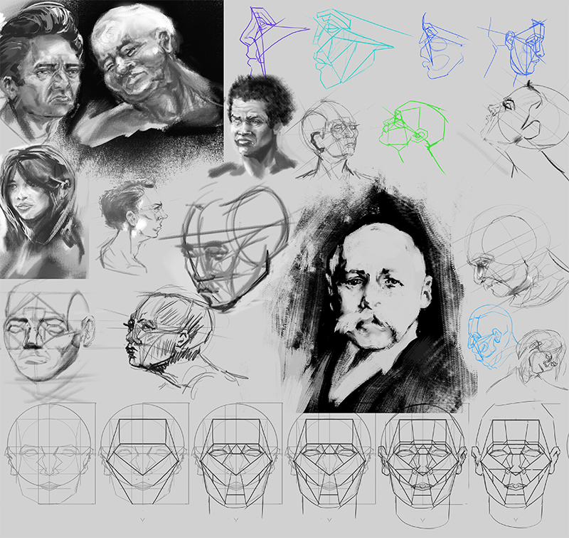
Making Faces: mostly making it up as I go along, just for fun.
I've been working on these since the New Year, a minimum of 30 mins on each area, every day to keep the plates spinning. On top of that I’ll have a specific focus each week that’ll spend the rest of my time on eg. studying a new chapter from a How to Book or just getting extra mileage in a certain area.
Gonna aim to post once a week, probs Sunday while a watch a level up session. I want to make the effort to try and post any references/ anything I've found useful as I go along so we’ll see how that goes. C&C very welcome, I will, one day, get around to posting on people’s sketchbooks, just a little out of my comfort zone, I'm looking at them all the time though.
Disclaimer: I've never watched Taken but I'm pretty sure these are the skills he was talkin’ bouts.
Posts: 60
Threads: 3
Joined: Feb 2015
Reputation:
14
I’m posting a day early this week as tomorrow is all about the mothers, at least in the UK anyway
Perspective:
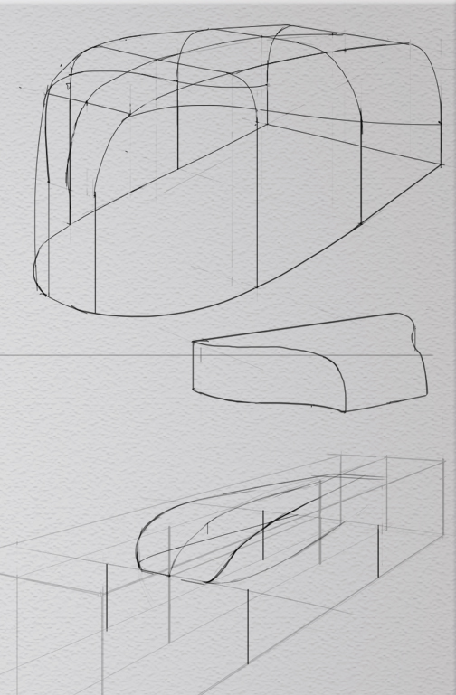
The main focus this week has been CHAPETER 04: CREATING GRIDS of Scotty Rob’s HTD book also threw in some exercises for the 2point combo and curve projection thingy – I didn’t really do that many while making my way through CHAPTER 03 so trying to make up for it a lil’ bit
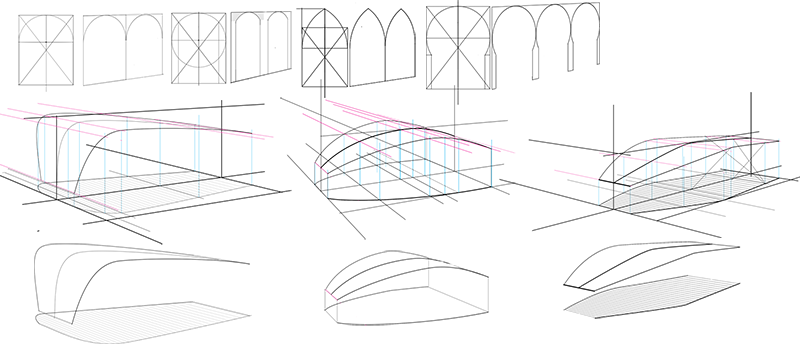
I could uplode more of the early perspective studies but this sketchbook is on the bland side of boring already
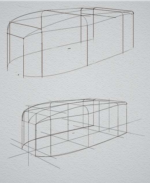
So about the grids, I’m gonna go out on a limb any say I don’t think using ellipses to make a grid of squares is not the best method when working digitally –traditionally I get it, paper is only so big and ellipse guides exist. With photoshop’s ability to transform shapes, work off the canvas and lack of ellipse guides I think it’s quicker and more accurate (there is an element of guess work creating the ellipse depending how long you wanna take) to just construct a full perspective frame work that can be manipulated as you go.
This be what I'm doing:
I’ll show how I use this and find the measure points in my next my next post (took way long to make and now I have to rush to work). I got how to find the measure point from these videos
https://www.youtube.com/watch?v=OB3UEpxFlj8
https://www.youtube.com/watch?v=uYNBEFJeo-A
How to render: still working on cast shadows

Design: More planes

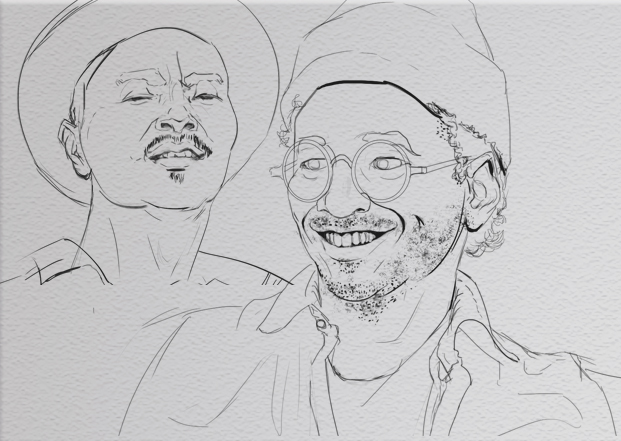
Faces (still not a big focus, just half and hour a day)

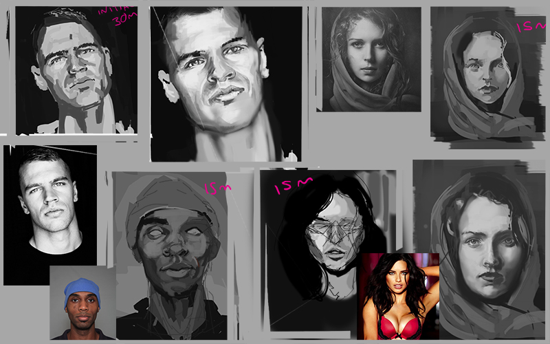
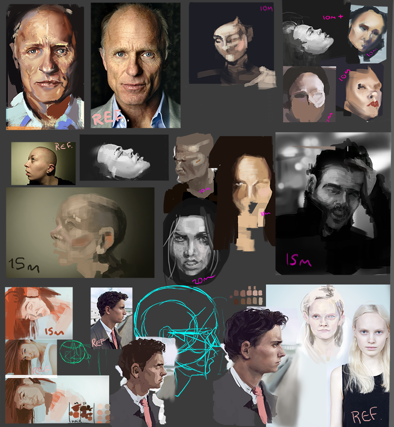
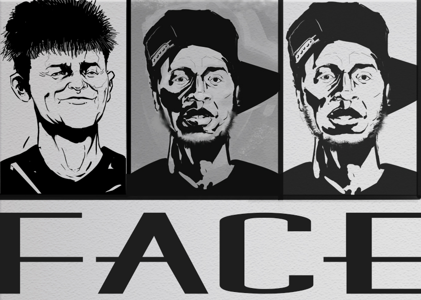
Some face painting I’ve done since the new year (I’ve since gone to just using black and white)

Right off to work!
Posts: 17
Threads: 2
Joined: Dec 2014
Reputation:
0
Hello
Now I do not know your background, but will definitely recommend you to use tradional tools such as pen or pencil. And I know also that Scott recommends.
It looks fine it you've made, both your faces and Perspective. But you need to get away for computers and do it by hand.
That's what I have been afvide of other artist and designer. then there must indeed be some truth in it.
And now I know that Scott is trained as an industrial designer, and therefore it would be a really good idea that you also study design and design awareness, as it is a very big part of being able to work Inside that world. fine to draw nicely and really, but there must be a good reason for the madness (design).
Posts: 291
Threads: 13
Joined: Dec 2013
Reputation:
5
interesting sketchbook, i like how you organized everything for a specific topic. i also do something kind of the same and i use a pomodoro like app, where i set a specific time like 1 hour, after and hour it will ring , take a break for 15 mins and on to the next one. nice to see other people do it. ill keep a lookout.
Posts: 60
Threads: 3
Joined: Feb 2015
Reputation:
14
Hey Martin, thanks for the input
It’s not long since I stopped traditionalling. No real reason why, just kind of fell of doing it. I wonder what the benefits of trad are, I suppose digital might be seen as a crutch, but I think that is how you chose to use it (such as practice with no undo) and I think that’s probably outweighed by the ability digital gives you to easily check, analyse and edit what you’ve drawn which makes learning a whole lot faster, and experimenting much easier.
Traditional diffidently makes for sexier drawings, I think I heard somebody mention that it leads to different design choices (more varied) because there is a larger verity of forms/shapes you can comfortably make because of the better hand eye co-ordination.
Ahh, I don’t know man, if anyone has any opinion on it please throw them directly at my face. I’ll definitely add some traditional into the mix though.
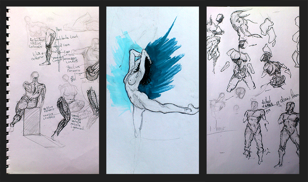
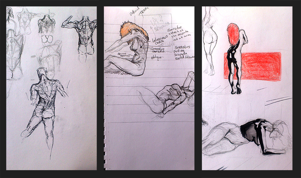
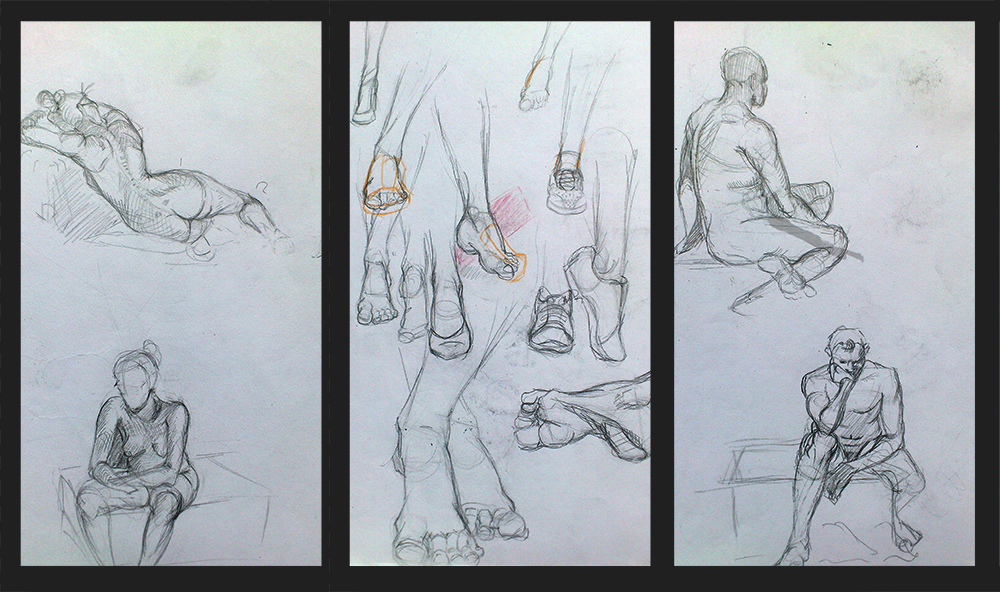
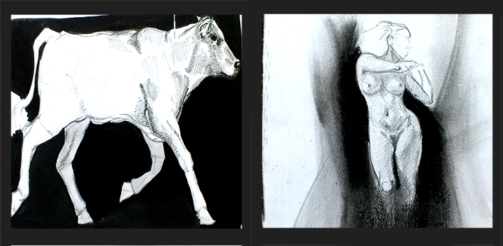
for now, here is a bunch from the past, back when I when to figure drawing (I gotta start that again too at some point).


I have absolutely no idea how to study design, I’m doing bits and drips at the moment like the planes and space junk but there is no structure to it really. Towards the end of the year my study is gonna be skewed way more towards design I just hope I have a better idea of what to do by then…
any recommendations?
Hey Firefox,
Everytime I read Pomodoro app, my brain translates it into porno app, I think I have a problem :/ I can’t get apps on any of my devices, I’m living in the past, I got a program called workrave on my computer though, every 30 mins it locks out my pc and orders me to stretch, it may be, the single most annoying thing in my life, I have to have it though because my arms are old and are a couple of wimps.
Thanks man.
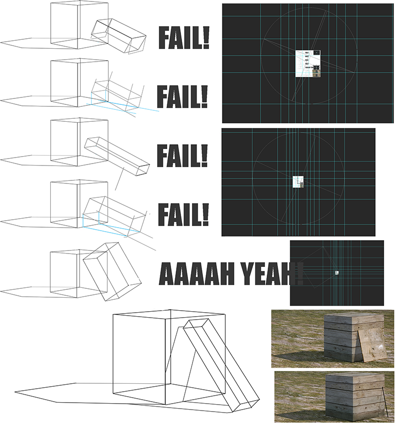
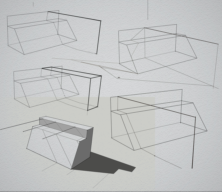
Big focus this week was how to tilt a cube accurately in perspective. I don’t know if it’s just my poor googling but I think the world forgot to put the how to on the internet (well maybe somewhere on Handprint but I’ve learnt to leave that can of worms alone). After a day of experimenting and much failing (I’ll leave out the various things I tried) I pretty much gave up. What I had come up with looked convincing enough and because the info wasn’t readily available on the internet I just assumed the real solution was too complicated to be worthwhile (how to convince yourself to quit)… one last google proved me wrong though
I found this video and about 1:20 into it there is the snippit of info I was missing:
https://www.youtube.com/watch?v=5HFOO-Lrct0
Cue Fanfare
<iframe width="420" height="315" src="https://www.youtube.com/embed/3suGfhnT2Sg" frameborder="0" allowfullscreen></iframe>
Quick step by step:
Set up your perspective
Choose a rotation the object finding it’s VP’s and measuring point (I posted someones vid of this last week)
Think of the measuring points as a station point and a vertical line coming from its corresponding vanishing point as a “horizon”, I’ll call it, the auxiliary vertical horizon…catchy
The to find the pair VPs for the tilt edge, have one corner of a square at the measuring point and make sure the square is large enough to intersect the auxiliary vertical horizon
Rotate the square at the Measuing point to determine how much tilt you want
The tilts VPs are where the square intersects the AVH.
Cry with joy.
Soooo.
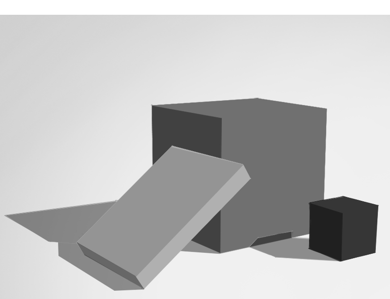
Perspective: some of the tilts attempts (at the bottom is my attempt at putting textures of a box a drew and playing with shadows, values and colour temp)

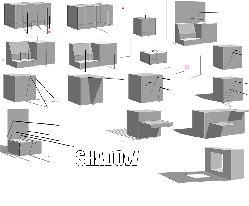
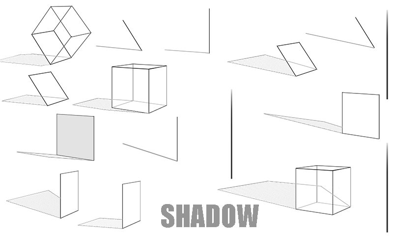
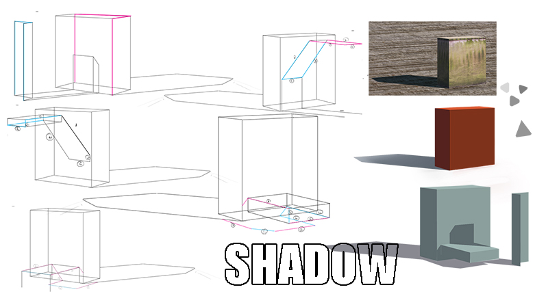
Shadow: shadow of a tilted object

Design: a new design thing I’m trying. Choose a real life plane and draw an ortho of it, design variations, translate into different views (this week was just more orthos but I only thought to do this late)

Faces: one painting from ref, which sux, I don’t know what I’m doing yet. And drawings from imagination, it makes more sense for me to do these while learning about faces is on the back burner. Lets me practice and consolidate some of the things I have learnt.

I failed to do composition once again
Posts: 17
Threads: 2
Joined: Dec 2014
Reputation:
0
Really like your drawings
It's a little hard to explain how to study design, as it depends on what you would like to work with.
You could say that design is an concept. Depending on who is defining it and the context in which it is used, design can mean many different things.
It's finding the optimum in particular set of circumstances.
Here is an Infographic that explains it very well. you have to ask yourself a lot of critical questions, not whether it is good or bad for it does not exist. Only if the work or not work.
And you should also ask yourself when you practice, what works in the image and can not do and why?
But it is also looking at other people's design and wondering why they have taken the choices they have made.
Posts: 60
Threads: 3
Joined: Feb 2015
Reputation:
14
Martin J Intarat: Loves me a good infographic, thanks man. FZD just put out a video about design ideas too, I love it when things come together like that.
I’m soo dumb when it comes to reviewing other people’s design I usually just leave it at “maaaan, that Shiz is DOPE” or “yep, S’allright” it’s something I really need to work on, and it’s the perfect thing to do when travelling or if it’s slow at work
you starting a sketchbook soon? I keep lookin’
sooooo, I missed my upload last week :/
In my defence I had spent most of my time swallowing pills and being paranoid (never google medical ills). S’all good now though so business and usual.
Perspective:
For the past two weeks I’ve been stuck in a perspective hole, I’ve flung so much time at trying to understand everything I’ve just been ignoring for the last couple years (the first week because I was ill and couldn’t do much else and this week because I became obsessed and couldn’t stop myself).
I have pretty much nothing to show, it’s mostly been theory and some sexy maths but I feel I have a much better understanding of it now. The last things I wanna look at before I closed this tangent and get back to studying from H2D is controlling distance/ scale accurately and if there is a technique in linear perspective that represents different lenses.
A tutorial that really helped me out:
https://www.youtube.com/watch?v=n-Rkpx1Ysgo
This guy is my hero, just sat by a road on a sunny day drawing boxes. The tutorials he’s made are exactly what I was looking for, they’re in that perfect middle ground between the basic arbitrarily draw dots on a line perspective and the mathematics heavy handprint style perspective.
check them out already!
Happy to lend a hand to any daggers who are working on their perspective, just shoot me a question I’ll do my best to help out
Shit that I’ve got down:
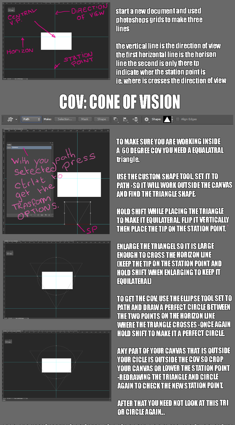
Accurately map specific rotations and tilts of objects in 2pt and 3 pt and find the corresponding measuring points annnd accurately mapping specific tilt of the direction of view (for 3pt perspective) and finding the corresponding COV.
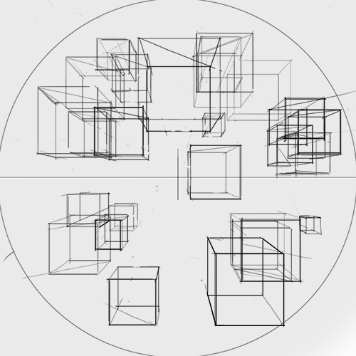
I really want to improve the accuracy of my perspective in loose sketches (of actual interesting shiz, not just boxes) so I’ve changed up my warm up from drawing straight lines to drawing freehand cubes in an attempt to improve my instinct of where Vp’s and Mp’s are
Starting as simple as possible this week with cubes in 1pt perspective. The only grid construction I’m using is an arbitrary sized 60circle of view and a horizon and centre of vision point (I condensed the attempts onto one layer rather than post them individually)

I check the accuracy afterwards
Rendering:
I putting so much focus on perspective atm I don’t want to progress further in the H2R book, it would be way more than I could handle. So I’m sticking to casting shadows for a few more weeks. It gives me a chance to practice the perspective I’ve learnt too

Process is to construct my grid and add an object to it every day along with the cast shadow as it’s not my main focus so I only spend 30mins a day on it to keep the plate spinning
Design:
Again just 30mins a day on design at the moment. Just to keep it ticking over while I’m all about the perspective study.
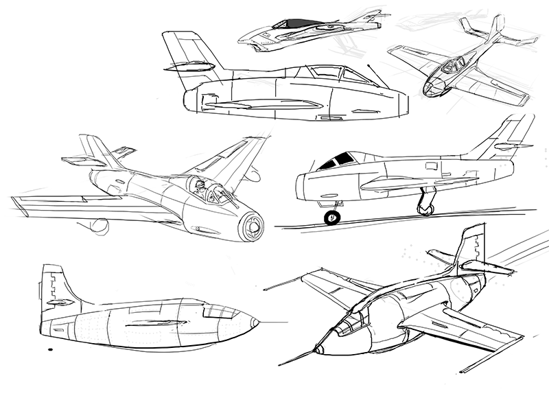
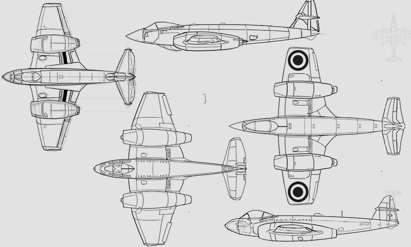
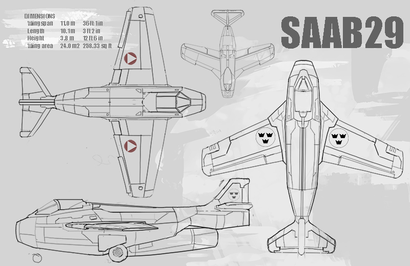
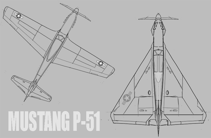
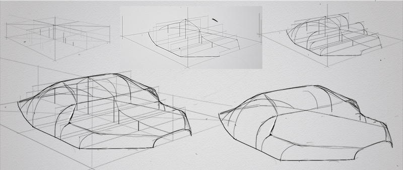
The base for these planes is the SAAB 29 Tunnan. My idea for this is to choose planes I like and draw variants of them keeping the overall size proportion roughly the same. That way I hope to bludgeon into my brain box proportion of things that are appealing to me and to get a little practice designing through thinking about consistence of shapes and panelling proportions and, you know, other such baloney.

One is a straight wing version in an attempt to make the design look older, I also made the panelling more uniform and basic to try and push the age of the design
The other one is just basing it around a square with one corner cut off (also the side view, I tried my best to make them relate to each other)
Composition
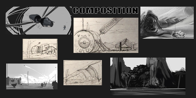
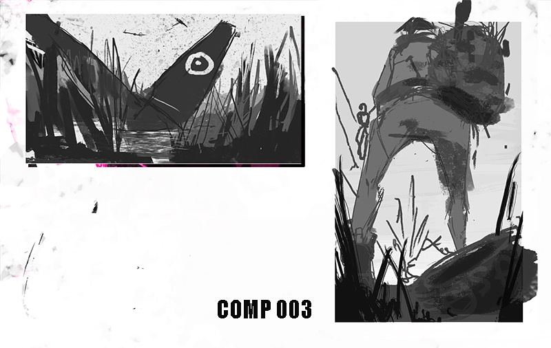
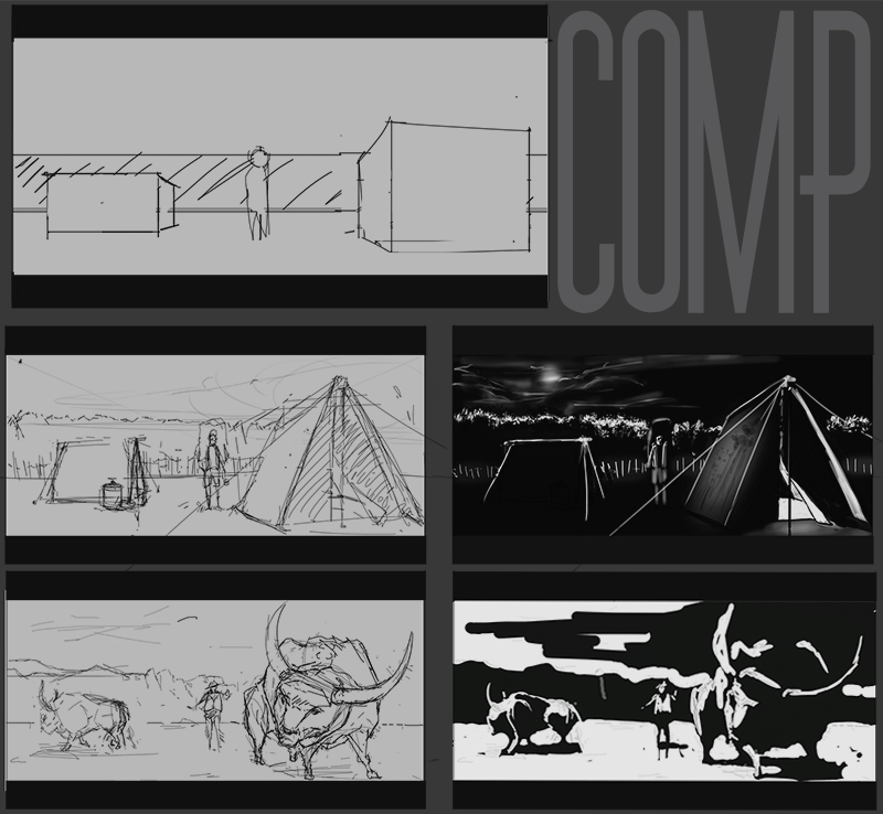
Yay I did Comp Stuff! They are such a time hole so I didn’t set any limit, I just do them at the end of the day to relax a bit. No real attempt to learn anything yet

Faces:
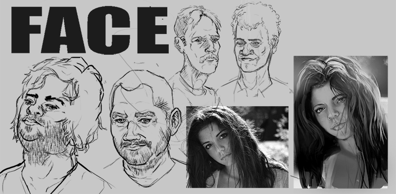
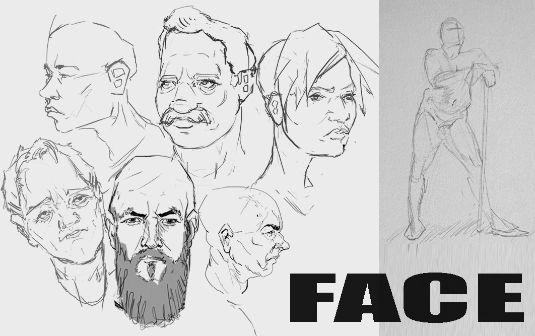
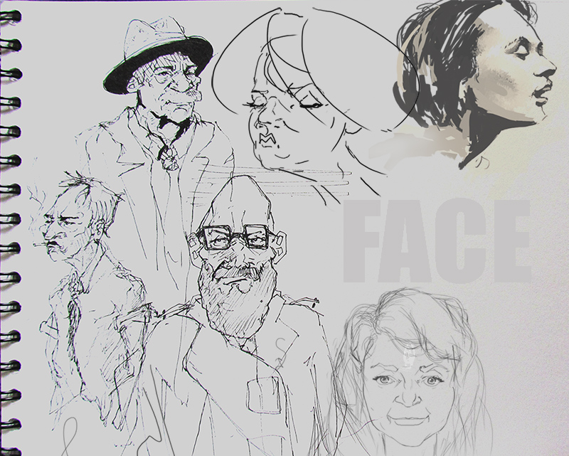
Really didn’t want to post these, they are just meh, I’m gonna do another bout of face construction studies soon (so, like planes of the face and the Loomis method) for now, just a quick doodle a day.

Also getting back into figure drawing slowly, I decided that can be my traditional practice.
Posts: 36
Threads: 2
Joined: Apr 2015
Reputation:
0
Hey, those are some interesting studies. I really like your airplanes and the last faces and figures, the pose itself is very convincing and gives out that natural feeling. I hope to see more, I would suggest keep on working on these perspective studies because one can never stop studying perspective. :)
Posts: 17
Threads: 2
Joined: Dec 2014
Reputation:
0
Hello Joe
Really like your studies drawings.
Yes it can be difficult at first not to be impressed and dazzled by a cool design or drawing. But over time, one can not look at a picture or an object without starting to analyze. so in other words you can not really see a pretty picture more, as you will only see errors or good ideas. :)
Yes I have to get started on a new sketchbook here. but just had a 3 years long On and Off period of drawing. Because my life went a little haywire. But now things are starting to fall into place, I will begin again with drawing, this time I will start studying Bargue drawing. as it suits my way of learning.
And I like the idea that it was this way the great artists also learned to draw and paint. And in the future I can help to carry this to a new generation to artist 
Plus it's good to be able to draw this way if you want to work Inside game and film industry as an illustrator.
Do you know these books? Sketching the basics
Sketching Drawing Techniques for Product Designers
Posts: 60
Threads: 3
Joined: Feb 2015
Reputation:
14
Lack lustre studies weeeeek (sang powerfully with much pizzazz)
Pah, who needs focus :/ I’m gonna blast through this post because I need to spend the rest of the eve scheming, figure out how to get the most out of the next weeks, need a bit of a shake up to re-engage my brain box.
A new plate a picked of the ground and started spinning again is figure drawing:
Ref: https://www.youtube.com/watch?v=OQtvK2lj0qM

I used the same ref everyday but changed my goal based on the proko’s vids, so first gesture then bean, landmarks, robo-bean then back to gesture for the end of the week.
Gonna do the same for a few weeks. Change the ref when the new Croquis café comes out.
Rendering:
Laaaazy shadow construction is lazy.

Design:
I should probably stop calling this section design, the delta winged mustang might be the favourite thing a drew this week because it’s so stupid.

Comp:
Used the daggers random generator, was something like low angle war watery something something. Only doing two comps is weeeeak though.

Face:
Some traditional some digi
The traditional ones are for the new daggers CHoW some kinda Neo Noir Detective

That’s my lot for the week.
Tsirides: the pose was a total fluke man : ) it has made me slightly obsessed trying to recreate it. So glad you suggested continuing the perspective, I thought the general census would be to cool my perspective jets. Much happier to trudge forwards with it now! ThankS
Martin: there is a chap on these boards who has done some really good Bargue studies (of facial features) it was the first time I’d seen them, they are now quite high on my list of new study topics. I’ll post the link to their sketchbook if I find it (I have a hard time remember who is who and doing what, so it’ll be a matter of luck when I next come across them). Be cool to see your studies, I can bug you for tips when I start on them too : )
Similar situation, I’ve had a few month now of life being relatively stable and it is the best, I hope you get the same.
Didn’t know about them books, they are now on my wish list. Thanks you. I’m having a hard time getting back to getting sketchy, I told myself a while age that the reason things I drew looked poor was because of sloppiness and they in no excuse for being sloppy. But a suppose that is the exact opposite point of view I need for doing exploratory design sketches.
Posts: 176
Threads: 1
Joined: Jan 2015
Reputation:
10
Dayum, dem studies off the fookin chain! I like um, lots of hard work. keep this up for some time and you'll improve. I can see your portraits already improving some!
My only advice at this stage - is something that some people wont agree with, but i feel it works for me. Don't spread yourself too thinly. When we start out at the foot of the mountain with illustration- i see it as 100 things we do wrong, and we have to focus on each 'wrong' thing until we get illustrations pleasing as a whole. Divide and conquer dem muthafuckas, so to speak.
What i mean is spend more time on say - just portraits, get a manual, absorb it all - become a specialist in that area, then move on.
And you are from the UK? Where abouts? I'm up in Aberdeen :D
Posts: 17
Threads: 2
Joined: Dec 2014
Reputation:
0
Hello Joe
It would be really cool to see some other people Bargue studies. and think it's cool if you also begin when the Bargue drawing, and maybe we could find some more people in here and make a kind of group (Bargue gang). 
Happy for you that you are starting to become more stable in your drawing
For it is not real enjoyable that one has downturn and keep too long a break from drawing. It can take courage from one. but I also begins quietly to pull myself together, but think it has something to do with that I have discovered Bargue the way to study at. 
And it's a really good advice Kimonas gives!! 
And as always very good studies, but Kimonas advice. so beware of having too many balls in the air.
Posts: 36
Threads: 2
Joined: Apr 2015
Reputation:
0
Yeah I'll have to agree on that with Kimonas as well, it seems to prove right to divide your process and learn individual stuff each time. But really give into it. Your faces look rather cool but I would suggest if you trying to give a more caricature feel to them learn the right anatomy and then start oversizing stuff. I too see improvement and it's very good that you are so productive! Very good work once more, keep it up man!
Posts: 40
Threads: 2
Joined: Apr 2014
Reputation:
4
Really digging your sketchbook and the perspective studies - it shows through your figure stuff, too. Lots of good books you're studying from, too. I do like this whole block-studying, I remember Wojtek Fus suggested it in some of the first sessions of Levelup, and it probably suits some people and their schedules. Any practice is good practice, but I agree with Kimonas in what he said though. It might push you a bit more into doing more stuff. But whatever suits you best in the end.
As far as design is concerned, I think the best way to go about it is to study from life - and re-invent it somehow. Have you tried out doing some silhouettes? It might force you to look for shapes and come up with some cool stuff. Try looking at some of John Park's Gumroads - he's got some really cool vids on form language that I think might help you in that aspect. :)
Keep up the good stuff!
Posts: 60
Threads: 3
Joined: Feb 2015
Reputation:
14
Late to update!
I got told that I had to move my butt to a different house last Tuesday while I was midway through writing this post (the people I lived with decided they were moving out, which meant I had to go too) so big old delay. The last week has been very minimal on the arts front too, more of the packing boxes/ moving to my mums/ trying to decide If I’d need a new job to afford to live on my own kind of week.
I don’t know how much time for drawing I’ll have over the next few week. Gonna keep up if I can.
First things first though, I gotta get this up, so long the rest of my day (I write so slowly)
Big thanks for all the comments people :)
Kimonas:
haha, thanks man. Yeah, I live down near Manchester
I hope I aint spreading myself too thin, most of what I do is more practice just to keep tabs on what ‘m doing, maybe sneak in a bit of improvement through mileage while nobody is looking. Hopefully it’s pretty low impact, like spending a bit of my day doodling faces and planes (trying to do a bit of what I want to do professionally, get comfortable with it, hash out work flows and what not) while the main focus is working through the how to Scott Robertson books.
I did plan on dedicating a few weeks here and there to take a break for the Robertson Two and lay some study on another area but maybs it’s probably better just scrap that and stick to the perspective/rendering books?
Martin:
Big ole coincidence: the person I mentioned have the Bargue facial feature studies is Kimonas ( above your last comment) AND Minksy has some really good Bargue studies too.
Study group sounds good, I read your post a while ago about art forums, I think specific groups could be a good idea for getting more people involved. What were you thinking? Personally I don’t have a lot of time to dedicate to it so maybe something like at the start of the week post a Bargue plate for everyone to study then the next week each person crit the accuracy of one other person attempt? Or just leave it open for peeps to post whatever?
Tsirides:
It’s a good scale to work out how lazy I was being, the more caricatured a face is the more lazy I was, distract away from accuracy issues with pointy cheeks and phat noses.
Minsky:
Hey! I was gonna bring up the wojtek example too, he had such a flexible study schedule, you probably need to be very analytical of your own work to know what to put you focus on, he must have really been on the ball to make that work.
I love john park. I bought a couple of his gumroads on environment design, the form language ones were next on my list. I remember in the Free Tutorial Friday SB tour (btw, have you watch the new Scott Roberson level up? I was looking forward to it so much, it was really informative, that man knows preparation) J Park mentioned he learnt a lot of basic mechanical joints and hinges (from doors and lamps, ect) and uses those basic forms to design mechs, the gumroads something similar?
I really miss his pew pew series.
I’ve tried silhouettes a little, a lot more in recent time. I’ve been trying out this workflow a bit https://www.youtube.com/watch?v=1rD-DwgqeQo it’s been fun but I’m still only drawing really boring stuff, hoping it’ll evolve over time. That form language G-road would be a perfect little boost forward.
Thanks everyone for the advice!
so, this is the stuff from two weeks ago :(
Perspective:
It has been my main focus but I have nothing to show, box after box afta box. that has become my warm up now so I'll be moving back the x,y,z form building soon
redering:
Still stuck in the shadows, I know now though that I need to get sorted with casting shadows from horizontal/ sloped surface onto sloped surfaces. I'll get that dont this week hopefully

Design:
played around with some more space junk... the rough perspective is looking better on them at least :)

Faces:
More focus on transitioning the perspective I've learn into practical face drawing know how, really happy with how it turned out. I only hope I remember what I did after a week of inactivity!

Composition:
Needs some serious work before a get anywhere with it. i'll keep it ticking away for now though

DONE
all being well I'll post again sunday, still have a bit of packing to and moving going on
Posts: 17
Threads: 2
Joined: Dec 2014
Reputation:
0
Quote:Martin:
Big ole coincidence: the person I mentioned have the Bargue facial feature studies is Kimonas ( above your last comment) AND Minksy has some really good Bargue studies too.
Study group sounds good, I read your post a while ago about art forums, I think specific groups could be a good idea for getting more people involved. What were you thinking? Personally I don’t have a lot of time to dedicate to it so maybe something like at the start of the week post a Bargue plate for everyone to study then the next week each person crit the accuracy of one other person attempt? Or just leave it open for peeps to post whatever?
Thank you very much JoeSB.
I do not have much time, time. But if one were to do somethingone can create a small forum self that would focus only on Bargue drawing. But otherwise I have also sneaky little around on wetcanvas.com and there are some really good threads about Bargue drawing. link 
Posts: 60
Threads: 3
Joined: Feb 2015
Reputation:
14
Getting back on track after the whole moving house/ finding new job shenanigans. Still working on the same categories but with new focuses
Perspective:
I've moved on from basic perspective learning to carve up x,y,z forms. I'm sticking to this for the next four months or so, chopping away.

Rendering:
Gonna finish of the rest of this month off with cast shadows (still not comfortable casting on to sloped surfaces). Bottom left is a sketch up model to check if what I was doing looked right

Face:
nothing going on here, I found a way to draw 'em that I like so just ticking along with it until I have more time to do actual studies (like anatomy/ planes of das face...)

Composition:
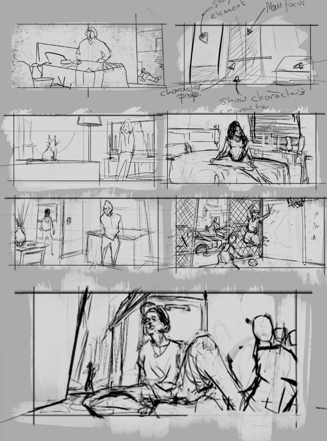
I'm so lost with composition. it quickly becomes an exercise into how well can a draw/paint a scene (not well btw) rather than how well I can compose a scene. I've thinking at the moment it might be better to focus more on studying film scene shots or illustration before I start attempting my own. I started to do that buttt changed my mind, and made up some stuff based around elements of shot.
I'll figure something out at some point

Posts: 60
Threads: 3
Joined: Feb 2015
Reputation:
14
very quick update
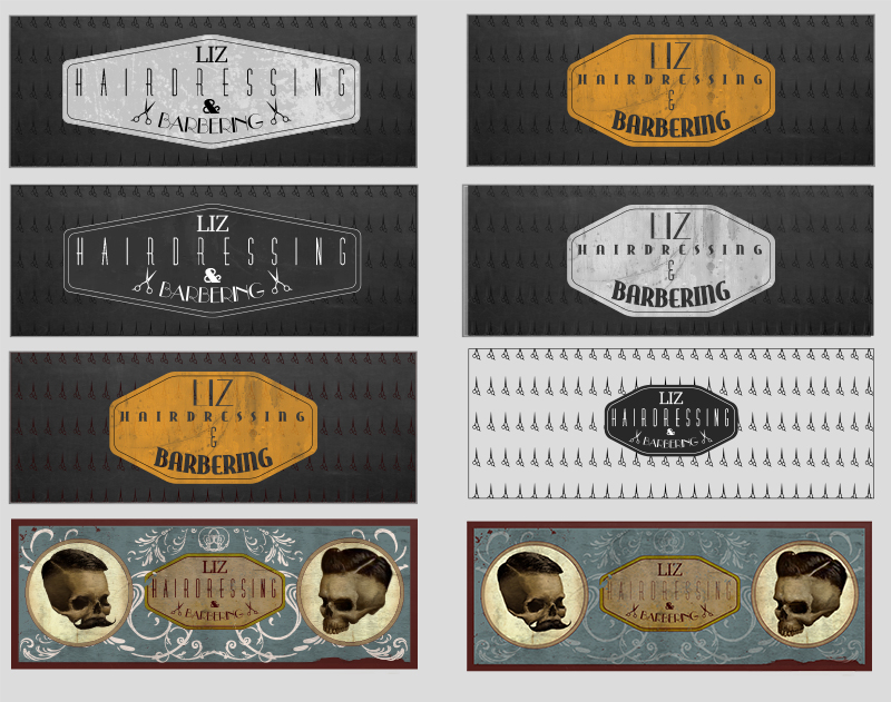
Bit of a different week, I've been designing! to a very low quality but designing non the less!. My sister asked me to make a logo /facebook banner thingy for her hairdressing. it was fun but I'm not at a point where I like what I've made yet. any suggestions?

Oop, I forgot to number them :/
she was looking for something old school barbershop meets Emo/Goth. the bottom two I went for old freak-show style posters.
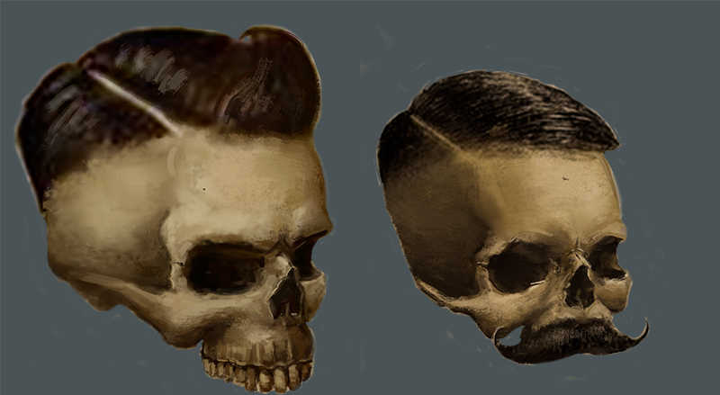
here are the skulls I painted for it. I've not painted anything for a while, so I was really happy with how these came out.

I got a little of my usual topics coved done. no way near as much as I would have liked to, I'm starting to get withdrawal.
Perspective:

more XYZ form stuff (all from H2Dr) I'm gonna keep faffing around with this for a few more weeks then try apply the technique to still life drawings
Face:

that is the lot :(
Posts: 60
Threads: 3
Joined: Feb 2015
Reputation:
14
hey people,
I'm bringing a whole heap of ugly to the table this week. Feeling good though, changed up how I'm studying composition so it's more analytical than just random, it doesn't look good yet but I'm making more choices and actually feel like I can learn and apply
Rendering went horribly wrong this week so I don't have anything to show and for design I'm gonna enter a IOW so i'll show that next week when I'm done.
HOW TO DRAW:

Ugly right? I need to start using some new techniques like cutting into the form... bulging out other bits. that's my goal for next week. one day they will be pretty, I'm just churning out a bunch of caterpillars atm.
Face:

Wanted to hit a more graphic look this week, the process is the same just finish it off differently. didn't come out how I wanted but it was something new.
Composition:

I bought Justin pichetrungsi's gumroad 'Lighting for Composition' helped a lot with deciding how to study comp.
what I'm gonna be doing is choosing a movie still. abstract the blocking of objects and camera and guess at what the intentions of the shot are. then draw up some of my own options trying to convey the same mood but with different objects or try and convey a different mood using a similar shot.
then I light it using the method in justin pitchrungsi's tutorial and try change the mood through different lighting,
I'm terrible at it so far but I'll get quicker and better. I've got a good feeling about learning comp this way.
LAST:
finished Facebook banner and Business card for my sister, I've edited her phone and email a bit just in case any of you are weirdos :)


We decided she would buy be some art boorks as payment, any peoples got suggestions?
Right I'm done, I've given up coffee and joined a gym this week. I feel I might die at any moment
cya
Posts: 60
Threads: 3
Joined: Feb 2015
Reputation:
14
Heyooo,
another week done, nothing much has changed since the previous so lets just get into it.
warm up:
Thought I'd share a bit of my daily warm up.

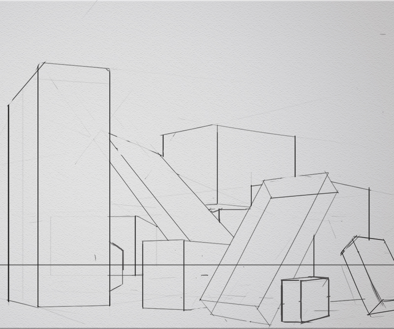
first thing I do everyday is an hour of basic perspective exercises. first 30mins is drawing boxes. I set up a horizon line and a 90° cone of vision (90° because it will also give me my station point). first line of the box is always arbitrary, it'll be the top or bottom side of the box heading of to an undefined VP. the next line is where the guessing begins, is determined by the relationship between the horizon and the angle of the first line. the next two lines are determined by the cone of vision. with the first VP and SP set there is only one possible option for the second VP, so I draw lines to where I hope it'll be (I dont make them on the horizon btw, I just draw lines to where I think they might be as I'm trying to improve my ability to see what looks right... also they are usually way off the canvas). I check the accuracy of my lines after using paths and start on a new one. HAH, that explanation was pointless and makes not sense, I'm keeping it though :) oh, and I draw all the line (cept the verts) free hand to warm up my sexy straight line drawing skillz)
I'll show what I do with the other 30 mins of warm up another time
XYZ Form Building:
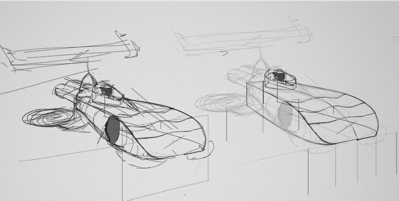
practising chopping and changing a basic form, starts off with a rough sketch of possible amendments then slowly, oh so slowly, start editing the form using techniques from How To Draw

little more attractive that last week, made me think of a hover version of a chevrolet grandsport. i'll finish it off throughout next week.
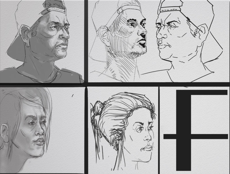
Faces:
Really ugly lines this week. the girl was from imagination.

The F is for Fail
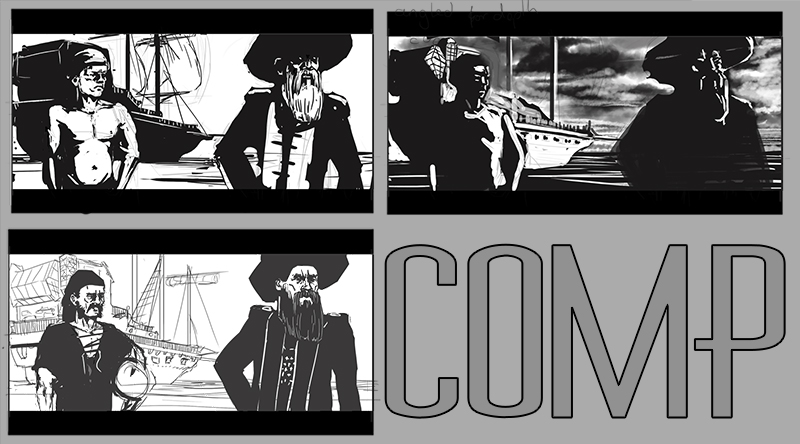
Composition:
Same deal as last week, I love studying comp this way, I want to get faster so that in a week I can do various scenes with different lighting options. only had time to play with the lights this time

Pirates yo
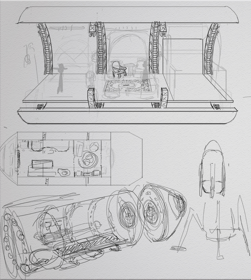
Design:
Design for http://www.conceptart.org/forums/showthr...ch-Vehicle
I'm not a massive fan of steampunk, seems a little random and pointless. A character might hang the jacket on some large industrial pipe if it was too hand but I hate they idea that they'd go out of their way to craft an ornate pipe sculpture coat rack... for example.
Giant steam powered spiders are totally baller however, wki wild, wiki wild, wiki wild wild west, jim west, desperado...

I'm thinking there is a platform in the cylinder that rotates around on tracks incredibly quickly, and the centrifugal force from this acts as a artificial gravity. since in space you'll have no up or down, the only frame of reference you have would be the force pushing you so the platform which would make it appear that the cylinder is rotating around you not the other way around. the tip of the bullet will be the re-entry capsule, with parachutes and what not.
I just need to fill it up with fancy Victorian travel splendour
|


![[+] [+]](images/collapse_collapsed.png) Spoiler
Spoiler