09-25-2015, 06:36 AM
yo Daggers, loooong time.
gonna do a bigger post soon showing what I decided to study but for now I'm just looking for a bit of advice on composition.
I'm working on this painting
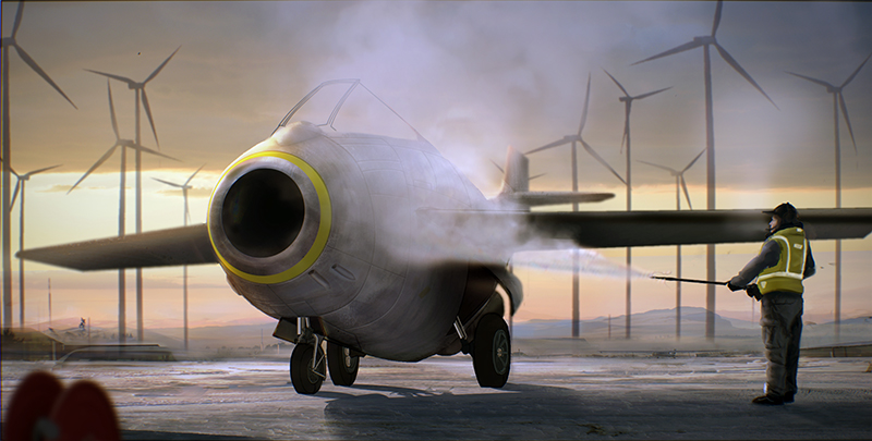
I was almost done with it but then I was hit with how boring it is. It was never meant to be action packed but I don't think there is enough going on for it to even be interesting
so the idea behind it is, it's early morning, it's cold, it's calm, a Plane is being de-iced before it's flown later that day.
initially I was gonna put more people and stuff in it (like the pilot waiting around, watching the work being done on the plane, drinking some coco, some more maintenance folks pottering around, tools and equipment) but I couldn't find a way to place them in the scene that I liked I hate adding things I think, like everything to be as sparse ans possible.
with the ground plane being so flat and boring and because I have soooo many horizontals and such a still comp I dont think I can get away with it being that empty. so now I need to add stuff in and I'm looking fo opinions on what to add and where to place 'em
so this is an early idea I had for the comp
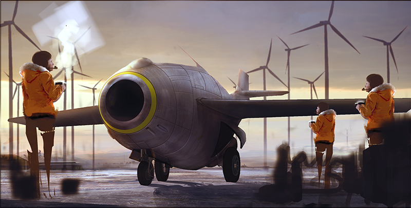
which I dont like too much
this is what I'm thinking now
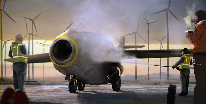
which I'm more happy with, but it's still not sexy. I think the dude on the left looking towards to pilot is something I'll keep, works to stop the your eyes falling off the left side of the picture, but other than that im not sure
any ideas?
gonna do a bigger post soon showing what I decided to study but for now I'm just looking for a bit of advice on composition.
I'm working on this painting

I was almost done with it but then I was hit with how boring it is. It was never meant to be action packed but I don't think there is enough going on for it to even be interesting
so the idea behind it is, it's early morning, it's cold, it's calm, a Plane is being de-iced before it's flown later that day.
initially I was gonna put more people and stuff in it (like the pilot waiting around, watching the work being done on the plane, drinking some coco, some more maintenance folks pottering around, tools and equipment) but I couldn't find a way to place them in the scene that I liked I hate adding things I think, like everything to be as sparse ans possible.
with the ground plane being so flat and boring and because I have soooo many horizontals and such a still comp I dont think I can get away with it being that empty. so now I need to add stuff in and I'm looking fo opinions on what to add and where to place 'em
so this is an early idea I had for the comp

which I dont like too much
this is what I'm thinking now

which I'm more happy with, but it's still not sexy. I think the dude on the left looking towards to pilot is something I'll keep, works to stop the your eyes falling off the left side of the picture, but other than that im not sure
any ideas?


