02-18-2016, 07:45 AM
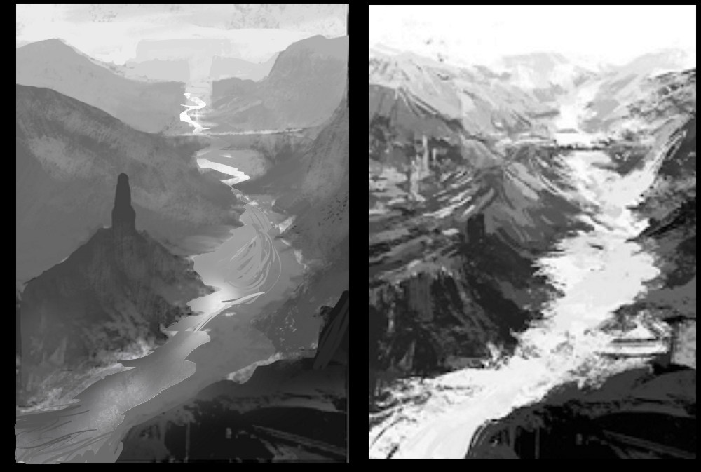
Hey AChi, glad to see you posting. The main issue I see is lack of clarity in values. You are trying to over-detail and texture and losing a sense of value/contrast at the various levels of depth. much of the time at this stage (and indeed throughout the entire painting process), less is more. You also tend to use too high and too low values together, and your value range within objects is a bit too contrasted. This is a common issue.
I took one of your thumbs and simplified it down to the essentials. The same can be done with all of them. I also created distinct focal points, using shape / silhouette contrast. Any details should mostly go at your various focal points and be implied or very played down everywhere else to provide some negative space to contrast against.
With thumbnails if the read doesn't work immediately it won't work without a lot of changes for the final.
In terms of workflow and going straight into colour or not. I am not against going into colour right away. I often work this way as it is more intuitive for me as well, but when learning I think it is important to understand how value works and how our perception of colour can change that value relationship.
Keep it up! :)


