07-07-2013, 03:57 AM
absolutely amazing details and rendering you're making is great. Treat my critique as loose ideas :D
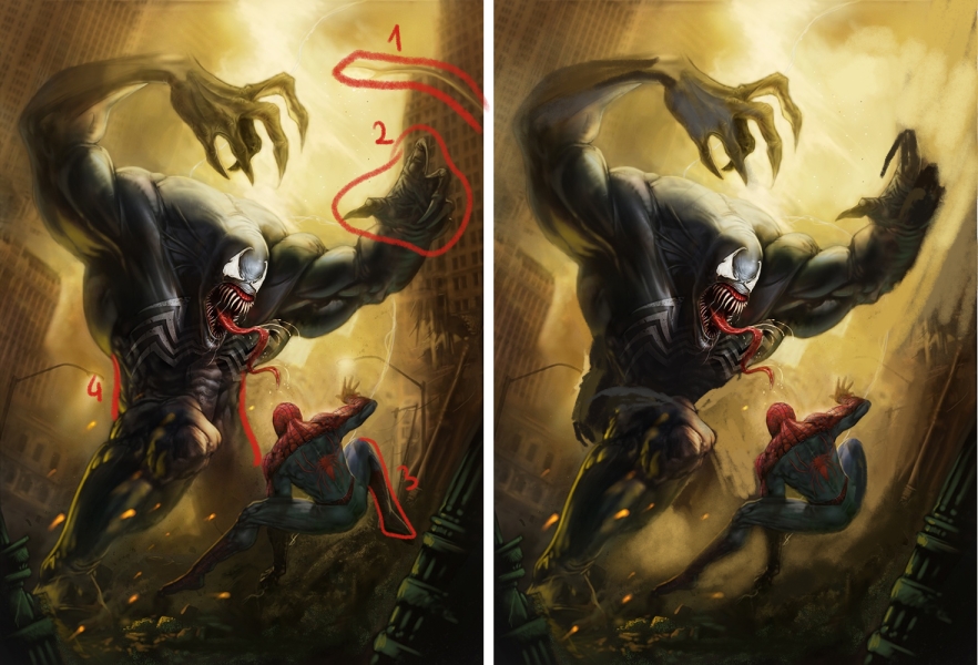
I suggest to remove lamp on right it messing up composition. For a better composition I would also change tilt of building on right so whole picture will be in diagonal lines(1). For the same reason I would moved spider-man leg to front(3). Rotate hand so silhouette is more readable(2). I also think hips area is now hard to read, when crouching whole body weight is based on leg in front so his hip should be probably rotated more to left (4)
Additional I think you should add more neutral color to his left hand cuz it look a somehow transparent.
cheers!


