07-13-2014, 11:01 AM
|
Coby's sketch book
|
|
07-13-2014, 11:01 AM

10-02-2014, 08:29 AM
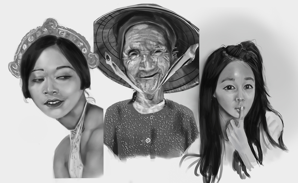
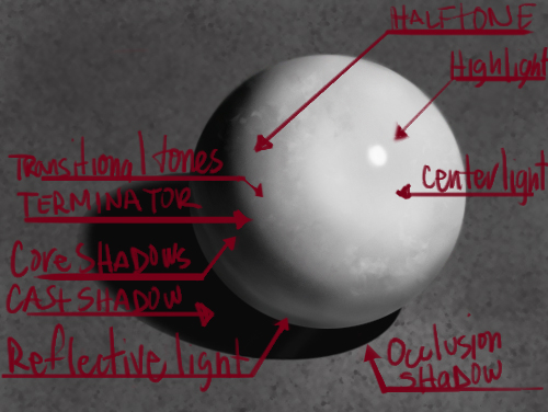
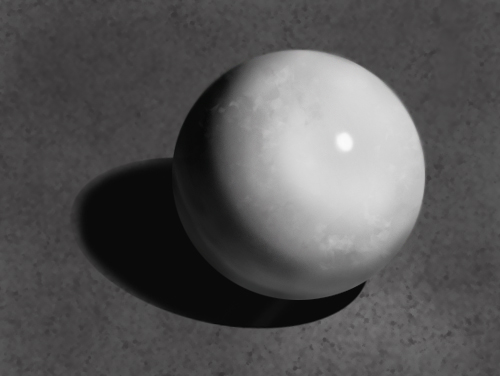
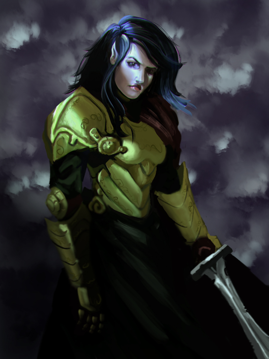 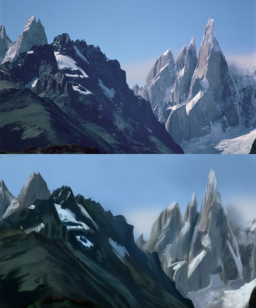 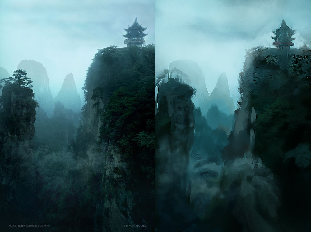 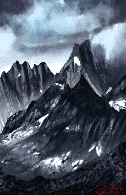 Followed James Zapata's Gumroad tut and other studies.
10-12-2014, 07:19 AM
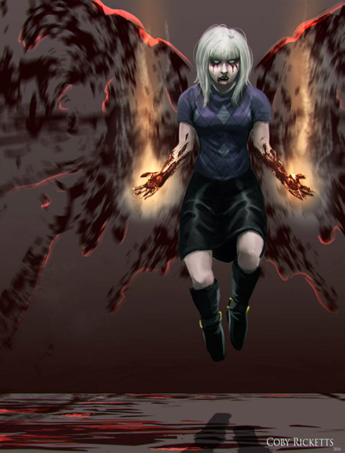 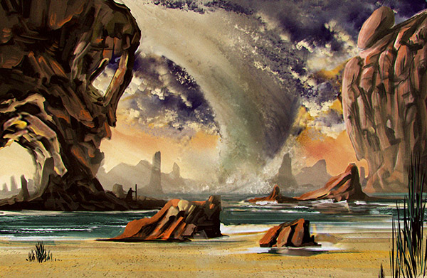  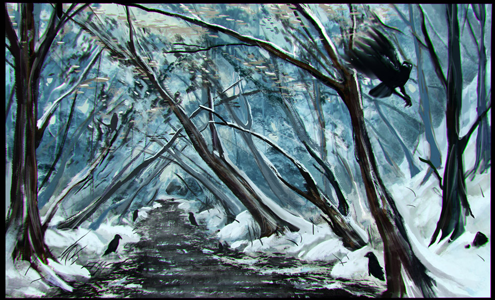
12-08-2014, 08:16 AM
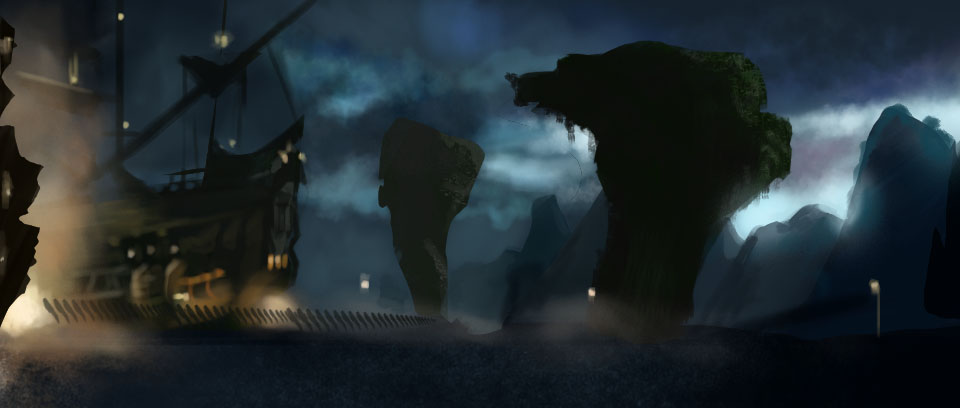
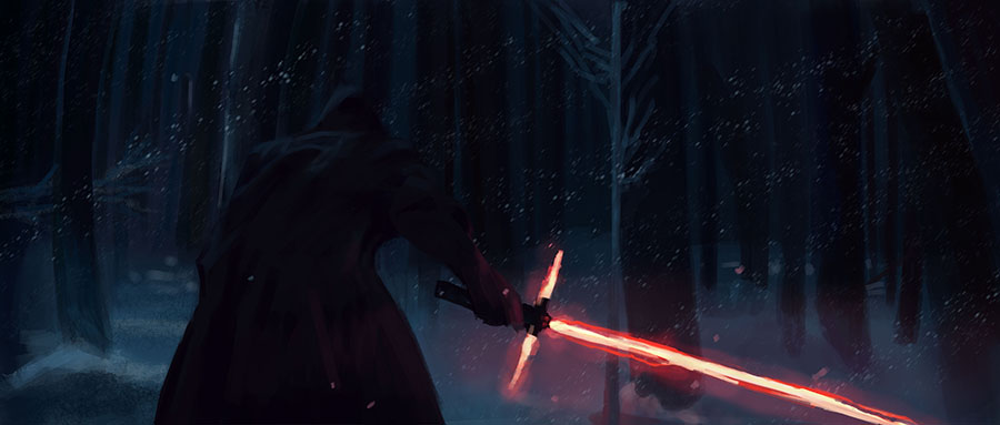
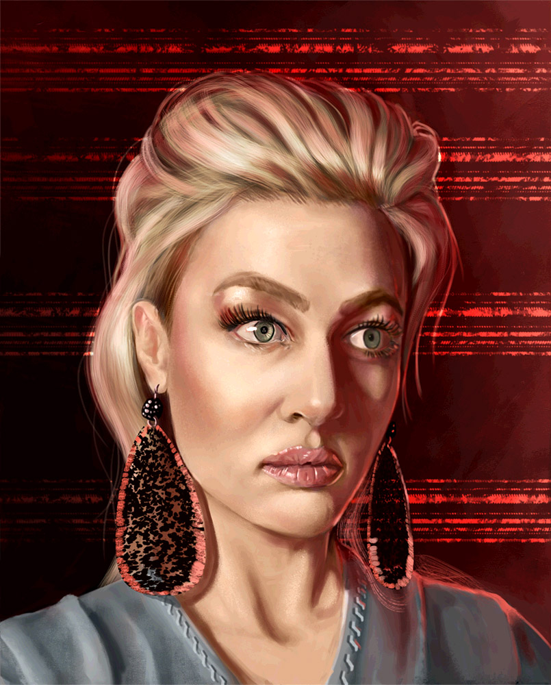
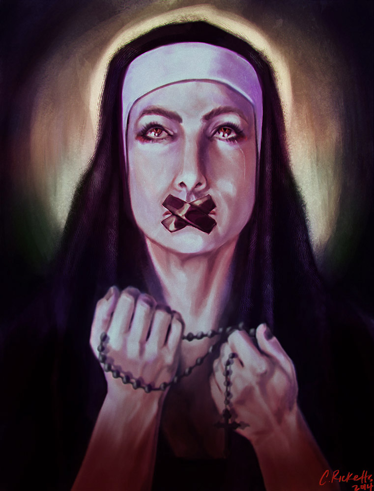
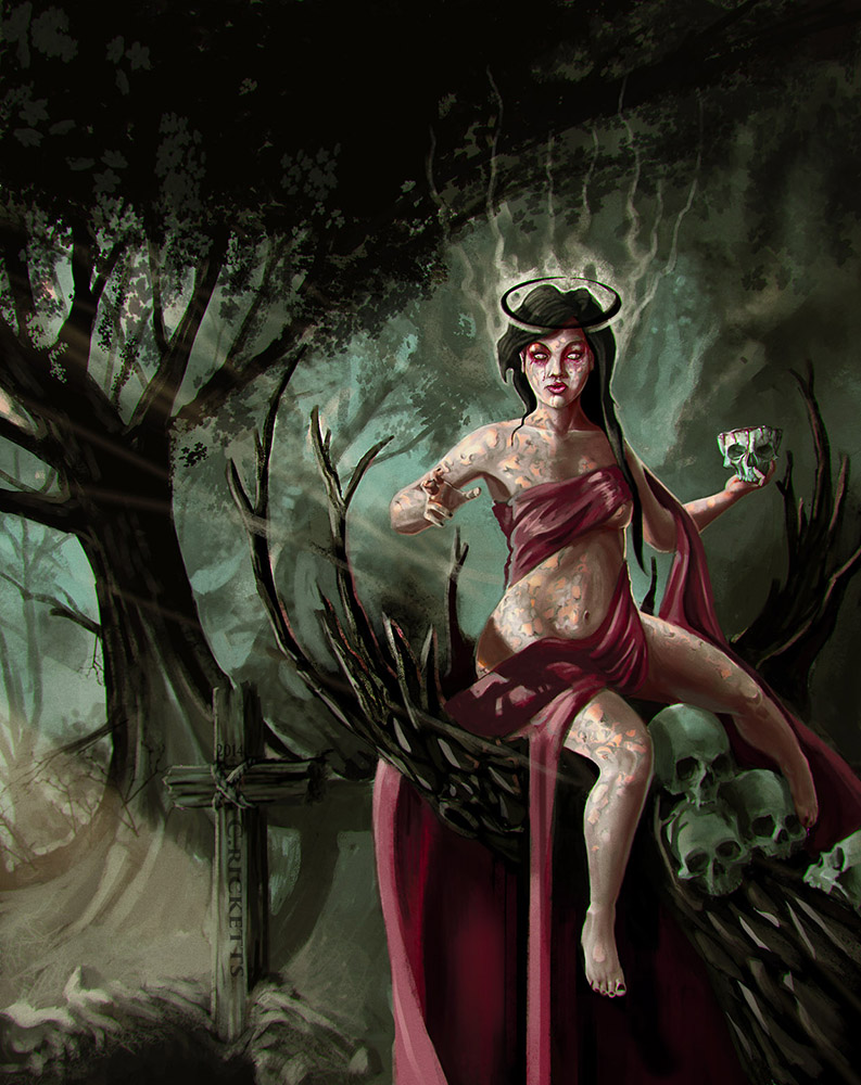
quick sketch and study dump
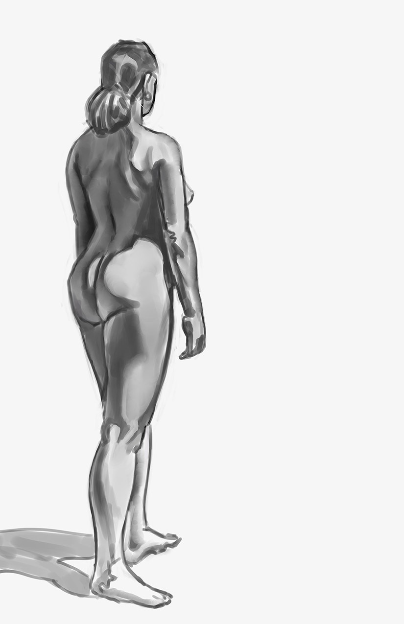 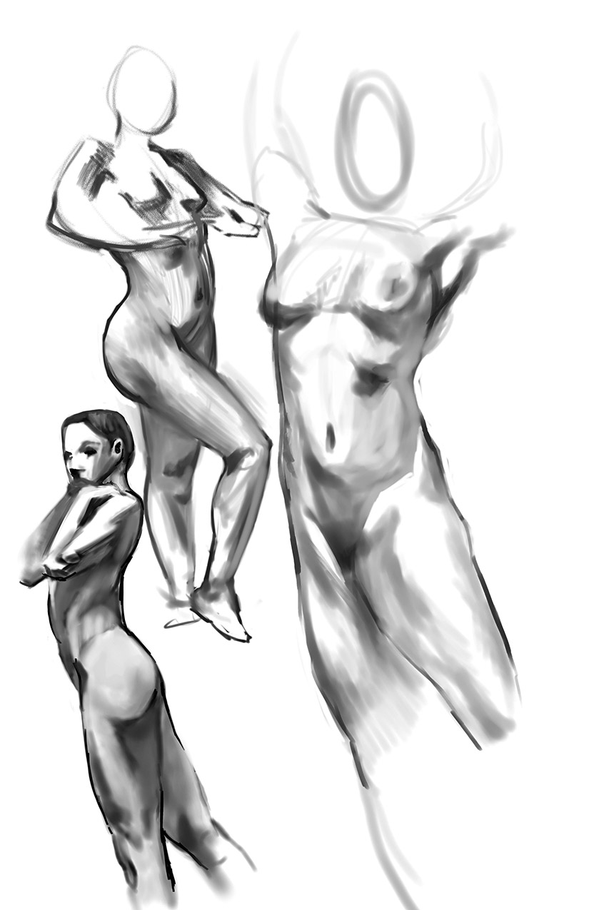 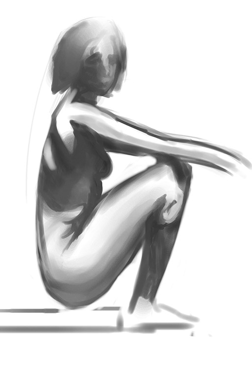      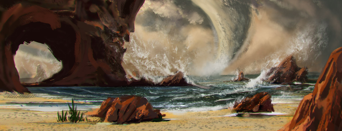 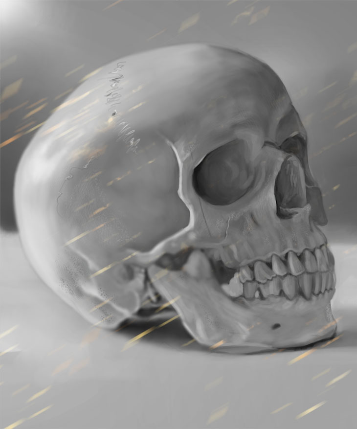 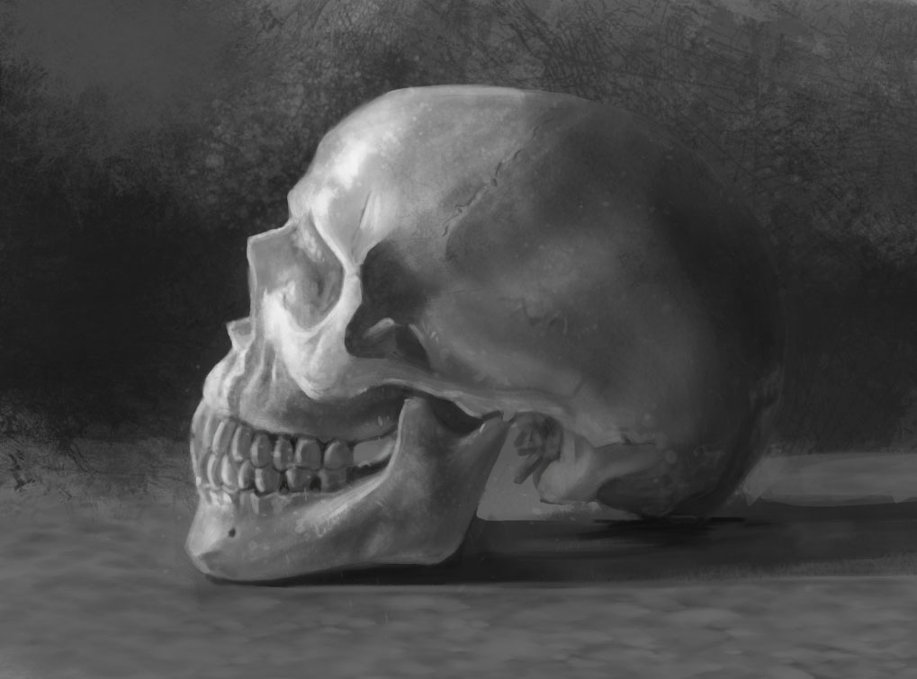    
02-18-2015, 10:10 AM
 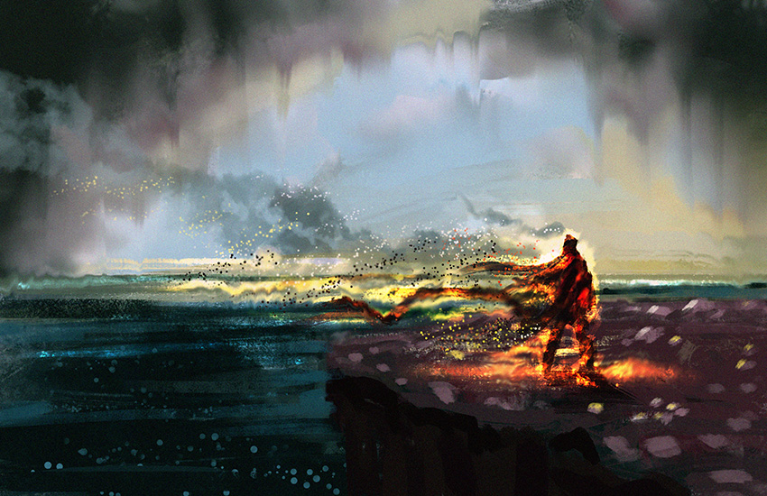 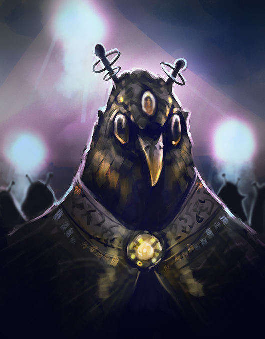 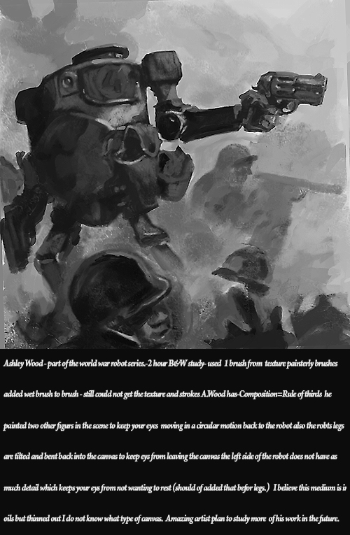 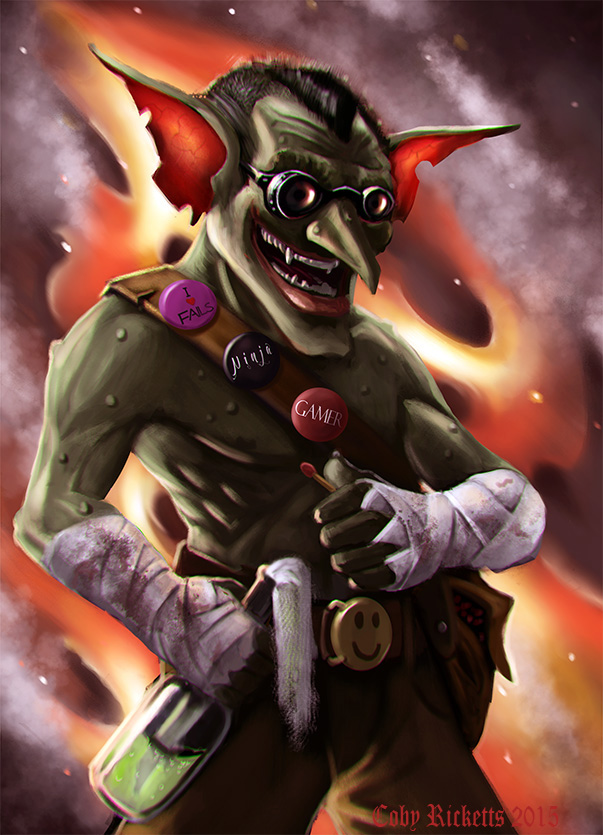   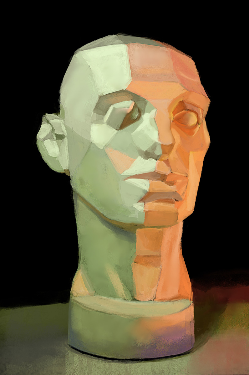 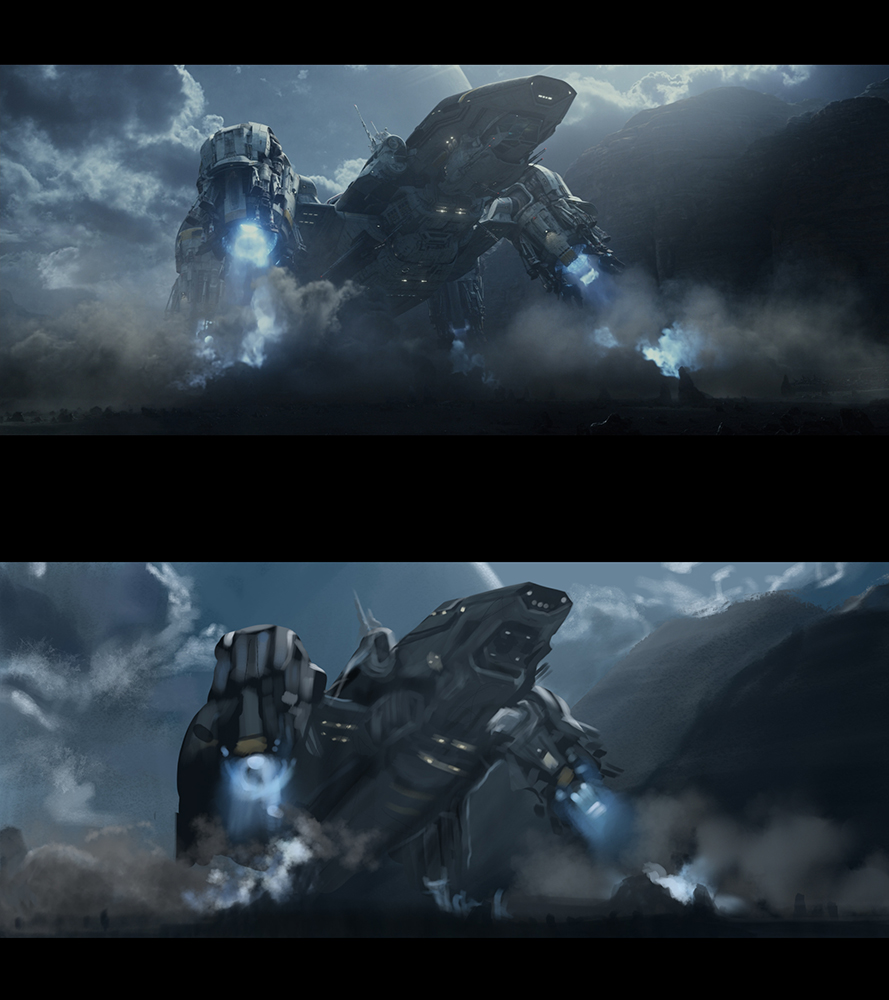
02-19-2015, 12:01 PM
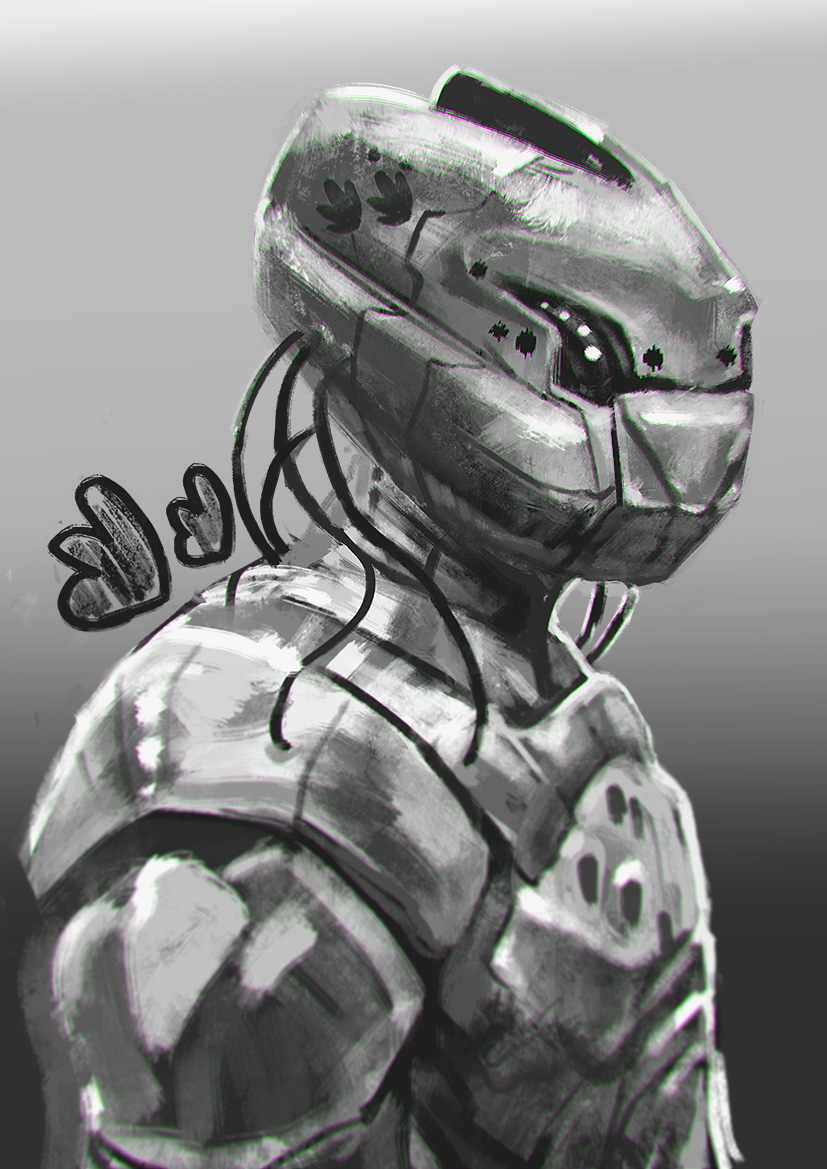
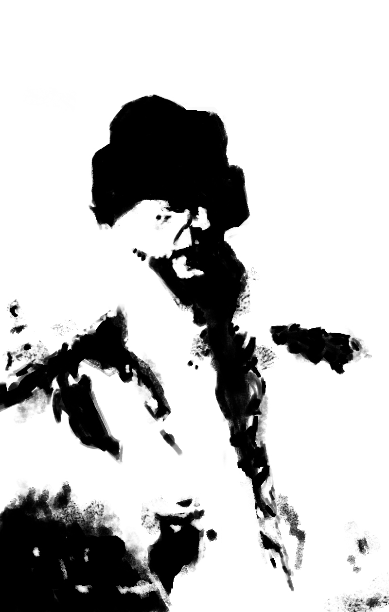
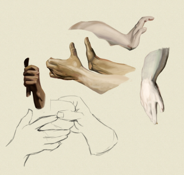
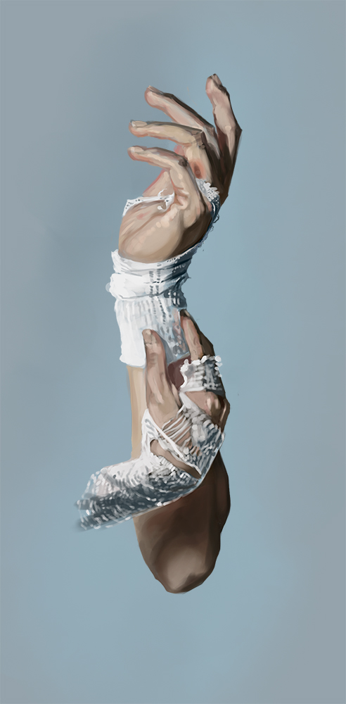 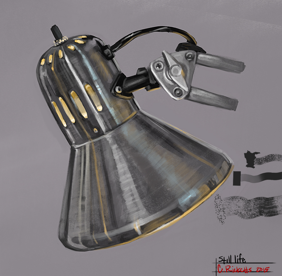 More study's/ Still life and some hands from a photo.
03-06-2015, 08:02 AM
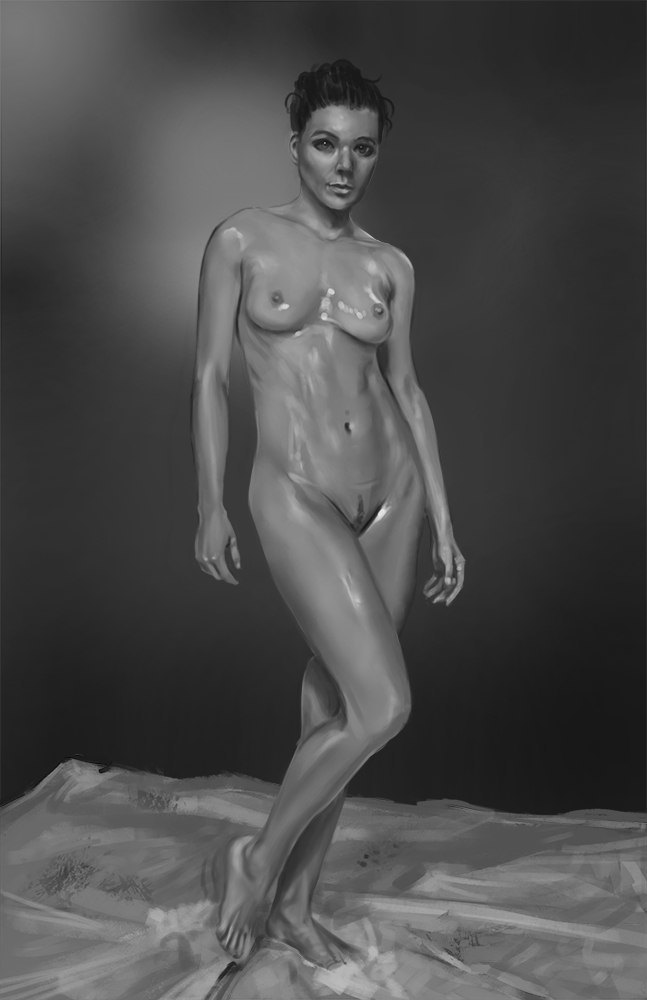
Study
03-06-2015, 04:25 PM
Nice volume of studies and work! Keep it uppp :)
Sketchbook ~ Blog ~ Deviantart ~ Livestream
03-14-2015, 12:44 AM
@pnate thank you.
05-24-2015, 05:52 AM
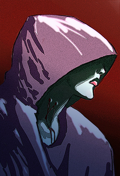
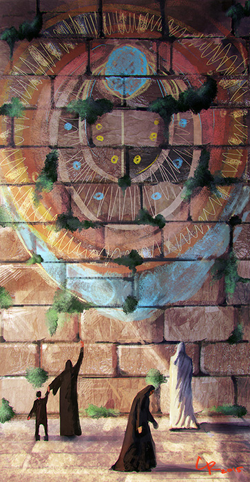
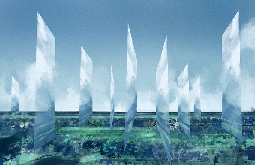
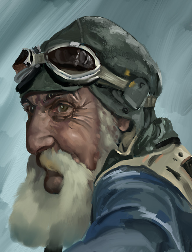
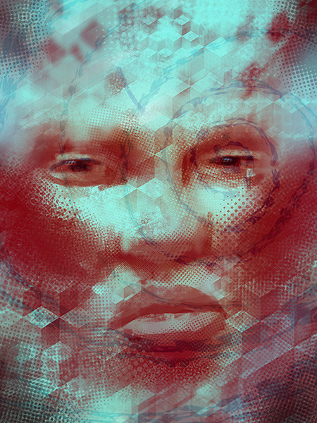
Some watercolors studies and some sketches.
05-25-2015, 05:57 PM
Hey thanks for posting on my thread, you got some serious work in here, I love your studies, great thread, keep it up!!
06-01-2015, 06:20 AM
Hey Chrisferz, Thanks.
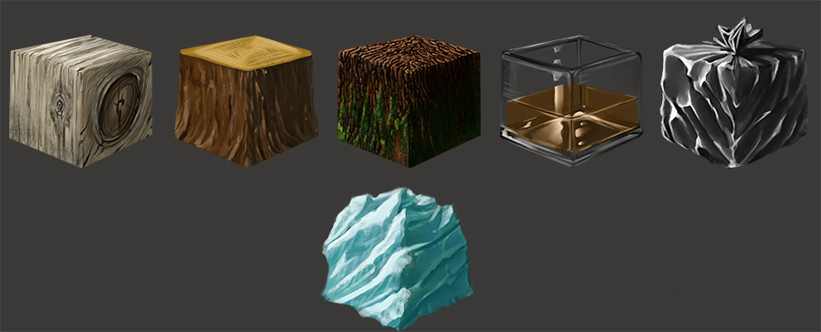
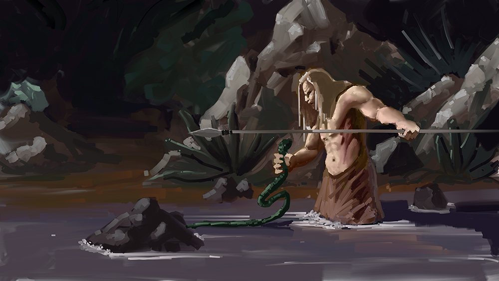
More sketches I did earlier in the week a couple wips and some studies.
06-08-2015, 12:47 AM
     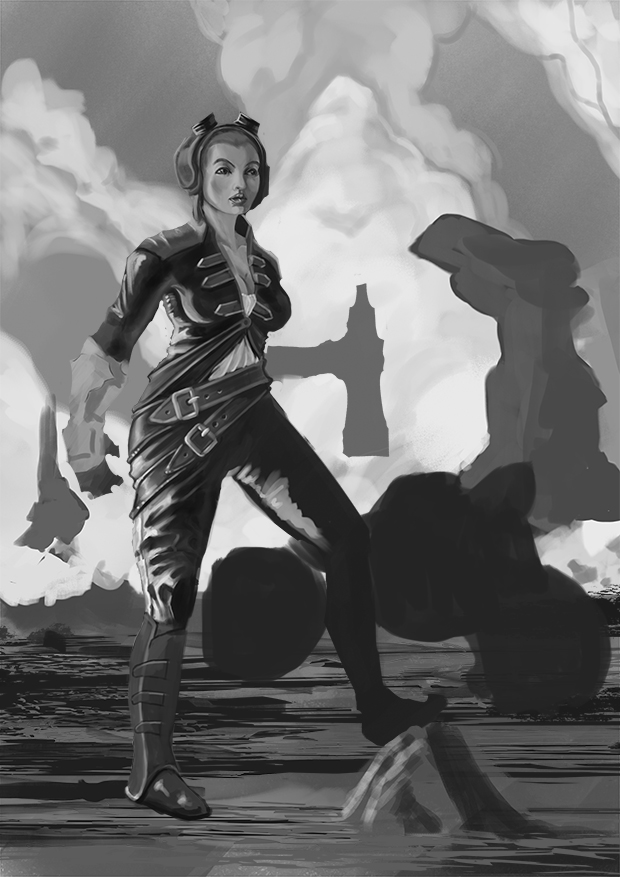 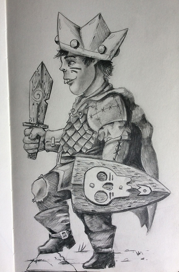
06-23-2015, 10:12 AM
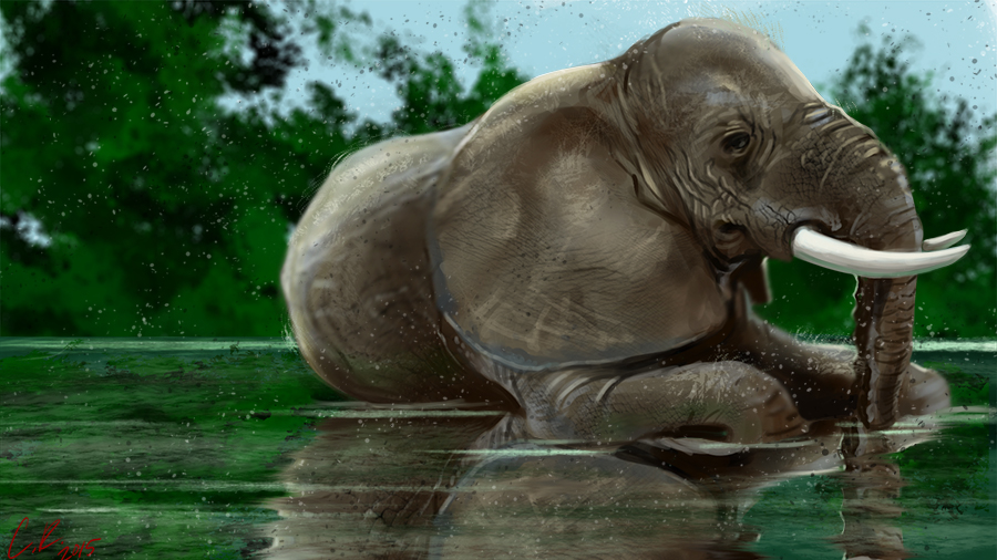 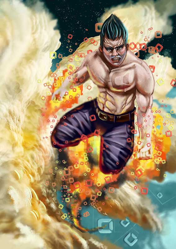
06-27-2015, 09:52 AM
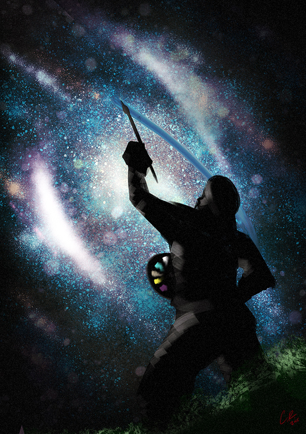 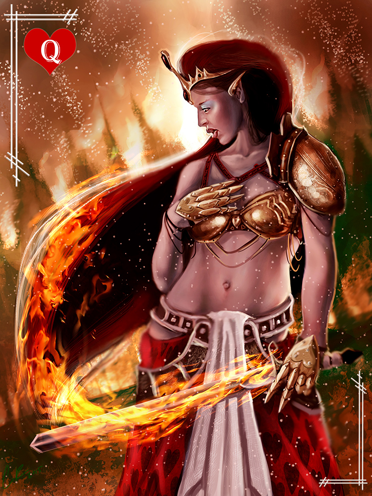 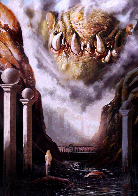 Whats up daggers? Just an update.
06-27-2015, 06:32 PM
o___________o
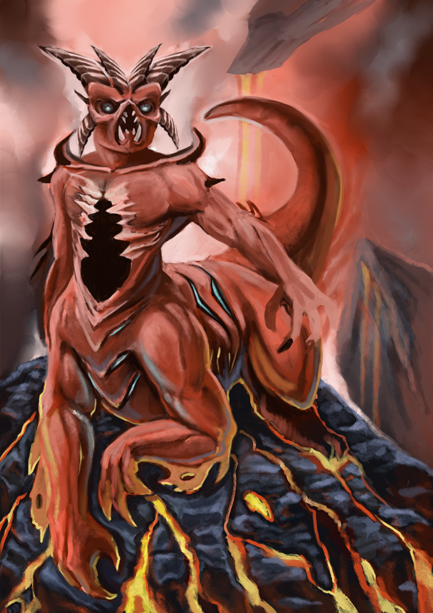
Lots of fascinating stuff in here, Coby! Must be all the experimentation that you do! Those watercolour fishies are divine, btw <3 I guess I would say to try and vary your edges to get a more solid form happening, as well as taking material properties into account and how light would react with them, like for example: 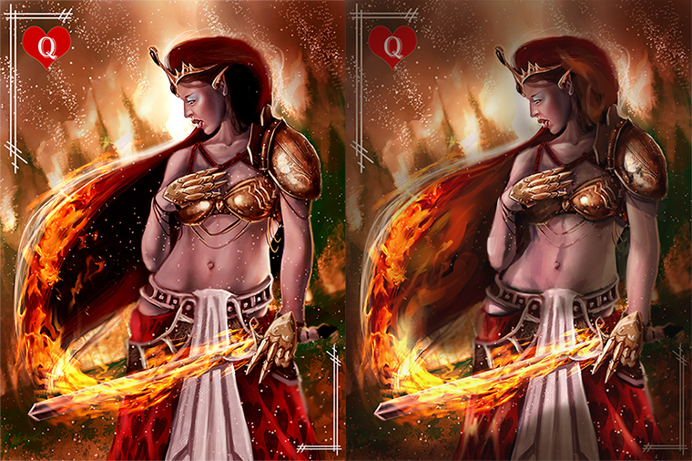 Did a quick paint over demo'ing some stuff. So I used a hard-edge brush and tried to give the figure a bit more "weight" and "solidness". If you're painting an image that has fire in it, it's really hard for the image to *pop* if the canvas isn't a bit dark from the get-go. So, by adding a multiply layer and filling it with a darker colour, then linking a layer mask to the layer by clicking on the [ O ] button on the layer toolbar and painting in black where I wanted to subtract darkness, I was quickly able to give the painting a bit more dimension. In addition to this, I adjusted the levels to get rid of any 0% blacks that you had in your image prior. Also painted over some areas that were unnecessarily dark, like her hair. Try to make it a habit not to use anywhere below 10% black in your images (and the same goes with whites, no large areas with above 90% white. Peak highlights are fine, depending on how you use them), because you illustration will end up looking flat/lifeless. Also, really try to think about an object and its property in regards to light. It helps a lot :D Oh and also concentrate on where you light source is in the image and stick to it! I hope this has helped in some way, just my two cents, Keep up the hard work! o/!
sketchbook | pg 52
"Not a single thing in this world isn't in the process of becoming something else." I'll be back - it's an odyssey, after all
06-28-2015, 02:40 AM
@smrr Thank you for the paintover and the input. I Struggled with this image allot. I have been having a hard time with lighting as you can see. The paintover helps greatly as I can see exactly what your talking about.
06-28-2015, 05:15 AM
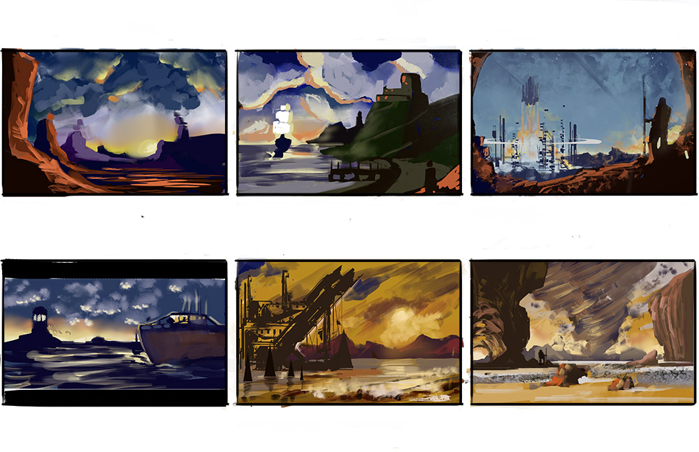
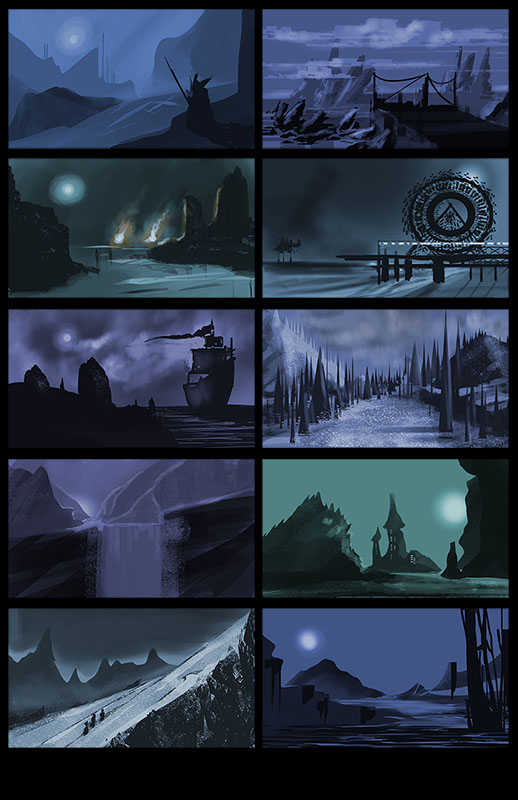
Nice ladies, enviro thumbnails have good colors.
06-28-2015, 06:39 AM
@crackedskull Thank you. I need to do more thumbs more often.
|
|
« Next Oldest | Next Newest »
|