Posts: 1,074
Threads: 9
Joined: Jan 2012
Reputation:
53
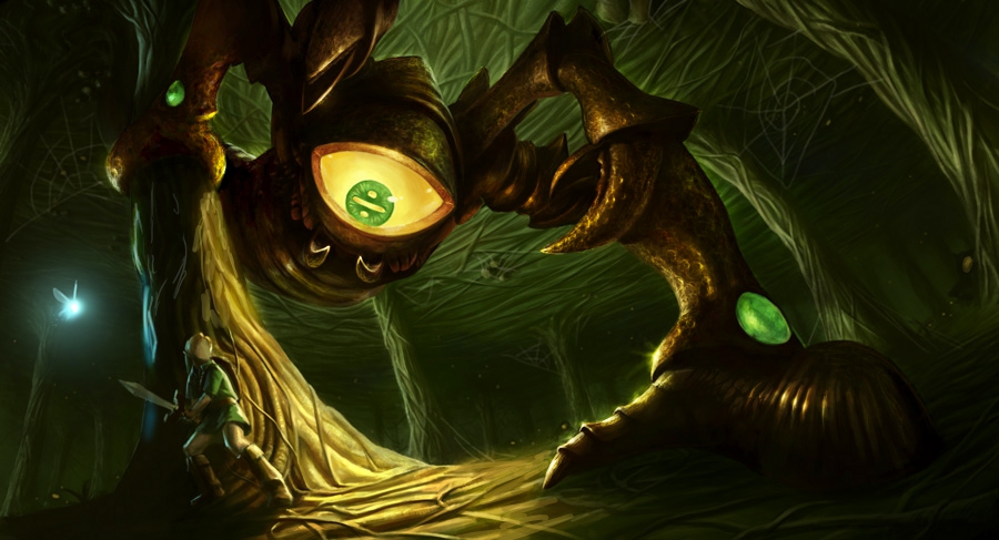
Not much left to do except paint stuff in now. I need to properly paint Link, who is still pretty much a sketch atm, and lots of texturing to do.
Will still need to drop some hours into this :) The fairy will still be a light source, I will just rework it all for it to be consistent.
![[Image: Gohma-08.jpg]](https://dl.dropbox.com/u/1614971/Crimson%20Daggers%20sketchbook/Gohma-08.jpg)
Posts: 253
Threads: 5
Joined: Apr 2012
Reputation:
8
Wow its turning out really great, i can't wait to see it when its finished
Posts: 742
Threads: 28
Joined: Jan 2012
Reputation:
44
The piece is pretty nice, however you should think about few things. First is that the eye of the monster is pretty big and round. That would mean the radius it gives light to is shouldn't be this narrow. Second thing is the bounce light - you live a little bit too much dark places. Consider the fact light is absorbed completely only by a pure black and neither the monster nor the environment are pure black, this means light will bounce billon of times till it gets completely absorbed thus lightening even the places that aren't hit by the light directly. So the light from the eye hits the ground and the tree bounces back to the monster and the ceiling, then bounces back from celing and other trees and the water dispersed in the air and a gazilion other things and hits everything mentioned above then bounces back....
... and so on.
Another thing is the texture of chitin. It's highly reflective (usually), so if a place is hit by the light and bounces it directly to the viewers eyes, it will be as or almost as bright as the source.
I made a little paintover, not really good, but I'm a bit too lazy to do it properly, however I hope you'll find it helpfull. If not, please just tell me to shut up.

--
Edit: Now that I look at it again I didn't really do a good job on painting the texture, might look a bit metalish. I still have a lot to learn :3
Posts: 1,074
Threads: 9
Joined: Jan 2012
Reputation:
53
Oooh look, my sketchbook was on the oblivion of the 5th page!
Thanks for the feedback guys :)
@Piotr, in the end, I didnt want hey shiny - I was more like a spider thing, not a bug. Made it deviate too much from the concept, so I went with something a bit more opaque.
Here~
Final will be up in a few minutes, better rez, on DA, CGHub and FB.
![[Image: Gohma-09.jpg]](https://dl.dropbox.com/u/1614971/Crimson%20Daggers%20sketchbook/Gohma-09.jpg)
Posts: 742
Threads: 28
Joined: Jan 2012
Reputation:
44
Looks really nice. I love what you did with the atmospheric shadow coming from claws (or whatever it is called) below the eye.
Posts: 258
Threads: 6
Joined: Jan 2012
Reputation:
5
Holy crap! You've been killing it since I last checked in! It was Chris Oatley's tweet that actually reminded me I hadn't stopped by in forever!
Great work!!
Posts: 1,074
Threads: 9
Joined: Jan 2012
Reputation:
53
(02-20-2012, 12:51 PM)Ursula Dorada Wrote: Quick bump here :)
Still kinda busy, been reading more than sketching :( Going to fix that asap.
Salvaged sketch from the weekend:
![[Image: Salvaged-sketch.jpg]](https://dl.dropbox.com/u/1614971/Crimson%20Daggers%20sketchbook/Salvaged-sketch.jpg)
This one is a killer, study or not, you've been doing well. Keep up with your progress! ;)
Posts: 1,098
Threads: 11
Joined: Aug 2012
Reputation:
34
awesome sketchbook, your last posts are killing it!
keep up the good work :)
Posts: 1,074
Threads: 9
Joined: Jan 2012
Reputation:
53
Thanks guys :D
So! It begins again!
![[Image: Satyr-Thumbs-01.jpg]](https://dl.dropbox.com/u/1614971/Crimson%20Daggers%20sketchbook/Satyr-Thumbs-01.jpg)
Posts: 1,074
Threads: 9
Joined: Jan 2012
Reputation:
53
Posts: 350
Threads: 15
Joined: Jun 2012
Reputation:
18
Really like the face/hair in this one, keep killing it!
Posts: 1,074
Threads: 9
Joined: Jan 2012
Reputation:
53
Thanks Atrenr! I'll try :D
Here, pushing the compositions. To me, it's really clear which one works better. What you guys think?
![[Image: Satyr-Thumbs-02.jpg]](https://dl.dropbox.com/u/1614971/Crimson%20Daggers%20sketchbook/Satyr-Thumbs-02.jpg)
![[Image: Satyr-Thumbs-03.jpg]](https://dl.dropbox.com/u/1614971/Crimson%20Daggers%20sketchbook/Satyr-Thumbs-03.jpg)
Posts: 1,074
Threads: 9
Joined: Jan 2012
Reputation:
53
![[Image: Salvaged-Sketch-22.jpg]](https://dl.dropbox.com/u/1614971/Crimson%20Daggers%20sketchbook/Salvaged-Sketch-22.jpg)
The thumbs I posted last time are in for deep revision.
I feel like I am on the losing side of the battle sometimes...
Posts: 387
Threads: 2
Joined: Jul 2012
Reputation:
6
I really like what youre doin with those comps-thumbs. Also, horizontal one.
Posts: 194
Threads: 4
Joined: Jan 2012
Reputation:
2
nice stuff since i last checked here! i freaking love your pencil sketches haha. the compositions seem to be improving too :) keep going :D
Posts: 1,074
Threads: 9
Joined: Jan 2012
Reputation:
53
Thanks guys!
Trying to push that composition into something good, not there yet but I need food.
Also this week ONE sketch. Yeah, I suck.
![[Image: SB-136.jpg]](https://dl.dropbox.com/u/1614971/Crimson%20Daggers%20sketchbook/SB-136.jpg)
![[Image: Satyr-Thumbs-04.jpg]](https://dl.dropbox.com/u/1614971/Crimson%20Daggers%20sketchbook/Satyr-Thumbs-04.jpg)
![[Image: Satyr-Thumbs-05.jpg]](https://dl.dropbox.com/u/1614971/Crimson%20Daggers%20sketchbook/Satyr-Thumbs-05.jpg)
Posts: 694
Threads: 14
Joined: May 2012
Reputation:
16
awesome sketches sula, and great job on the zelda painting! Keep pushing it!
Posts: 1,074
Threads: 9
Joined: Jan 2012
Reputation:
53
Thanks Jon! :D
Here, weekend's last breath. Man, I really need to nail down this composition, or this painting is not going to happen.
![[Image: Satyr-Thumbs-06.jpg]](https://dl.dropbox.com/u/1614971/Crimson%20Daggers%20sketchbook/Satyr-Thumbs-06.jpg)
|
![[Image: Gohma-08.jpg]](https://dl.dropbox.com/u/1614971/Crimson%20Daggers%20sketchbook/Gohma-08.jpg)
![[Image: Gohma-08.jpg]](https://dl.dropbox.com/u/1614971/Crimson%20Daggers%20sketchbook/Gohma-08.jpg)


![[Image: Gohma-09.jpg]](https://dl.dropbox.com/u/1614971/Crimson%20Daggers%20sketchbook/Gohma-09.jpg)
![[Image: SB-121.jpg]](https://dl.dropbox.com/u/1614971/Crimson%20Daggers%20sketchbook/SB-121.jpg)
![[Image: SB-122.jpg]](https://dl.dropbox.com/u/1614971/Crimson%20Daggers%20sketchbook/SB-122.jpg)
![[Image: SB-123.jpg]](https://dl.dropbox.com/u/1614971/Crimson%20Daggers%20sketchbook/SB-123.jpg)
![[Image: SB-124.jpg]](https://dl.dropbox.com/u/1614971/Crimson%20Daggers%20sketchbook/SB-124.jpg)
![[Image: SB-125.jpg]](https://dl.dropbox.com/u/1614971/Crimson%20Daggers%20sketchbook/SB-125.jpg)
![[Image: SB-126.jpg]](https://dl.dropbox.com/u/1614971/Crimson%20Daggers%20sketchbook/SB-126.jpg)
![[Image: SB-127.jpg]](https://dl.dropbox.com/u/1614971/Crimson%20Daggers%20sketchbook/SB-127.jpg)
![[Image: SB-128.jpg]](https://dl.dropbox.com/u/1614971/Crimson%20Daggers%20sketchbook/SB-128.jpg)
![[Image: SB-129.jpg]](https://dl.dropbox.com/u/1614971/Crimson%20Daggers%20sketchbook/SB-129.jpg)
![[Image: SB-130.jpg]](https://dl.dropbox.com/u/1614971/Crimson%20Daggers%20sketchbook/SB-130.jpg)
![[Image: SB-131.jpg]](https://dl.dropbox.com/u/1614971/Crimson%20Daggers%20sketchbook/SB-131.jpg)
![[Image: SB-132.jpg]](https://dl.dropbox.com/u/1614971/Crimson%20Daggers%20sketchbook/SB-132.jpg)
![[Image: SB-133.jpg]](https://dl.dropbox.com/u/1614971/Crimson%20Daggers%20sketchbook/SB-133.jpg)
![[Image: SB-134.jpg]](https://dl.dropbox.com/u/1614971/Crimson%20Daggers%20sketchbook/SB-134.jpg)
![[Image: SB-135.jpg]](https://dl.dropbox.com/u/1614971/Crimson%20Daggers%20sketchbook/SB-135.jpg)
![[Image: Photo-study-10.jpg]](https://dl.dropbox.com/u/1614971/Crimson%20Daggers%20sketchbook/Photo-study-10.jpg)
![[Image: Salvaged-Sketch-20.jpg]](https://dl.dropbox.com/u/1614971/Crimson%20Daggers%20sketchbook/Salvaged-Sketch-20.jpg)
![[Image: Salvaged-sketch.jpg]](https://dl.dropbox.com/u/1614971/Crimson%20Daggers%20sketchbook/Salvaged-sketch.jpg)
![[Image: Satyr-Thumbs-01.jpg]](https://dl.dropbox.com/u/1614971/Crimson%20Daggers%20sketchbook/Satyr-Thumbs-01.jpg)
![[Image: Salvaged-Sketch-21.jpg]](https://dl.dropbox.com/u/1614971/Crimson%20Daggers%20sketchbook/Salvaged-Sketch-21.jpg)
![[Image: Satyr-Thumbs-02.jpg]](https://dl.dropbox.com/u/1614971/Crimson%20Daggers%20sketchbook/Satyr-Thumbs-02.jpg)
![[Image: Satyr-Thumbs-03.jpg]](https://dl.dropbox.com/u/1614971/Crimson%20Daggers%20sketchbook/Satyr-Thumbs-03.jpg)
![[Image: Salvaged-Sketch-22.jpg]](https://dl.dropbox.com/u/1614971/Crimson%20Daggers%20sketchbook/Salvaged-Sketch-22.jpg)
![[Image: SB-136.jpg]](https://dl.dropbox.com/u/1614971/Crimson%20Daggers%20sketchbook/SB-136.jpg)
![[Image: Satyr-Thumbs-04.jpg]](https://dl.dropbox.com/u/1614971/Crimson%20Daggers%20sketchbook/Satyr-Thumbs-04.jpg)
![[Image: Satyr-Thumbs-05.jpg]](https://dl.dropbox.com/u/1614971/Crimson%20Daggers%20sketchbook/Satyr-Thumbs-05.jpg)
![[Image: Satyr-Thumbs-06.jpg]](https://dl.dropbox.com/u/1614971/Crimson%20Daggers%20sketchbook/Satyr-Thumbs-06.jpg)