Portfolio Class- Character Development!
I put some time into trying to lay in Dan's most recent crit on my mordred.

[Image: Mordredcrit1.jpg]
[Image: Mordredcrit2.jpg]

I feel like its working a lot better. Hopefully no one has any major changes/suggestions before i start locking it down?

Reply
ImSkeptical - Looking good man, The head could maybe be a little bigger still? And from his torso position, it kinda looks like his feet should be the other way around. I.e the left foot (his right) could be further forwards, and the other one further back. I like the idea for the stance and what you did with the spear though. Looks much more dominant.

Roughing in the lighting for my Mordred. Wanted it to be dark and moonlit, but I'm not sure if this is just too dark. Been staring at it for too long. Any thoughts?

[Image: file-809.jpg]

Edit: Took a break and came back to it. It's way too dark. Shit.

Reply
YES JAKE ITS TOO FUCKING DARK, FUCK

experimenting with going straight to colour, ala michael berube. the face was just a render test to see if it was possible. i think im going to play around with the colours some more
[Image: ddcolour1.jpg?t=1358284350]
Reply
Damn Mahon! D:
Looking great

También se habla español!
Reply
yea mannnnnnn fuck usin grayyyyyyyyyy
Reply
jake, you need to start comparing your work to working pros in order to get a basis for youe values. look at dark work or night shots and try and see just how much light is actually there,
Reply
Wow Thomas, looks f* nice man, great job!

After Dan's crits i realized that it was indeed strange if you look at Mordred from the side with that tiger's head on his chest/belly. So i removed the tiger form the lineart and made the complete armor. This way i wouldt have blank spots in my line art and could move the tiger over the page.
Also added a helmet with Morgane's crown features.

Step 3 was to draw the tiger's skin without the bones.
Step 4 Hang the tiger over his shoulder and made his arms like a cross belt. **Winner
Step 5...... I tried to put the tiger on top of his face, but it looked dull even more stupid when his helmet was beneath it. Cause the helmet is to big on the sides to hang a skin over it.
I also think that the piece is more in balance now true the weight of the tigers face and the flag on the other side.

What do you guys think?

[Image: Lineart2.jpg]
Reply
Thanks guys! feeling good about it. Bottom right Erik, although he looks more hunched for some reason
Reply
Hey Thomas why is the color layer all blurry? Just curious, looks amazing. thanks

Reply
Thanks Aaron, the reason the colour layer is blurry is because I blurred it. Thanks

- just kidding. The way I made my palette was grabbing a bunch of photos with some colours I like, setting them to soft light and colour layers - various other layer types. I used a blur filter on all the photos to get rid of detail, because I only wanted the colours. It's only to get base colours to work from, and then I go from there. I don't think its 'matte painting' unless I use details from photos, maybe it's not the most purist method but if it gets the job done, who cares
Reply
Some great entries everyone! I loved the Morgane, and already Mordred looks like the next level!

I took a quick stab at this Arthurian challenge, sketched all 4 in about 20 minutes before going to bed.

[Image: 6rO67.jpg]

This is not meant as a serious entry, as they are still pretty much medieval for one thing. It is an interesting bunch of contrasting characters which looked like fun to draw. I would approach it more like a real job with a tight deadline where you design all 4 on the same sheet to save time and ensure that you can unify the designs.

I would love to have time to finish these more. Hopefully I can work along with Dan Warren art class pt 2: the Warrening :-)

Daggers!

Reply
I restarted Mordred since the first design had to many flaws :(
I tried to include everything dan critisized on the first one ( I hope).
The hand and the left arm need some more work. If you guys spot even more obvious mistakes please just tell me straight ahead :) Thanks

[Image: mordm.png]
Reply
@ erik- that fouth one with it wrapped and the head on the shoulder looks great. just enough asymmetry!and, if you wanna carry the tiger theme a bit more- that ball and chain could easily be those claws on a chain weapon. you could style them to the tiger theme and go with the whole paw angle. <3
Reply
Zipfel - Nice one man, cool pose

Thomas - Cheers man, I appreciate it. Colours are looking sweet btw, nice work.

Dan - yeah, I've been looking at some stuff and trying to reign it in, not really working though.

So here's where I'm at with this so far...
Trying to pull it out of the dark. Think I'm just gonna start from the lines again though, I never really got the hang of going from values to colour, and it's just a bit muddy and gross.

[Image: file-1743.jpg]

Reply
I really like the mood you're getting now Jake, I don't think you should give up on it
Reply
Hey guys,

So i'm pretty sure that i'm at the last stop before i can start to rendering.
Thomas, you mentioned that he in some kinda way looked hunched.... wel that word haunted me for at least 2 days :D so i switched the tiger from shoulders. Dan thanks again for the tip and feedback!

I added a couple of things to Mordred.
- More studs/spikes (helmet and sleeves).
- Logo on the chest with some big "tiger" scratches. Once he fought a tiger and guess who the winner was.... yeah the price is resting on his shoulder ;)
In the final render i'll add more scratches and dents.
- Re-designed the ball and chain.
- added the final colors to match the tiger and Morganne. Black, gold, grey, silver and brown.

I'm pretty happy the way it came out with the colors and the switching of the tiger.
Stepped away a few times and came back to see how my eyes follow the drawing.
Start point, the head. End, his left shoulder.
[Image: eye.jpg]


[Image: Final.jpg]
Reply
moving forward a bit, sorry it's taking so long. I'm struggling a little with retaining the low saturation mood. I think raising the saturation of the banner creates a nice contrast to the pale chest area and gold.

[Image: ddcolour3-3.jpg?t=1358475208]
Reply
Hey Jake, its a cool idea and could have a really great mood, but perhaps rethink the stance you have going on, the hunched over look has great potential but his shoulders have come up a bit to far towards his neck so it looks like hes hunched AND bringing his shoulders up himself, just give him some weight, i did a very quick sketch of what i mean about the shoulders, just a bit more flow and less rigid. I think it will help a bit.


Attached Files Image(s)


Reply
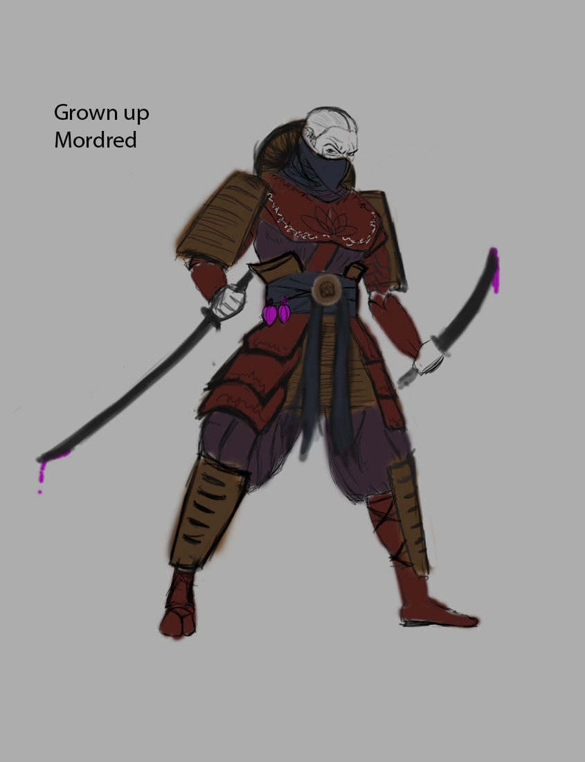
hello .
So i changed the design a bit .
i also did a younger age mordred

suggestions are always welcome :)

young Mordred


and Grown up


Reply
Here's mine
[Image: 019iht.jpg]

Reply


Forum Jump:


Users browsing this thread: 16 Guest(s)