08-14-2014, 04:36 PM
And a few quick double crossbows sketches..
|
Lale's Traditional and Digital sketches!
|
|
08-14-2014, 04:36 PM
And a few quick double crossbows sketches..
08-14-2014, 08:24 PM
lookin gooooooodd
08-14-2014, 10:05 PM
Loved the self portraits!! You are definitely doing it right! Seems that you have facility in doing this kind of studies :)
And you already decided what pose you will choose for the badass female character? It will be just a concept, or a illustration? I would say to just do more gestures and be more careful with the feet, to get a nice support for them! for sure it will help you to get the right gesture for this badass woman! Anyway, nothing too much to criticize! see ya o/
08-15-2014, 06:57 AM
Thank Rosolino! :D
I haven't decided for the pose yet but I worked on a few more today and especially on the outfit.. It will be just a concept for now, will do some other stuff and illustration later on. The thing is, I've set myself several deadlines until the end of the year, and for each week, I have to end up with a new painting that will go in my new portfolio! :) So loads of work ahead!! Thank you for the nice comment and advice! ^^ Here's some of the outfits I've been trying out for my character design.. Will hopefully finish it by tomorrow!!  Oh, and, while doing it... A buddy of mine suggested that it needed more boobs... this is what it got me to... :D 
08-15-2014, 08:28 AM
boob woman ftw. best design ive ever seen, though could use moar boobz.
08-15-2014, 09:40 AM
Whoa, really cool stuff Lale :) I really dig the cartoon stylized stuff you get into, those animals and creatures are way adorable. For the fantasy illustrations, the biggest thing that catches my eye is that the compositions could use some beefing up in terms of storytelling. For instance, in the rock monster one, I think it would be stronger if the rock monster was looking at the woman and not off the page. That way, you have the attention of the two stars circling within the image, and so the viewer's eye will be circling in the picture too (in theory. I think.). Another concern is that in that last character, and this is gravely disappointing, is that there aren't enough boobs. I see what you did there with the testicle breasts, but you passed on the knee-boobs or even a nose-boob. Why?
Sketchbook ~ Blog ~ Deviantart ~ Livestream
08-15-2014, 06:43 PM
Hey thanks a lot pnate!
Well I need for sure to get more paintings like the fantasy ones down to train more on composition. I've been a slacker when it comes to full illustrations.. But working on it! Thanks for the crit and advice! ;) Also, I am sorry for the serious lack of boobs, especially the nose boob. They were jus tout of stock at that moment.. Hope I won't disappoint you that much next time.
08-18-2014, 03:15 PM
That sargent study was amazing :)
I liked how there was only one boob on the elbows to push an asymmetrical design but somewhat disappointed because there could be a squished boob on the other. The breasticles make up for it though.
08-19-2014, 04:36 PM
I never intended to disappoint you, people. I will make up for it. Someday soon. XD
08-20-2014, 02:02 AM
Epic fail of the day... Duh... I can't seem to keep stuff loose and I ALWAYS end up diving into details and start refining... damn it. >.<

08-20-2014, 02:09 AM
:U Interesting idea. It's missing a bunch of additional boobs but ... nice.
08-20-2014, 04:38 AM
Thanks Adrian! :) Hpefully will do something better tomorrow..
08-21-2014, 07:25 PM
Yesterday's 30min sketches.. Needs a lot more practice! >.< Will try to only use a hard edged brush to get my quick studies down, as I tend to make everything muddy otherwise..
 
08-22-2014, 02:41 AM
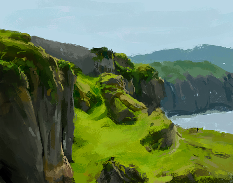
1h30 landscape study, ths time using a hard edged brush, trying to avoid the muddy look...
  Second one is a sketch that I'll hopefully be painting tomorrow. All poses are done from imagination, it was great fun! Still need to do a few more and then I will put rearrange them and do my composition.. :)
08-26-2014, 07:23 PM
Morning sketch! 1h-1h30 cave study using hard edged square brush, 100% opacity only.
 Also working on this at the moment.. Hopefully will finish it today! 
08-26-2014, 08:24 PM
I'm liking this latest painting. Just some more value separation and it's gonna look great!
Discord - JetJaguar#8954
08-26-2014, 10:52 PM
Yep, what Tristan Berndt said, if you add a faint rim light from the top it should work perfectly.
Landscapes are looking great too.
08-27-2014, 07:17 AM
Thanks man! :)
I keep pushing, I really want to make something nice out of it.. having a good feeling about this, it has been along time since I had this much fun and felt like I was actually painting something that has a meaning to me. Here's where I'm at with it.. Will keep working on it tomorrow for a bit.. 
08-27-2014, 07:20 AM
That digital painting is looking excellent so far.
08-28-2014, 04:22 PM
Thanks! :) On my way to finishing it up! ^^
|
|
« Next Oldest | Next Newest »
|