12-12-2019, 03:57 AM
(12-10-2019, 12:05 AM)darktiste Wrote: There a better sense of unity here but everything feel paste in place because there little to no perspective cue. Overlapping isn't enough to create depth.I feel like the girl should be looking at the tin man instead of the lion because it create a loop back into the lion instead of going toward the tin man and i feel like the lion is disconnected from the rest i think you should move is head toward the other but at the same time i like to see more of is face so i am conflicted on this.
yeah dude. Definitely bit off more than I could chew with this one. I'm letting it sit for a while as I study up and think about how to best approach bringing it to a finish, if that's even worth it at this point.
What I'd probably do is repaint Dorothy altogether after sketching out her design some more, and maybe have that compositional loop you suggested. Then I'll work the background to give better perspective cues and framing.
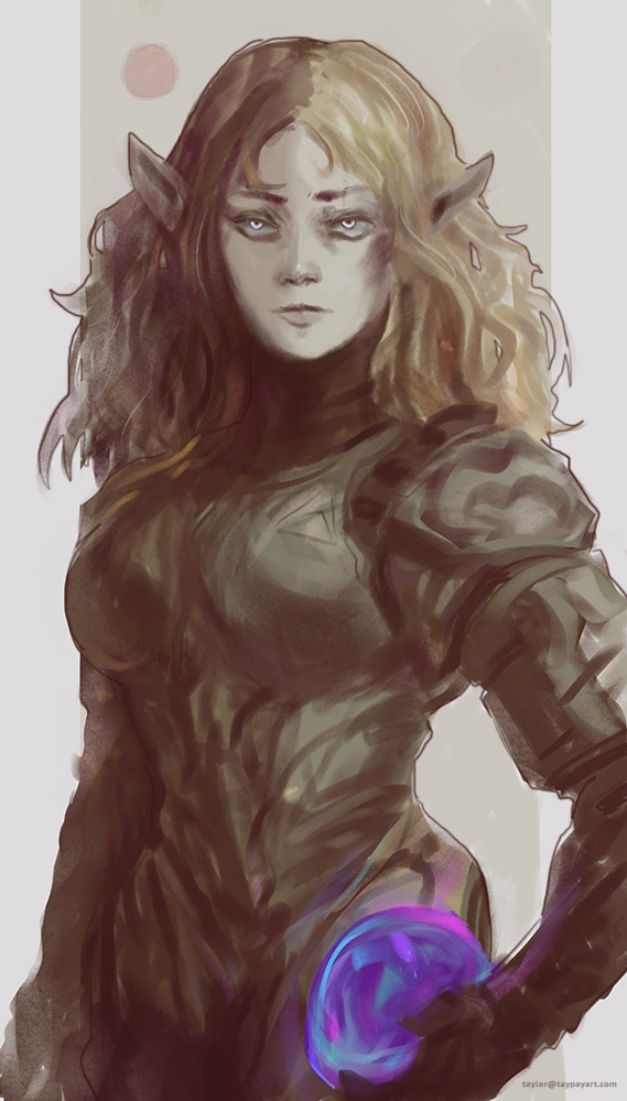
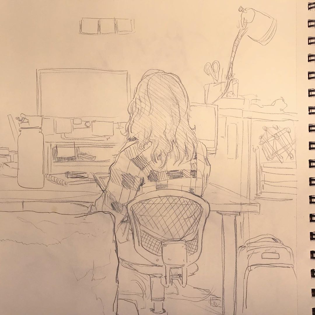
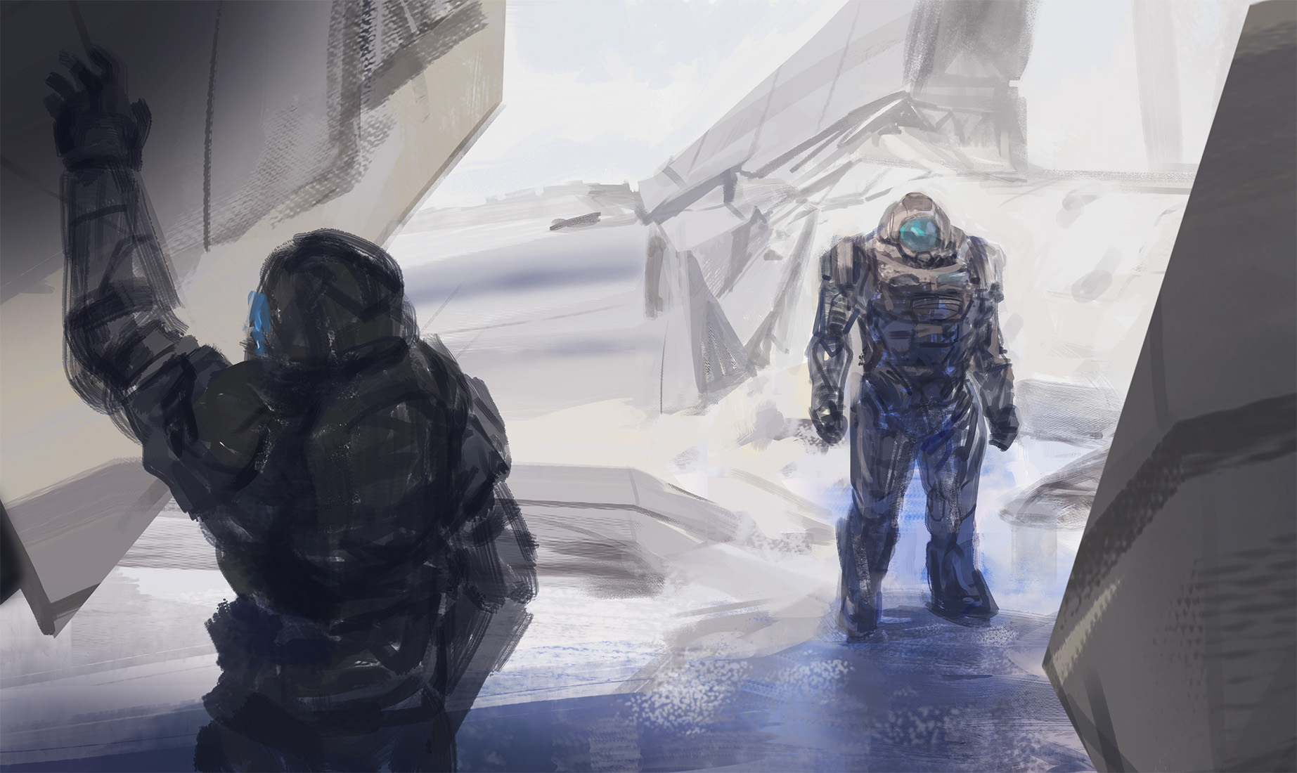
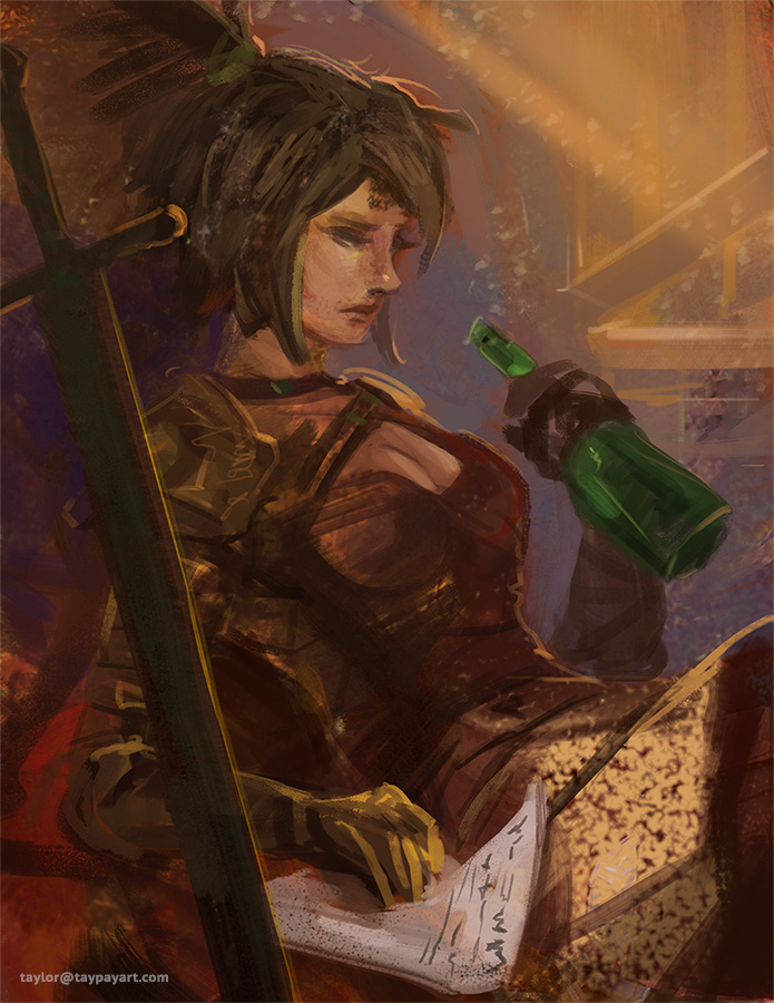
New things - Drawing of my Gf from life, Bargue drawing, and some digital works aiming to develop a bit more narrative and composition skills. Ref'd Jaime Jones for one. of 'em :)


