DeniDimochka
Unregistered
Posts: 429
Threads: 0
Joined: May 2012
Reputation:
7
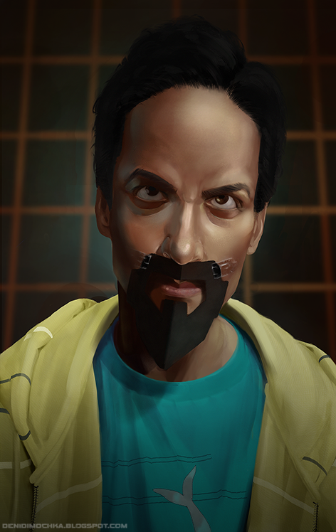
welcome deni! im a huge fan of community, so im in love with the evil abed haha. keep up the great work :)
DeniDimochka
Unregistered
(12-07-2012, 07:34 PM)BenFlores Wrote: welcome deni! im a huge fan of community, so im in love with the evil abed haha. keep up the great work :)
Thank you! Checked out your deviantart and your work is really coming along, lovely :) can't wait to see more
Posts: 129
Threads: 2
Joined: Feb 2012
Reputation:
0
Evil Abed is brilliant, I felt genuine fear. And love.
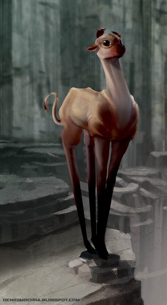
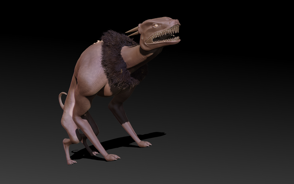
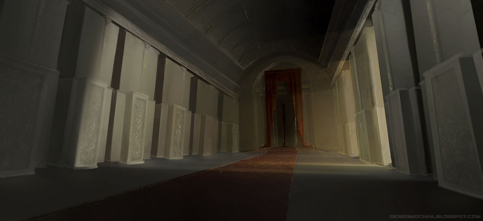
Really enjoying the creature too, looks adorable. This is all good stuff, you've got some really nice lighting going on too. Can't wait to see more!
DeniDimochka
Unregistered
(12-08-2012, 11:41 AM)hollinrake Wrote: Evil Abed is brilliant, I felt genuine fear. And love.
Really enjoying the creature too, looks adorable. This is all good stuff, you've got some really nice lighting going on too. Can't wait to see more!
Thank you! Like you I also have endeavours to suck just a little less then before, dynamic lighting is definitely one of the things I'm always working on. You have some really strong compositions going on in your work! Very effective use of the rule of thirds :)
DeniDimochka
Unregistered
Here's a rough of the new piece I'm working on, its based on this image http://www.sideshowtoy.com/mas_assets/jp...02-001.jpg . If anyone has any suggestions or critiques they'd be absolutely welcomed! :)

Posts: 387
Threads: 2
Joined: Jul 2012
Reputation:
6
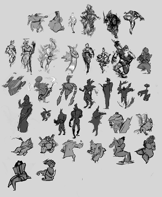
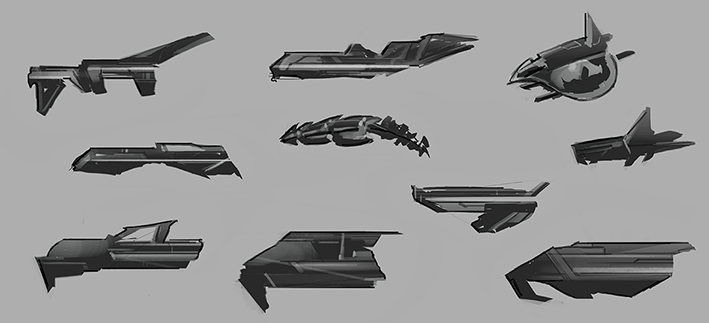
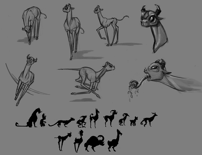
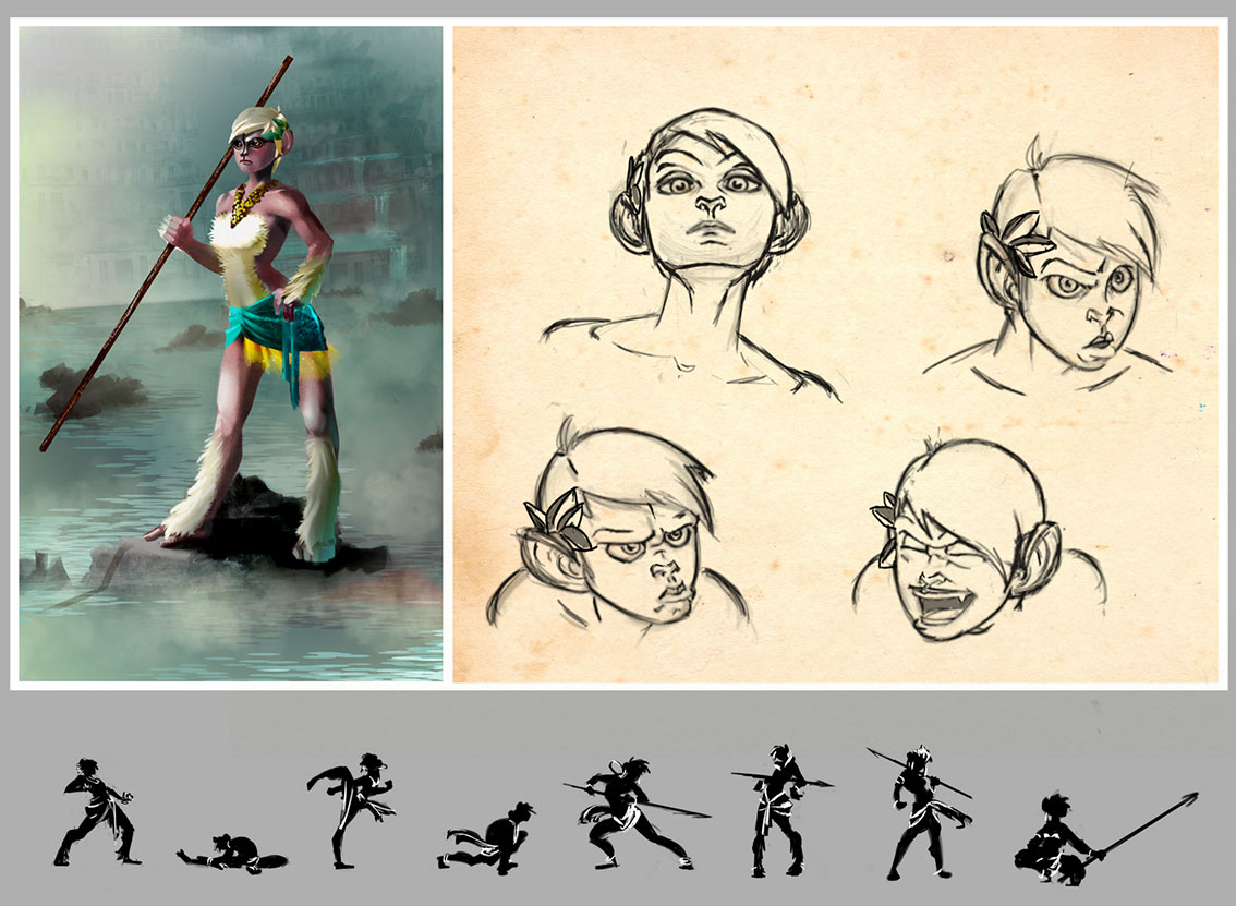
Very interesting style, those thumbs blew me away! Welcome.
edit: http://www.youtube.com/watch?v=TtrqSIhZR_Y eye
DeniDimochka
Unregistered
(12-11-2012, 09:55 AM)iCi Wrote: Very interesting style, those thumbs blew me away! Welcome.
Thank you! I really admire your environments, you've got a great use of color.
Posts: 16
Threads: 1
Joined: Jan 2012
Reputation:
2
Wow, some really nice stuff in here. You've got some really great work. Love your sketching style.
I've got no real advice to give but hope to see more!
hellz yeah, unique style dude! and nice compositions!
DeniDimochka
Unregistered

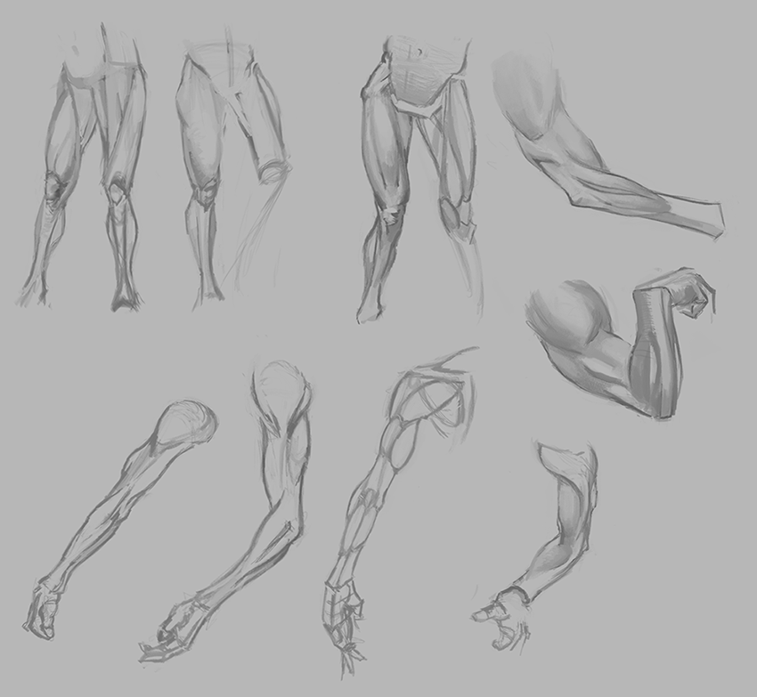
Some Michael Hampton studies.
Posts: 253
Threads: 5
Joined: Apr 2012
Reputation:
8
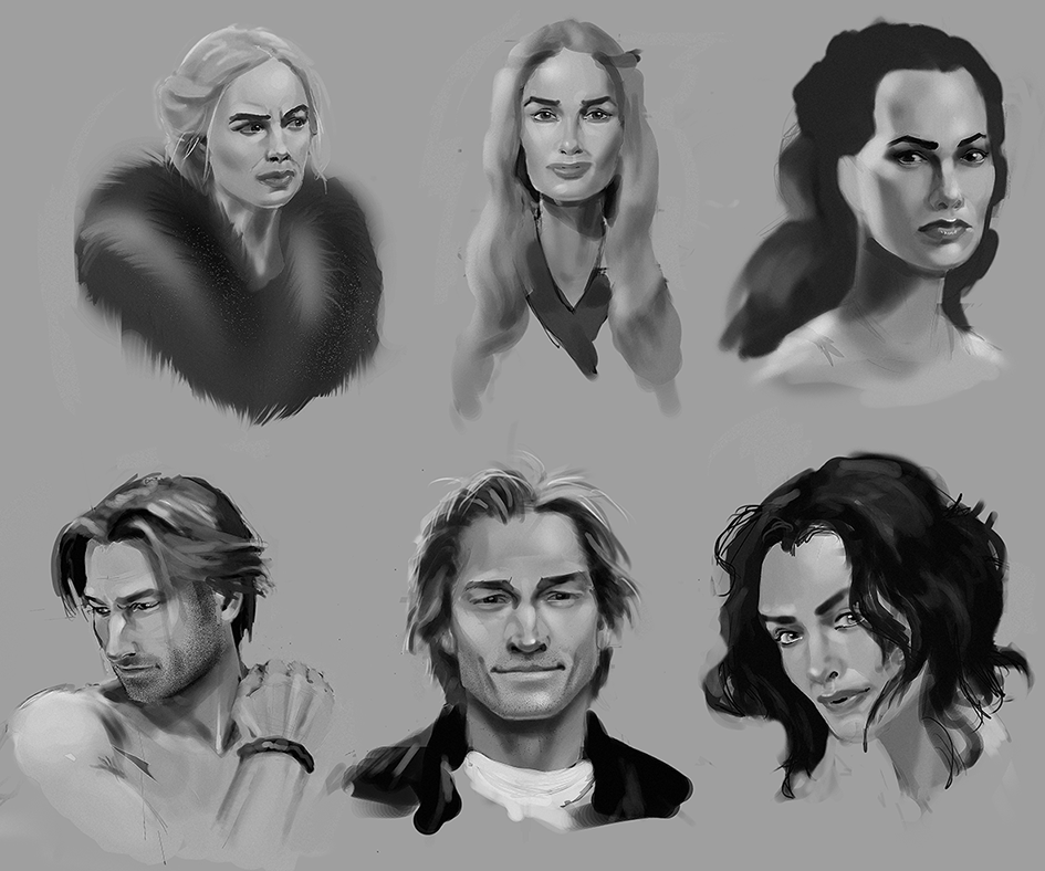
I love your community fan art and game of thrones studies! The only thing i can really think of suggesting is perhaps trying to study/ do more natural lighting? Not like there's really much wrong i can see with what your doing xD. I'm looking forward to more from your sketchbook :D
DeniDimochka
Unregistered
(12-17-2012, 10:59 PM)ImSkeptical Wrote: I love your community fan art and game of thrones studies! The only thing i can really think of suggesting is perhaps trying to study/ do more natural lighting? Not like there's really much wrong i can see with what your doing xD. I'm looking forward to more from your sketchbook :D
Thank you! No I definitely agree, I need to work on more subtle lighting, not everything can be a hitchcock/noir reference lol. I appreciate the critique, I've also checked out your stuff you're working on for Dan Warren's class, you're really coming along, you have a nice use of color theory in your inca piece.
DeniDimochka
Unregistered

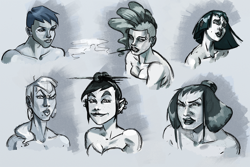
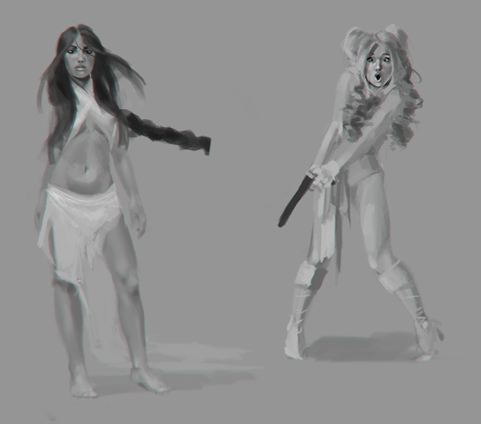
This was supposed to be just a few quick studies is ladies, but I got a little carried away.
Hai Deni.
I like the happy tone in your works and the expressivity of your characters. I can tell you know what makes a face happy, sad, suprised etc. But i think you're backgrounds, clothing, props could really use some more studying, this shouldn't be a problem since you know your values and hos to construct. Just do a couple of photo studies after some objects and i think you'll have enough visual library to fill up a piece! Keep on posting!
DeniDimochka
Unregistered
(12-20-2012, 08:10 PM)Veer Wrote: Hai Deni.
I like the happy tone in your works and the expressivity of your characters. I can tell you know what makes a face happy, sad, suprised etc. But i think you're backgrounds, clothing, props could really use some more studying, this shouldn't be a problem since you know your values and hos to construct. Just do a couple of photo studies after some objects and i think you'll have enough visual library to fill up a piece! Keep on posting!
Thanks! I agree, Its easy to get caught up in just working on more enjoyable things to draw but yea my clothing, folds and props do need some more work.
DeniDimochka
Unregistered
Doing some much needed prop sketches! Painting simple objects always feels so tedious to me, I'm not sure if its just I'm not as comfortable with it as more advanced artists are or if its just one of those things you eventually grow to like or what. Either way to make it a bit more fun I tried doing the entire thing using brushes I NEVER use and not using the eraser, instead just painting over something to erase it. It was a blast and an awesome learning experience, so if there's anything you'd rather snort wasabi sauce than draw I would try doing it a way you've never done it before.

Also what you are seeing here is Litterfish,the world's most awesome catbox by Robert Brinkmann and Dan Panosian which can be found here should your cat be cool enough http://iovo-designs.myshopify.com/
DeniDimochka
Unregistered
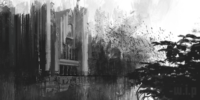
Just wanted to post a little w.i.p. because I've been a bit unproductive artish wise at the moment(getting caught up in moving ugh T_T) BUT if anyone's got any recommendations on how to make this better while its still in this process stage let me know!

|
