02-11-2015, 05:37 PM
Aether- It's The Lorax dumping a bag of chips on himself with his feet. Inspired by some Tumblr post a while back.
|
Arch's Book of Stuff
|
|
02-11-2015, 05:37 PM
Aether- It's The Lorax dumping a bag of chips on himself with his feet. Inspired by some Tumblr post a while back.
02-11-2015, 08:07 PM
Awesome improvement! I really like your linework and your colours are just beautiful!
Maybe you can work a bit with the proportions of the face? Andrew Loomis' book on Drawing Heads and Hands is really good! Keep up the good work! ^^
02-12-2015, 09:22 AM
Bjork- Hey, thanks! I definitely agree, faces are so hard and need more work! I really wish I could get into that book as much as other people. I really love Loomis as a teacher and reading his words of wisdom, but the actual techniques were too technical/confining for me. I gotta read more of his stuff, though. I never read anymore. :'D
Here's today's stuff. I'm really scared to admit that I feel I'm learning, but it feels like things are getting easier to understand and figure out. Attacking obstacles and solving problems are getting easier and easier to deal with. They're even becoming more fun to solve! The habit of continually putting myself into these kinds of situations is what I think has been the most helpful. It's a lot like playing a new game where everything is fresh. You don't know where all the items are, how a combo system works, or how the physics can work to your advantage. It's only after hours of exploration can you really decide how you want to play through it. Once you've acquired the knowledge of all these aspects that allow you to better adjust the play-style and technique, can you really get down into it all and start to customize your personal experience. Just some thoughts in regard to how I've been feeling. Even if it's a gross wall. Time to work in more painting! :]  .jpg)
02-13-2015, 05:47 PM
Another still life. These are hard. Gotta keep it up. :]

02-15-2015, 09:58 PM
Hey man, some really great drawings/designs in here. A lot of cool shape breakups, very Japanese which i like :D.
I think if you wanna work on something, it would be your lighting skills, more specifically direct lighting. Like a lot of good draftsman, you have ambient scenarios down okay, because they work off your strength where you can design your values around those cool shapes with your different materials and clothes. But direct lighting seems to give you a bit more trouble. I tried to do a paintover to try demonstrate ![[Image: 8d93fb5f6e.jpg]](http://puu.sh/fWC4d/8d93fb5f6e.jpg) So first I just made it b/w because it's mostly a value/value design problem. Next I decided what was in light and shadow, and roughly placed it in. I think you were pretty much there, mostly i placed the face in shadow and designed the cast shadow over her with a bit more complexity, trying to show off more forms and not just make it fade off as a tangent to her collar. Then I upped the contrast a bit on the new breakup of light and dark. Next row, now I had decided what was in light and shadow, I continued to try design those cast shadows of the light, note her hands, legs, and the cast shadow of her left arm onto her torso. This is where you can really give a strong sense of lighting, it's quite subtle, but I think attention here makes a crazy amount of difference. Then I changed the levels to show your design better. The last one is me thinking maybe you might see putting her face in shadow as a cop out, so I tried my best to design what I think direct light would look like in that scenario. But I want to stress it is a choice, you can use just local value, i.e., her face being lighter than a wall to pop her face out, or you can design how direct light falls on her face. Although I'm not the best at making up direct light, I think what helped me the most was studies like this ![[Image: 0133PracticeSketches131012.jpg]](http://i1046.photobucket.com/albums/b461/ImSkeptical/Art/0133PracticeSketches131012.jpg) I haven't done them in a while, but I remember doing them was a huge breakthrough for me in understanding cast shadows and direct light better, as well as making sure to emphasize that difference if it was called for. Sorry for the long post, hopefully it was somewhat helpful! Keep being cool and working hard :D
02-16-2015, 05:15 AM
ImSkeptical - Damn. Thanks, man for the killer feedback! Really appreciate it, and it was most certainly helpful. The examples you'd given have already taught me a lot, so I'm definitely gonna get on to some lighting studies. I'm gonna need them before I finish up a couple more things, haha. Thanks again. :D
Forgot my post for today. I'm almost done with this guy. Really excited to go on and fix and give a lot of stuff a try on this, especially the lighting. :] Sadly it's really been the only thing I've been working on, so there's not much else. Gotta get to doing more humans, though! Much to do. Very little time. Wow. 
02-16-2015, 08:33 PM
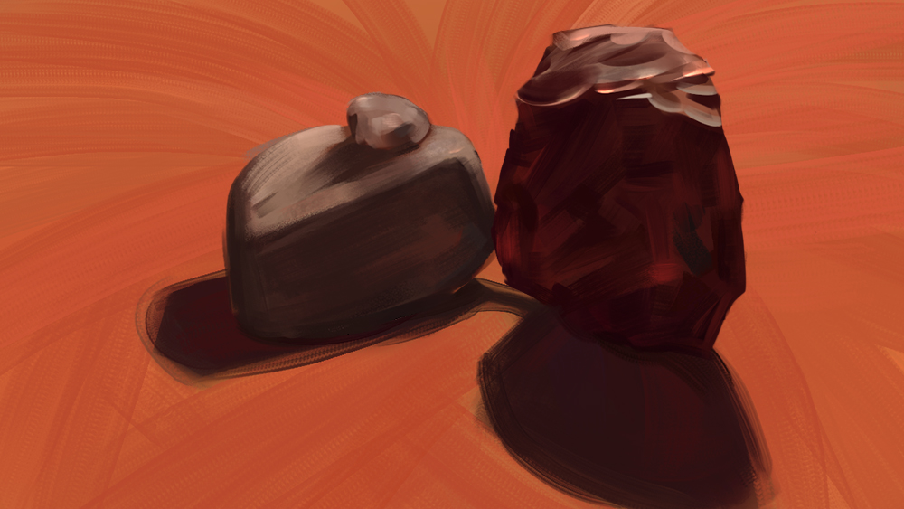
Another still life. I focused more on light this time around, so not much detail and all that fun stuff. Going to have to do more to get the forms more solidified and readable next time, as well as more volume.
It'll be fun to set up some more lighting scenarios! :] 
02-19-2015, 04:43 AM
More studies. Still getting the hang on still lives and lighting. Next time I will do better with nailing the ground plane and capturing the cast shadows!
I'm almost finished with the knight. Just some smaller things to go, which always seems to take the longest and is the most trying of the process for me. But he will be finished. It's been a great learning experience. :D .jpg) .jpg)
03-01-2015, 01:01 PM
Here's some stuff from a few days ago/last week. I've hurt my shoulder painting again, so it's been pretty slow going with productivity and all that. Shit really sucks. It's getting better, but not fast enough.
I'll have some more fun stuff within another week or so. :']  .jpg) .jpg)
03-02-2015, 02:43 AM
DUUUUUUUUUUUUUUUUUUDE Major amount of progress since the last time I checked!! Them lines are looking a lot sweeter, and the faces too, you clearly have leved up your graps of structure and line quality, also form recognition has improved, so much cool stuff!
Now for the obligatory crit: ( more like advice) On the painting side of things I like your colours and stuff, but I feel you need to start trying to figure out your edges, by that I mean that the correlation of edges is very stale, it needs more oumpfh! more subtle soft edges, more blending and finding a good balance between that and crisp edges and shit. I mean, if you wanna do only hard edges it's perfectly valid as a style choice or whatever, but I find that understanding soft edges and blending is essential to make cool shit ( I'm actually still finding out how to accomplish this) so maybe try to introduce "fake" soft edges in your still lifes, to see how can you integrate them with what you see. Overall I think you're showing awesome progress buddy, just keep banging that wall, and keep surprising me with these sweet jumps of quality! :D
03-07-2015, 09:27 PM
Suira- Hey, man! Really been missin' seeing ya around here! It's really good to hear that there is actually noticeable improvement. It's so hard monitoring you when you're you all the time. Haha. Thanks for the crit/advice, and I'm most definitely in agreement with you! I can't let myself get too hard on those edges. :V
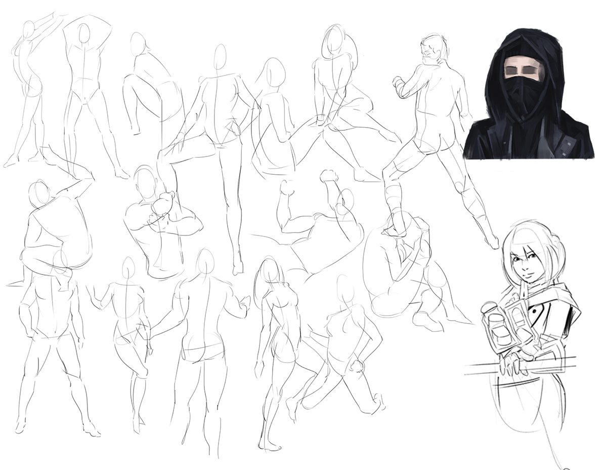
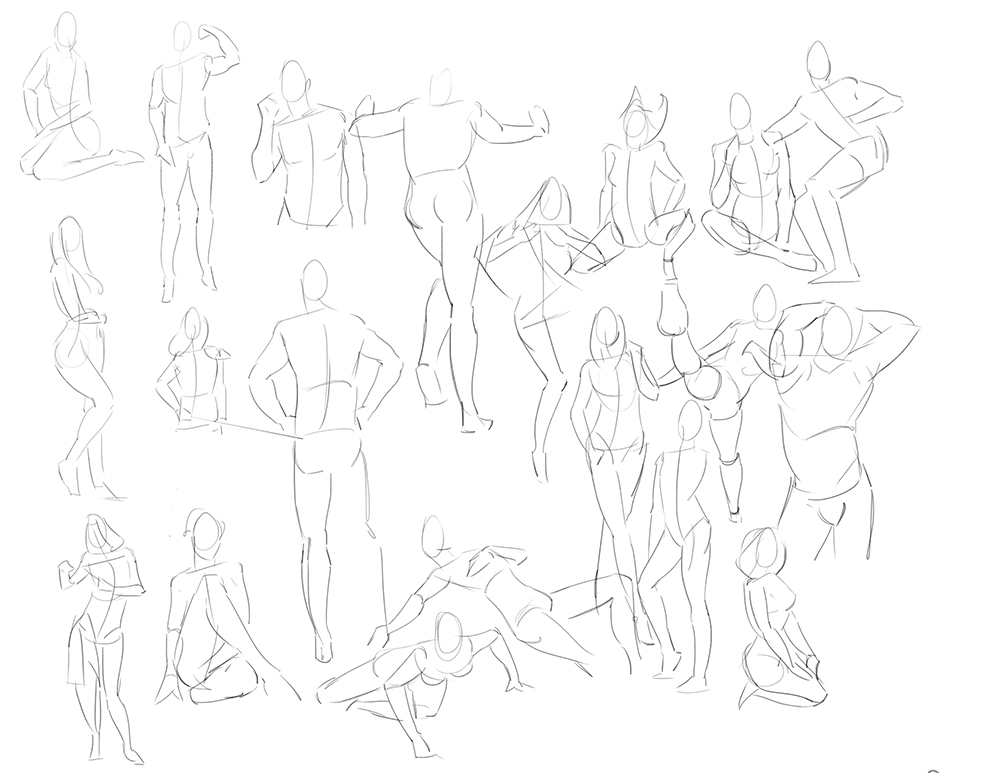
Here's some studies and a Spitpaint. Trying to get a little soft, and still trying to focus on those light form/edges. I always need to keep reminding myself to just focus on one thing at a time.   
03-08-2015, 12:12 PM
Not much for right now. A little WIP for a thing I'll try finishing over the weekend as a bit of a test, and there's some more Spitpaints. I'm really glad I got back into doing them. It's really hard to go so fast. :]
  
03-10-2015, 07:41 AM
More things and stuff.
   
03-12-2015, 09:01 AM
More stuff. I'm on a bit of a witch kick it seems. I just can't stop. :U
Speed is something that I'm going to try and get better at because I'm currently slow as hell with my output, and it sometimes doesn't even mean a better result, which is a problem. I need to start getting my portfolio together soon and finding work since I'm halfway through the grace period of my school loans. Maybe it's just me, but I just don't feel ready to do work for anyone. I feel too slow, that I have an inadequate skill set, and I'll just let clients down. I dunno, it's just an excuse I guess. Haha. The planets will never align, the seas part, and the world open itself up to you so that everything is perfect to continue moving forward. The guy on the balcony was something to be finished by last weekend, and the speed is still an issue, however it will be finished. I'll have some progress on some fan art and the character piece down at the bottom as well! :]   
03-13-2015, 10:27 PM
Dayum! Hard at work my friend! Really nice stuff in the new updates, your lineart is pretty nice, specially for the manga-ish chicks, and the edges on the paintings are steadily improving.
Now on the crit/advice section xD : I think your paintings need more subtle gradients, specially trough characters ( skin , materials, etc), I have recently discovered that adding really subtle gradients ( and sometimes not so subtle) trough a character adds a lot more interest in the rendering. Of course you have to be carefull since you don't wanna add interest to areas you don't want the viewer looking at, but it's a really good way to start of with something that tends to be more sugestive to your brain. The method I'm developing to do this is as follows: 1) Do your lineart or whatever foundation you prefer ( I personally start in stage 2 when it comes to painting ilustrations or stuff like that). 2) On a new layer paint over the silouhette of your character with a dark midtone ( the hue depends on what you want for the specific comp, but itsd better for it to be fairly desaturated) , be very mindfull of getting a clean shape with hard edges (you can blend them in the final stage if you want or paint over). 3)Now make ANOTHER new layer with a clipping mask ( ctrl+alt+g) attached to the previous layer with the silouhette, and pick a darker value with a 20 to 25% more saturation (between 1,5 and 3 , depending on your brush settings) and select a huge round brush ( preferably with flow/opacity set to pen pressure) and subtly create a gradient starting in the oposite direction of the key light you're gonna put into the painting. Give it the biggest contrast shift in fairly short spaces, meaning don't make the gradient completely stable, or it will probably give a fairly strange feel. 4) Now make ANOTHER new layer with a clipping mask ( ctrl+alt+g) attached to the previous layer with the silouhette, and paint your key light ( main light) and whatever you want, but keep the underneath layer as your shadow , meaning that you only paint light in this layer, no shadows, when you wnat a shadow you erase the light in the layer not paint over it. This will give you a basic gradient from which you can start to work in more subtle gradients ( you can kinda yolo them if you're subtle about it, and by that I mean slight hue shifts or value shifts, nothing really impacting) , the more you practice this the more you start seeing in one way or the other in many pro paintings. I'm pretty sure that pros use other methods to paint these subtle gradients, but the one I use is the only one I know that allows for a lot of changes and freedom, even if the method itself constrains you by forcing you to keep your layers organised. Anyway, I think this is one of the most important things I realised lately and it tackles a problem I had for a long time and I feel you might have aswell, which is that you understand well the light source and stuff, even ambient or reflected light, but need a little extra juice in order to make it more interesting to look at. I hope it helps, and sorry for my long ass explanation :P
03-24-2015, 03:11 PM
Suira- Hey! Thanks, man! I'll have to give that process a shot at some point, and it wasn't all that much trouble to read through, so no worries. :D
I really don't have much to show, and I've no idea where nearly two weeks went. Pretty pissed about that. Recently portraits have been something of interest to me. So, I was able to get my GF and friend and sit for a few hours. They're both pretty bad and disappointing. Haha. I'm considering doing more portraits. They've been pretty fun and it's great to actually paint things that are alive.  
03-27-2015, 02:34 PM
I'm trying to get back into the daily post of work.
There really wasn't much to show for today . . :T 
04-24-2015, 02:41 PM
Wow it's almost been a month since my last post. I've got a lot of stuff, so I'll try to dump a little bit at a time as to not be overwhelming.
The first two are client work. I did some quick stuff for a card game that a friend is working on. I've been unemployed and haven't been looking for work, so it was nice to actually do something for someone else for a change. Haha. Hopefully there will be more "pro" work to show soon. There are a couple studies, also. I've got to be more frequent with posts again. I forget how much I love CD. :D    
04-25-2015, 11:15 AM
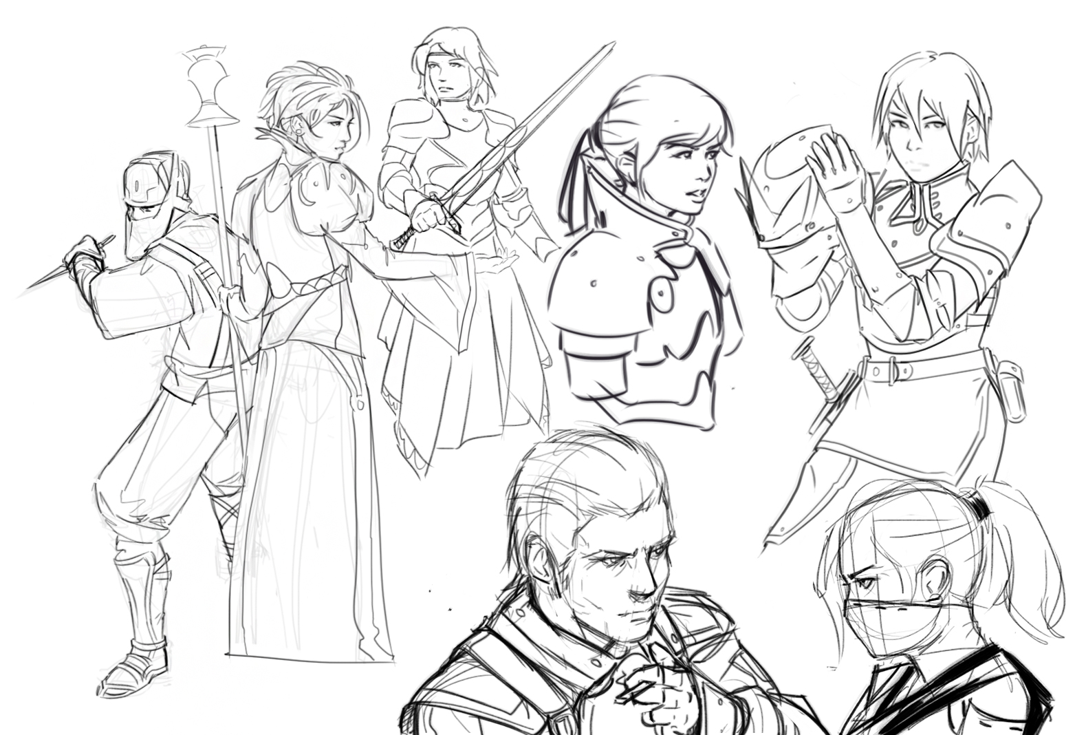
Here are some older sketches from a week or two ago.
I've got more client work that I'll be able to share soon, hopefully. :]   
04-27-2015, 12:06 AM
So much great stuff since I last visited! I don't really have something to crit, just keep going! I'm really enjoying the colours and the brushwork in your new works and studies (:
|
|
« Next Oldest | Next Newest »
|