01-20-2013, 07:31 AM
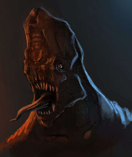
ok so I made this painting recently and I feel I have not made enough improvement recently as well as if I'm stuck in a rut (drawing wise) Could I Get some insight on this.

|
Critique needed
|
|
01-20-2013, 07:31 AM
ok so I made this painting recently and I feel I have not made enough improvement recently as well as if I'm stuck in a rut (drawing wise) Could I Get some insight on this.
01-21-2013, 05:15 AM
The two light directions you have in the picture seem to work pretty well. I noticed that the cracks you have in the creatures face seem to be catching the wrong color of light from the opposite direction of the proper light source. The blue cracks on the left, from what I can tell, seem to be catching blue light on the right (--->) side of the cracks, as opposed to the left side which is where the blue light would be hitting those inner parts. If that makes sense, eh. I'm still learning quite a bit about lighting myself, so don't quote me on any of this.
Also, the face and the part right beneath its jawline would like much more dimensional if you to add more core shadows. The values in these places are looking a little light, and assuming both sides of the faces aren't completely blown out by the light there would be some darker shadows in there. I'll try to get post a paint over to better illustrate what I mean if I wasn't clear enough, and if I have some extra time. Anyways, hope this helps, keep it up, and keep rendering it out! |
|
« Next Oldest | Next Newest »
|