looking for critique for future images
#1
hey guys, long time reader, first time typer to these forums, so hopefully im in the right place!

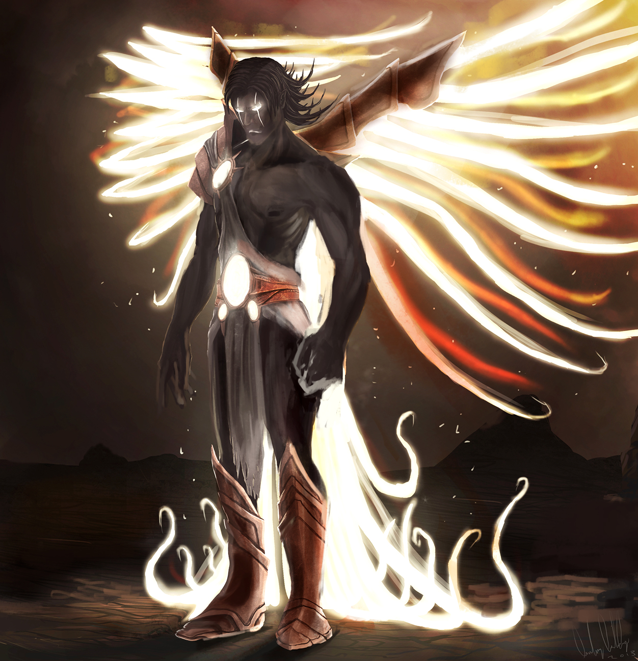
here is one of my newer images that i posted a few days ago and was hoping i could get some critique on this for next time i draw an image similar to this, listing what techniques i could use and how would i apply them.

here is the image of a rejected angel throw back from the heavens.


Attached Files Image(s)


Reply
#2
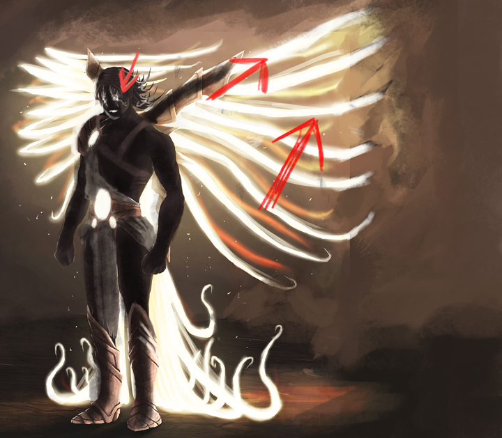
First tme I'm making a paintover ^^
It's a very complex lighting you have done here, I just repaint the muscles so they are more connected between them and not just put apart like in a flayed anatomy study and put some shadow. : )
The main thing that I can say is to always stay focus on the major light of your scene and paint everything thinking about value first and then color.

Here you can download the PSD file.


Keep up the good work D5f02ecd


Reply
#3
fantastic, thank u so much for that info :) yeah lighting is kind of my down side
Reply
#4


Basically, besides anatomy, give the design some room and don't cut off the image.


I did a critique on livestream for you to hear, I attached the image below.

http://livestream.com/mciii
Reply
#5
[Image: deathangelresized.jpg]
I'd say that you should add some reflected light from down to his fists-also since wings are not completly behind him -they are spreading-so a bit of light should fall on his arm.
I added light between his feet and spreaded ground light a bit (should actually be more).And some light around the light on his clothes.

CD dA FM  MaL
Reply
#6
(03-07-2013, 02:29 AM)Mike086 Wrote: Basically, besides anatomy, give the design some room and don't cut off the image.


I did a critique on livestream for you to hear, I attached the image below.

http://livestream.com/mciii

hey man, thank you so much for that critique! it helped a lot! yeah i did take some references from diablo because i liked the whole wings idea off of it, but yeah the burnt out wings would be sick! thank you!
Reply
#7
I'm glad to help, I had fun looking over the work, can't wait to see how it turns out!
Reply
#8
(03-07-2013, 02:36 PM)Mike086 Wrote: I'm glad to help, I had fun looking over the work, can't wait to see how it turns out!

im doing the same guy but different pose, if u wanna check it out:

http://crimsondaggers.com/forum/thread-2351.html
Reply


Forum Jump:


Users browsing this thread: 7 Guest(s)