Mario FanArt (Opinion please)
#1
[Image: d5xagh2]

I'm trully proud of this one, I know it's far from perfect, but I feel that I'm improving! I'd like to know your opinions about it! Last time you advised me to pay attention to the values and I did so this time! I wannna know what's the next step!

Thanks for the attention!
Reply
#2
I don't know if it's just me, but I don't see an image?!?!?

Reply
#3
(03-08-2013, 01:26 PM)ChantalFournier Wrote: I don't know if it's just me, but I don't see an image?!?!?

yeh me neither :/
Try submitting again?
Reply
#4
Perhaps it is about this image.
[Image: mario_meets_a_new_world_by_markdotea-d5xagh2.jpg]
Reply
#5
I don't why I can't attach images properly! Thanx for doing it for me!^^
Reply
#6
Ok, I'm going to say just one thing but you have to pay attention because it won't be easy to fix.

When you shade something, you don't just add black on top for shadows. You already use colored lights, but it's the same for shadows. It has to be way darker than that before skin starts to appear grey. I'm going to write something unpopular because a lot of people invent rules about how to do art and how to learn, but you should take a neutral grey image (128/128/128) and a few good color pictures of people in a similar environment (think fire dancers, or around a bonfire on a beach or something) and pick the colors from the pics, and dab the colors on the grey bg. Then pick the colors on your image and dab them next to the other colors on the grey bg. Compare their shadow colors to your shadow colors. You will be surprised how saturated theirs are.

Shadows often take characteristics of the ambient light. Here the ambient would probably be a desaturated blue from the sky, it doesn't mean that the shadows are blue, it means that they are bluER. If your local color is orange, the shadow would be more desaturated, but if the local color is yellow, the shadow would be slightly greener.

Also, often skin has a very saturated red part before the shadows start to take the color of the ambient light. I hope this helps.

Reply
#7
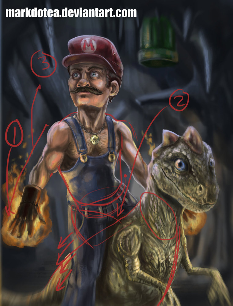
Did a quick little redline pointing out some things.


1) I always talk about tangents. As far as image composition goes, there shouldn't be anything directly 'resting upon' the border of the image. I'd say either have the fire effect going completely off the border, or tucked within. Would probably look better tucked in. ;)

2) Mario looks like he's falling off of Dino Yoshi there. He's leaning very much to the left like he's holding on for dear life with his legs. He would have to be shifted over to the right entirely for it to work. Good tilt on the shoulders -> hips though, overall.

3) The length of his right arm that is outstretched is stumpy. This is because the proportions of everything else is off. The fingers swing to the right part of the upper leg but it's just not long enough. Also his rib cage needs to be fleshed out more he's missing some organs on his left side ;).
Reply
#8
[Image: mario_meets_a_new_world_by_markdotea_pai...5xfqol.jpg]

I agree with the two preceding posts, but I've got something to add.
What's up with you light sources? I see that you have two different lightning temperatures, which is fine. Fire and some blueish purple white light. But look at the arrows which indicate the different directions the light's falling in from (there's more, but I couldn't draw them all). You've got to make up your mind as to which one it's gonna be! :D
Your blueish light seems to be coming from everywhere, so I'm leaving this up to you.
But the fire situation seems to be wrong somehow. I'm going to ignore the fire light hitting yoshi in the front, we all know that's not possible. But the way you drew those fireballs I would think the light should come from down and slightly behind. If you want the fire light coming in from the front, you have to change the position of the hands or something.

Reply
#9
Thanks for all the help people! I'm definitly paying more attention to those things next time!^^/
Reply


Forum Jump:


Users browsing this thread: 6 Guest(s)