Dark Caster painting
#1
Hello there!
I'm a new user and currently, I'm really trying to make my art become better.
I hadn't done a lot of paintings in a while and decided to make one again.
So I made this one: http://twitpic.com/c719wz
But I really wasn't satisfied with how it looks.. And I only worked about 4 hours or something on it. So now, I'm remaking the painting (also in a different pose). I like it a lot more now.
But I'm still searching for critiques and if you can, a quick paintover, so I know what I should improve. I'll try to make this my best work yet. I would be very thankful for everyone who could help me :)
Here's the original concept of the painting.
http://i53.tinypic.com/11ryvzt.png
And here is how the new one looks so far
[Image: epoI1sk.png]

Sry for any grammar mistakes, but English is not my native language. Dutch is :p
Reply
#2
This is the kind of image that lives or dies on the anatomy. I suggest you find someone who can stand like that and photograph them. The other option is to have someone photograph you. If all else fails, act out the pose and what the guy is doing and look at yourself in the mirror and think about how your body parts relate to the other. I think the way the torso, pelvis and thighs connect together have important problems.

Reply
#3
Oh yeah, you're right. I tried that pose and figured I should turn his right foot and leg a bit more inwards and his left foot a bit outwards. Thanks for the tip!
Reply
#4
Nice pic! My suggestion is to rough in a background, even if its only a couple of abstract shapes, just to get the colours right and reading, also it'll be a lot easier on your eyes xP But other than that what ChantalFournier said :)

Reply
#5
[Image: K9eHLn1.png]
Would this be a better 'pose' for the right foot?
Reply
#6
I think it's done. Can I have some tips or even better, a paintover?
http://img200.imageshack.us/img200/838/d...tingv2.jpg
Reply
#7
Pretty cool finish. I'm no good at crits but i think you could do a little more with lighting hitting the body since the back round is dark it seems a bit weak. also his clothing could use a bit more texture, it looks too bland. all in all i like pose. keep up the good work. hope it helps a bit.
Reply
#8
Well those are the exact same points i was worrying about!
But I have no idea of how to create some texture in the clothes and things like that :s
If somebody could do a really quick paintover with an example, that would be awesome :)
Reply
#9
Hi there Roroth,

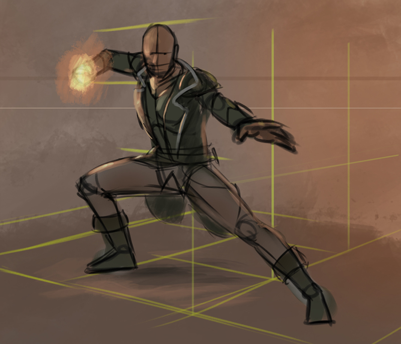
That's a very complicated pose you got there and usually I don't find them that interesting but it is just my opinion. I did however have a go at it so I did a quick paint for you.
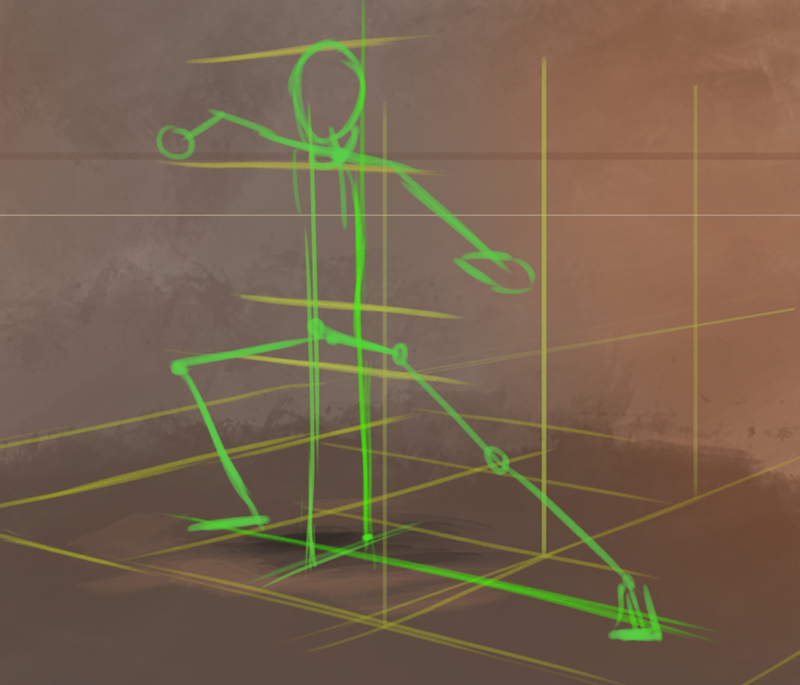
First we want to put him on the ground and in perspective. Then he needs to be in balance so I tried the pose ( apparently I am not that bendy :) ). You can see this in the green lines. Just the stick lines give a very good idea of the direction of the arms an legs.
I read one remark about putting a background in it and that is very good advice and so I put it in.
I also put in some suggestions of the light and tried to keep the whole thing as close to your design as I could.


I hope it is usefull,
If you have any questions you can always ask.

Cheers
Reply
#10
Thanks for the paintover! The 3d thing is st i never tried out before, but im gonna do that now!
The background is something that i still have to make.. Maybe something with dead tree branches, a sort of graveyard.. Or maybe something like your bg. Idk yet. Thanks once again for helping me out!

Roroth
Reply
#11
Np. Looking forward to the result:)
Reply


Forum Jump:


Users browsing this thread: 12 Guest(s)