03-26-2013, 12:04 AM
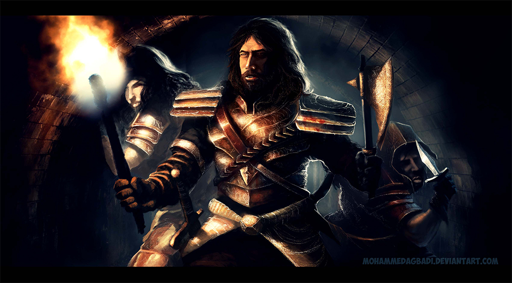
been putting in some studies but i still have problems painting faces and skin....please i need help in that direction, especially going about selecting colours for skin.
|
seeking paintover and critique
|
|
03-26-2013, 12:04 AM
been putting in some studies but i still have problems painting faces and skin....please i need help in that direction, especially going about selecting colours for skin.
03-27-2013, 07:41 AM
Hey man, did you use photographs to start this off or is it all painted? Just curious.
In terms of skin tones there are quite a few "tutorials" and techniques that various artists use that you can find using google. (Check out the gallery here for the posts by navate. CW resources ) Generally speaking base tones are mid saturation reds the shadow areas and stubble areas for men should be cooler (low-mid sat blues, purple's, green depending on the type of skin you are going for) Mid to high saturation reds/pinks/yellows for areas on borders with light and areas like cheeks , and even low sat. high value cyan or yellows for the absolute highlights. You can use different schemes for different racial skin types. I found Navate's scheme quite useful and well presented. In this specific instance your cast light is so strong that it will heavily skew the tones of your skin towards the warm. so look up reference. Basically your tones are more yellow, they should probably be a bit more red, and the shadow areas may not be cool at all, but a red shifted towards the cooler end. I'm going to give you some general feedback as well. I find the torch is competing with the guy's face as a focal point as it is the point of highest contrast in the image so you could tone that down a lot more and not have it so big. It could be a torch on its last legs than in full flame. The rim light and the background light source is nicely done, it looks quite realistic. I think the shadows in general appear a little too dark, and I didn't analyse the values, but they look pretty much black in some areas. They also don't quite match up with what you might expect from the forms, like the cast of the handle on the axe, and on his face. The shadows on his face are too abrupt and dark. I'd say a little bit of colour in the shadow areas overall may help a bit. I like how the chest area is rendered but I think you've gone a little overboard with highlights on some of the other areas and they are all competing a bit with each other. Not everything is consistently lit, for example the knife on the dude on the right. While we're there the guy with knife is drawn inccorrectly, his face is huge, the angle of the arm is strange, basically I think he needs to be redrawn The shoulder plates don't look right and stick out in render quality and even style compared to the rest of the armour so I would consider tweaking those. Compositionally this is pretty bland and a bit odd. You have a diagonal going, but the intended focal point (his face) is at the top and in the middle of the canvas. It seems it might be better to either arrange the figures around him and below him in a pyramid, and maybe tweak the canvas proportions so it is more portrait than landscape or arrange it so his face hits a third below the top of the top edge. There are tangents between guy with knife and the axe. Oh and the main guy looks way too much like Chuck Norris, unless that's what you were going for. Hope that's useful
03-27-2013, 09:23 AM
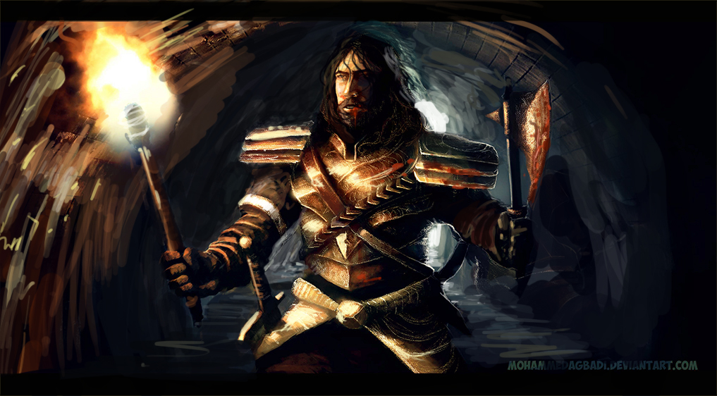
Hey ! I agree with monkey bread ! I played with this a bit. In my opinion I left the other two figures out and focused on how light was behaving. I noticed you back lit the middle guy so I added a light source behind him. I'm no expert here I just played around emphasizing what was already there or taking some parts and trying to tell story.
** One big thing I noticed though was the understanding of light and its direction and how it defined what was what.*** There's tons of good lighting references out there nothing but time and practice, at least in my experience. Can help with learning lighting . Movie or screen shot studies help me. Cheers!   ps , those bricks are not your friend ......nor mine. lol
03-29-2013, 04:51 PM
wow!!! thanks you guys!! and yeah bmonkeybreed....i put a background from google and painted the people up...i understand you guys critiques...thanks a ton!!!
i like your version joerdenleigh....really cool man thanks!! love what you did to his face and axe...oh oh!!! yeah i kinda had chuckie in mind though!! thankyou both... ![[Image: goblin_dude_sketch_by_mohammedagbadi-d5vdykh.jpg]](http://th06.deviantart.net/fs70/200H/i/2013/049/d/5/goblin_dude_sketch_by_mohammedagbadi-d5vdykh.jpg) here's another sketch i'm working on....please crit..... |
|
« Next Oldest | Next Newest »
|