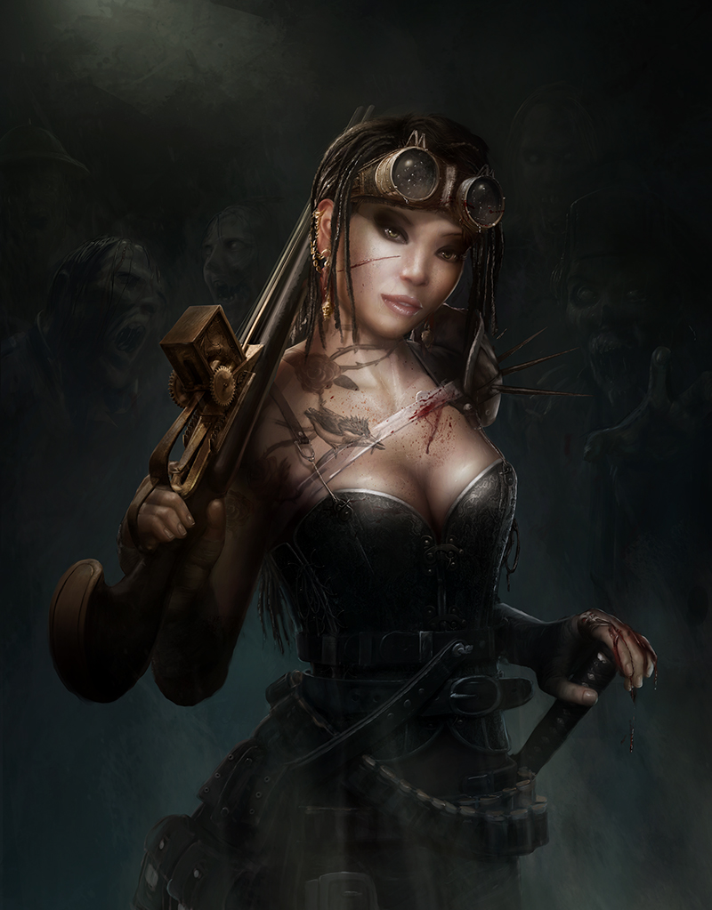
steampunk character paintovers welcome
#1
Hi All! I just joint this forum. I made this character a while ago but feel that is does't really stand out as it is with many of the things I paint. I really would like to improve my level of painting since it seems been stuck for a while.

I hope I can find my answers here:D


Reply
#2
Hey Pascal, welcome! first off you certainly have some skills. Some of the photorealistic stuff in your folio is pretty indistinguishable from a photograph, especially those history characters. I almost feel you need someone with more experience than myself to crit you, but I did notice a few things. First a question, with this piece and the other more photoreal stuff you did, how much do you use actual photographs and integrate them then paintover and how much is just referenced from photos? It may explain a few things I noticed but I'd like to know before critting anything. Thanks

 YouTube free learnin! | DeviantArt | Old Folio | Insta
Reply
#3
(03-30-2013, 03:26 PM)monkeybread Wrote: Hey Pascal, welcome! first off you certainly have some skills. Some of the photorealistic stuff in your folio is pretty indistinguishable from a photograph, especially those history characters. I almost feel you need someone with more experience than myself to crit you, but I did notice a few things. First a question, with this piece and the other more photoreal stuff you did, how much do you use actual photographs and integrate them then paintover and how much is just referenced from photos? It may explain a few things I noticed but I'd like to know before critting anything. Thanks

Hi Monkey bread. Thanks for your response. The historical characters where done for a tv program World history with a wink featuring a german comedian. After filming the whole thing they forgot make photo's for the promotional posters. They asked me to take the video stills on a greenscreen and make them in to A0 300 dpi posters. To do this I used the lighting and pose from the videostill although the pose did change a bit but not significantly. Then I googled the comedian to get the characteristics of his face and started painting. In the cleopatra I did have a photo made from the originals dress of all the shiny things I pasted that in and changed the lighting. For the rest it is painted.

In this painting I use a texture for the corset but for the rest it is all painted. I did change it several times just to improve it and since that didn't satisfy me I realised I needed some help and so I ended up at crimsons daggers.
Reply
#4
Hey Pascal,
The only reason I asked about whether you used lots of photo elements is because some of the things in the piece look a little more real than others and I suspected it might have been to do with different lighting sources on original photo images. Actually you're just technically very good :) but I think there are some minor inconsistencies in lighting that probably give the image that impression.

So I did a paintover.


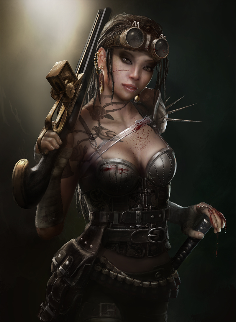
The first thing I noticed was that your comp wasn't working to bring focus. The light source was your hightest value and focal point, not her, so I toned that down almost to nothing and basically made the light facing her the main source. I brought the focus to her face and chest where it should be. I also upped the saturation at the focal points to hammer home the message. (It's probably a little too obvious, but that was just to get the point across)

There were some depth issues: a tangent with the gun and her head so I tried to push the gun back. I tried to bring her arm holding the gun forward a bit. There was a slight issue with perspective of the gun that I tried to fix in the handle (very subtle) but I still think there is an issue with how it doesn't appear to rest on her shoulder. That would require more painting than I could be bothered with, but basically bringing it and her arm down a little or angled slightly might
fix the problem.

Colour tweaking: I brought in some cools into the shadows and I upped the warms in the highs.

Again the paintover is a bit obvious but I basically tried to reinforce the pyramid comp. and get us looking at the good bits. :D
I hope that helps.

 YouTube free learnin! | DeviantArt | Old Folio | Insta
Reply
#5
Hi Monkeybread,

That helps a lot and thanks for having a go at it:). The paintover is very helpfull because you did it a little too obvious. I do put a lot of attention on the details, it is almost meditation. The result is that I loose the focus on the all over image. It is very usefull to have somebody tell me that and I think think this post will bring my work a step forward. I will play around with it and apply your advice and post it back here.

Cheers:D
Reply
#6
Phew...I was worried I wouldn't have anything useful to add. Glad it helped man. See you around the forums!

 YouTube free learnin! | DeviantArt | Old Folio | Insta
Reply
#7
Well I finally had the time work on this in the weekend. I had the fortune of having a couple of very busy weeks. There where several issues that I changed.
1 the perspective of the gun. I made it more dynamic and made the triangle stronger
2 I adjusted the light to focus more on the important elements:) I also changed the color of the top more to reddish tint and the rest a little bit more blue.
3. the light in the background almost gone.
4. changed the all over detail rendering to a more equal level.

I think it has improved a lot. If there are still more issues please let me know, it is appreciated.

Thanks Monkeybread

Cheers,

Pascal


Reply
#8
Nice dude! So much better. :) The only tiny minor thing I see is the shoulder spikes and the zombie face are kinda working like a tangent in a way though. I know it isn't per se but for some reason it draws a tiny bit more focus than I think it should. Maybe shortening the spikes a bit or something? Really really small issue. Great stuff man.

 YouTube free learnin! | DeviantArt | Old Folio | Insta
Reply
#9
Hi Monkeybread,

True it is sticking in the eye a bit. I decided to move the zombie up a bit. I also lightend the gun hand slightly and added a little bit more blue light behind the character.

Again thanks for helping me out!

Cheers


Reply
#10
Lookin good. I'd be happy with that piece if I were you! :)
 YouTube free learnin! | DeviantArt | Old Folio | Insta
Reply
#11
Yep pretty much!
Reply


Forum Jump:


Users browsing this thread: 9 Guest(s)