Posts: 342
Threads: 37
Joined: Jan 2013
Reputation:
13
Well seeing as you helped me and I saw your icon I thought I'd share my 'cents' worth :D
I'll mainly crit the ship one I think as theres more i can say about that.
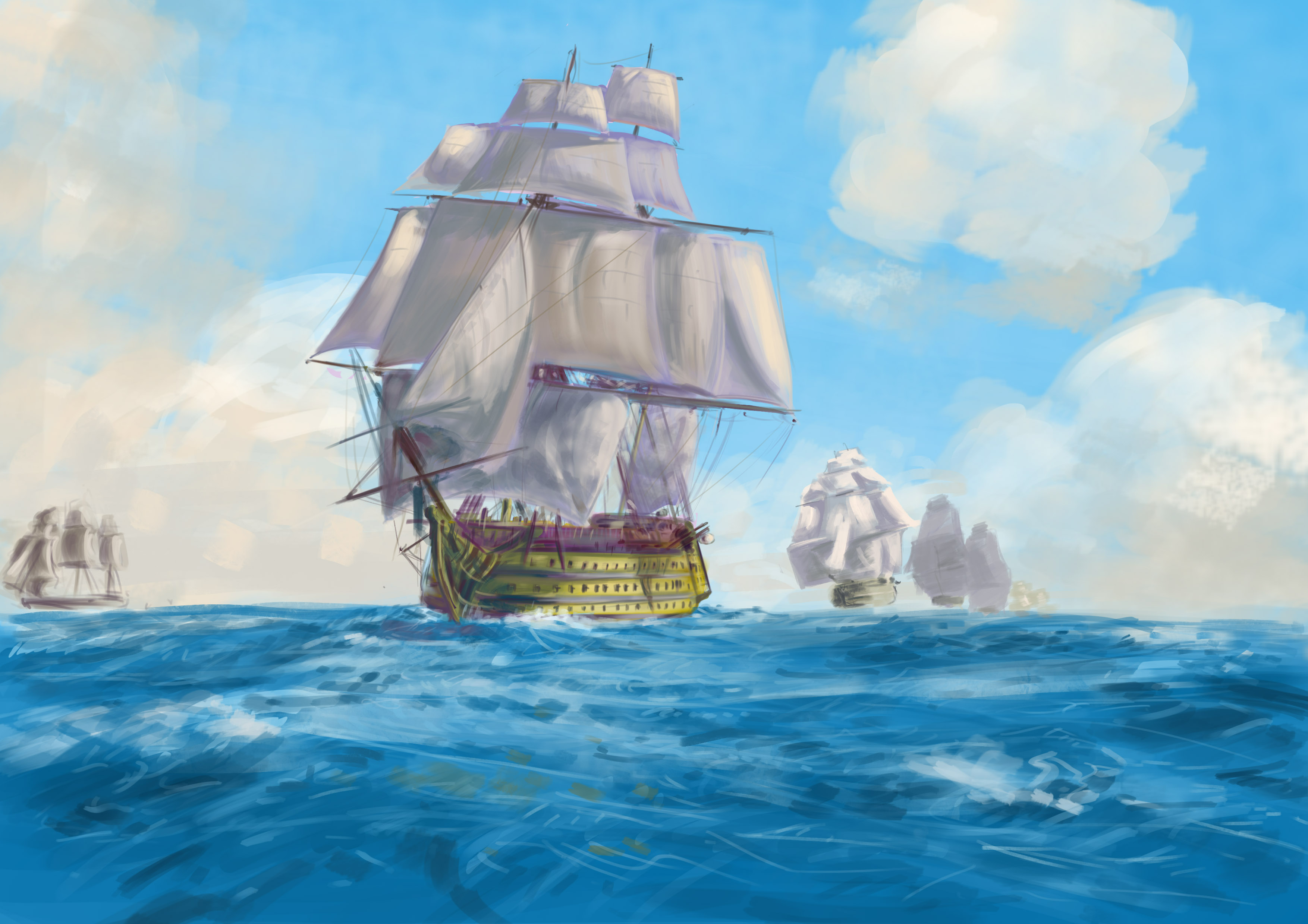
The main difference between your ref and your drawing is that you are missing the warm colours from the sails (the greeny and orangey yellows), and there are no highlights. The contrast between the dark parts and the highlights are what will make the piece pop, so copy the white foam from the sea in bright white, and highlight the sails and the hard lighting on the ships hull as well.
Make sure that you maintain the full sails look by studying how they billow out- it is the white parts that form elipses of sorts, while in yours the ovals are made out of blue.
I may do a quick paintover of this if you'd like? I feel like a bit of a hypocrit for offering seeing as I'm at a pretty basic level myself but I think there are a few things I could point out if you'd like, including some colour stuff.
let me know ;)
Keep the good work up ^^
Posts: 39
Threads: 9
Joined: Apr 2013
Reputation:
0
Heya Ward,
If you feel like doing a paintover, please do! It's okay by me. Somebody's else eyes is always a good thing to spot things that someone tends to forget after spending a couple hours on a piece.
It's a WIP anyway, so I still have time to push it better, (as soon as I find some free time, next week hopefully...) --'
Posts: 1,970
Threads: 22
Joined: Apr 2012
Reputation:
243
Hey alchimi, welcome to the boards. I just wanted to comment on your figure and not the study. It's actually a waste of time for someone to paintover a study because the things that are different should be obvious from just looking at the original and your own piece next to each other. If your goal is to do a straight copy then make sure all the proportions line up, things are in the right place on the canvas, the colours have the same temperature etc. A paintover will not help you in any way to achieve those, but increasing your observational skills will.
For your figure, the proportions and pose are actually pretty good, so well done. You do need to pay particular attention to feet and hands, as these have more complex forms and it's easy to spot when things are wrong as in yours. Anatomy studies are what you need to do to improve. where you fall down the most is on rendering form and lighting. You have a very distinct light source shown by the shadow, but it doesn't seem to affect the figure at all. It is almost cel shaded and flat. You can only show volume with a change in values, and if you don't control your values, you won't be able to render 3d looking forms. My advice would be to start practicing rendering light and shadow on simple objects like, cones, spheres and cubes. Do it using only grayscale at first, because value is 90% of how the form reads, and trying to do colour on top of that makes things much much harder. Try to this for different lighting conditions and do it from life too. Get Gurney's Colour and Light book, it's amazing and will help you.
In general this lack of observational knowledge and not having value control is what is most obvious in your work, so I'd say get used to really tryjng to draw and sketch, and paint from observation more. The more you do the better you will get at it, and focus on the fundamentals first. Hope that helps.
Posts: 39
Threads: 9
Joined: Apr 2013
Reputation:
0
Hey monkeybread,
yeah you nailed it. I need to work rendering form and lighting. Allways been more on the comic book side of drawing...
And yeah, I didn't draw enough hands and feets in my life, and I should start practising values from observation. I made a lot of nude studies, but never really focused on values.
I have that Gurney's book actually, (got it after I made that figure) really full of excellent information.
Anyway thanks for your crits. I guess I'm in for some loooong study hours...!
Posts: 1,970
Threads: 22
Joined: Apr 2012
Reputation:
243
Hey no worries mate...you wanted to help, that's the main thing ^_^


