Posts: 84
Threads: 6
Joined: Oct 2012
Reputation:
3
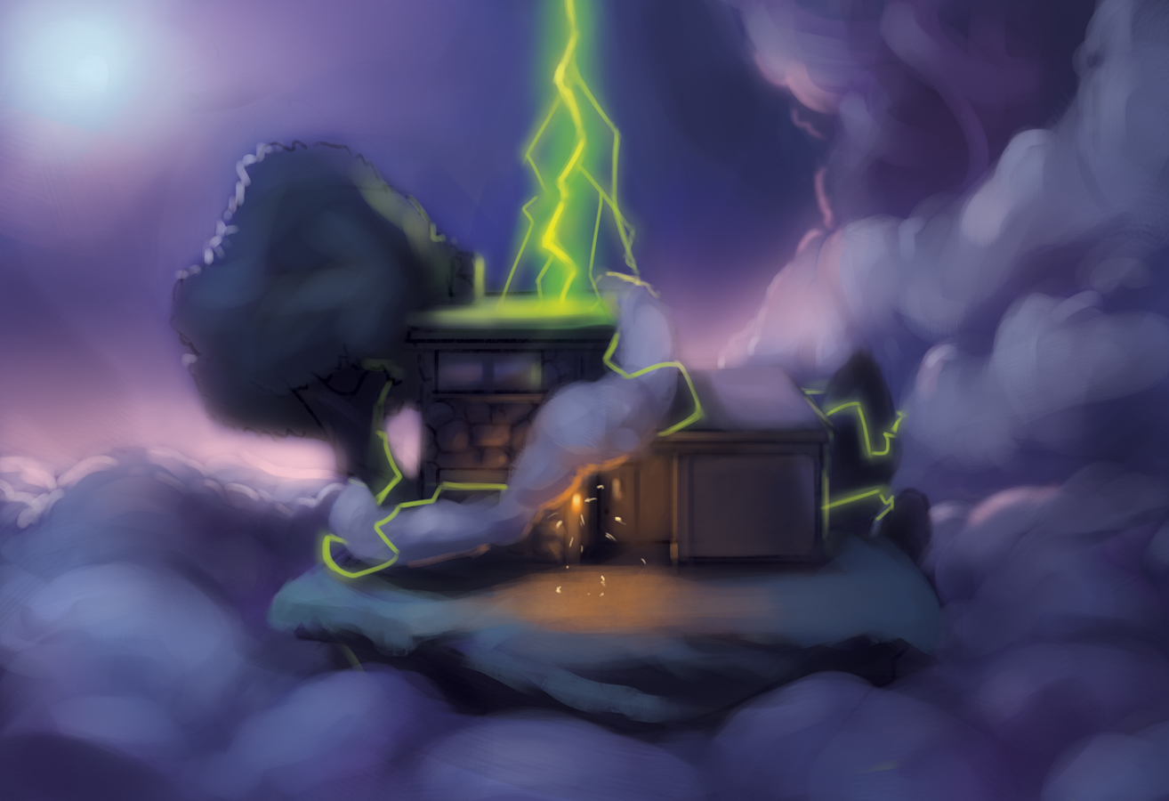
I guess it's probably explained in the story, but I don't get "aliens" from either the ship or the figures. I think you're missing an opportunity to push that idea by just dropping one of their silhouettes in the green light of that open door. As far as the ship goes, it would help if it was floating above the house, maybe the aliens could be repelling down some ropes or something. Right now it just looks like part of the house.
The only other thing I see is that the image seems a little flat. The background looks like it's on the same plane as the foreground, you're not showing the house in three dimensions, and nothing runs off of the page to suggest space beyond this house.
The last thing, and it might be intentional if it's a children's story or something, are the green eyes and mouth. Sort of looks like a Cars kind of thing. He's really happy about the invasion/abduction. Lol.
Posts: 367
Threads: 4
Joined: Oct 2012
Reputation:
25
It looks good and cute : ) I really like how you made it simple yet interesting. I think that trees,ground and background are a bit too similar, so you should just make that trees stand out a little bit, maybe to add a tiny bit of different color or to make it lighter/darker ,as you wish.
Posts: 112
Threads: 5
Joined: Mar 2013
Reputation:
6
The new one is better, but everything is very centered. You could play off that by cropping the sides and giving it more canvas at the top to make a portrait format.
Posts: 19
Threads: 2
Joined: Mar 2013
Reputation:
0
I think you should bring back the darker sky since it gave off more atmosphere for the abduction aspect. The sky seems to light in your updated version of the painting. Giving off a sense of daytime instead of nighttime. Which brings in the question as to what is the time of day in the dream.
Posts: 342
Threads: 37
Joined: Jan 2013
Reputation:
13
I'm by no means a good artist, but I'll just throw what I can at ya. Though it sounds really annoying and i get that, i actually prefer the first one that you did. The atmosphere is much more fitting for a slightly dark and disturbing dream, while the latest one is a bit fluffy and light for me.
Personally I would try doing a more dynamic angle for the camera, as everything is very 2D and static, try for example going bottom right so that you are looking up at the house with the alien above, so you can include both and also give it a more dynamic 3D look. If you tilted the camera and blurred the edges it would also push the dream like feel of the piece a bit more too.
Also I'd try to push the value a bit more, its all become a tad muddy in my opinion- try getting some highlights in there, such as on some of the leaves on the trees or on the edge of gutters etc, and try getting some contrast between hard and soft edges- at the moment it all kind of blurs into one a bit.
Anyway, that is just my opinion, hopefully some of that helps in my rambling :)
Good luck with it, will stay tuned for more.


