Posts: 112
Threads: 5
Joined: Mar 2013
Reputation:
6
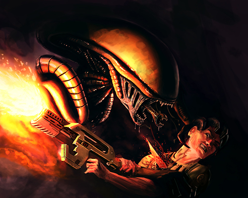
You have picked a very tough lighting situation. The alien is pretty good, but the guy, not as much, I feel like you have ref for one, but not the other. I also feel like the gun should cast a shadow on the guy, his nose should definitely cast a shadow on his cheek and eye. Also, the alien has a kind of cold rim light on his head but not on it's arms, and the guy has no rim light at all. I'm not sure what the orangey brown stuff at the bottom left is. If it's fire, he would die even without an alien there. If it's smoke, should that gun really produce smoke like that?!?!? Is it just that you didn't want to draw the alien body?
Posts: 1,970
Threads: 22
Joined: Apr 2012
Reputation:
243
Just briefly the transition and contrast between your lit areas and the terminator shadow/core shadow areas are probably a bit too abrupt and contrasty. The falloff in light output from a muzzle flash is quite low because it is so bright in the instance it is firing but you could still probably add more of a blended value transition. The human especially looks tpo washed out with no shadowing.
From a realism point of view that muzzle flash is more like a flamethrower and it's so bright it's drawing too much focus....if it's supposed to be that's fine, but I would say use ref of an assault rifle on what muzzle flash actually looks like and what colour it is.
Perspective on the alien's second mouth isn't quite right, and I'd like to see a bit more how it's body connects up perhaps because at the moment it is mostly disembodied hands and tail and head. The purple in the background is way too saturated, so I'd tone it down to draw focus to where is't suppose to be. For the most part, I'd really focus mostly on values. Use black on a colour layer over top or an adjustment layer to check your values, as you only have one layer at the moment, and that is foreground.
![[Image: alien5_15_wip_by_ravish261-d65d7hx.png]](http://fc03.deviantart.net/fs70/i/2013/140/8/c/alien5_15_wip_by_ravish261-d65d7hx.png)
![[Image: alien5_15_wip_by_ravish261-d65d7hx.png]](http://fc03.deviantart.net/fs70/i/2013/140/8/c/alien5_15_wip_by_ravish261-d65d7hx.png)


