Gabriel-Dias
Unregistered
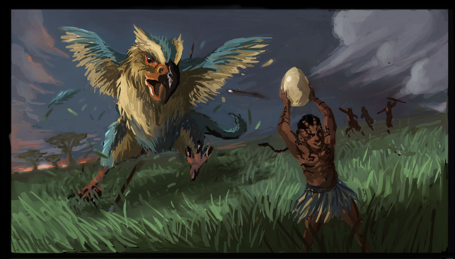
So, it's been a while since i actually finished an illustration. I've come up with this, and even though i kinda feel it's not the best i can do with this idea, my brain has stopped working for the day. I would really appreciate any help you can give!
Some things i'd like to know: are the background elements working right? Is the scene clear and understandable? Does that bird look really dumb?
Thanks! :)

Posts: 1,098
Threads: 11
Joined: Aug 2012
Reputation:
34
the composition looks fine to me. But both the bird and the boy anatomy needs more work.
But i understand that this is still a wip, so maybe you already planned to keep working on that.
Also you could try to push your values more to give the scene a more dramatic ligth setup.
Other than that, i like this scene. :)
Posts: 184
Threads: 4
Joined: May 2013
Reputation:
11
hey!
yeah, looks pretty nice to me. my adjustment suggestions would be:
the slanted horizon gives a sense of dynamism, speed, etc, which i think are slightly hindered by:
1) the egg, relative to the picture frame, is sitting vertically, it looks completely still. might look better if its slanted and held at an angle, flowing with the composition more
2) same with the bird, although he is slanted in a dynamic way relative to the ground-plane, he is in a straight vertical line relative to the frame, which makes things feel a bit more static too.
some other things:
- the clouds in the background don't stretch out behind any of the characters, they end precisely where the characters start, having them go underneath the characters and be overlapped like that should help bring some depth into the picture
- nice perspective, with tribe in the back, bird center and man in the front
- nice work on the spears too!
- the stretch of bright green grass is a bit uniform and out of colour to my taste, might look better a slightly different hue and with some more variety?
- yes the scene is clear and understandable, and the bird does like quite dumb
thats all that comes to mind, hope it is helpful to you : )
"If you want liberation in this life, there is no area that you do not watch. Watch the breathing, watch the posture, watch the flow of energy, watch the texture of the mind, watch the response to objects." - Namgyal Rinpoche
Gabriel-Dias
Unregistered
Eduardo, yeah, the anatomy has been bothering me. I'll get on to that. As for the values, i always seem to mess them up, especially when i start with color! I'll get right on that.
aks9, So, I guess i got confused by my own composition :D I really wouldn't have noticed these angle problems on my own, thanks! And as for the clouds and the tribesmen, i was told to watch out for tangents, and that they were hard to miss. Serves me right, i didn't notice that either.
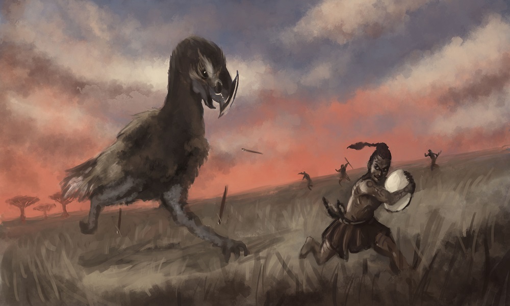
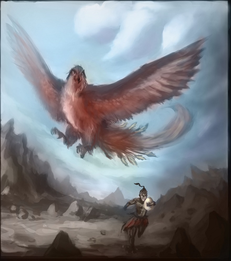
So, i think i'll go back to work on this one, but first here are the thumbnails i did for this. As you can see, i chose the 2nd, but then i though the 1st was also nice. So i started that one, as a 2nd version of sorts, and i think it's looking better! It's very different though...


Gabriel-Dias
Unregistered
So, updating on the progress!
I tried taking all the points into account, and well, the first one is looking radically different. But i'm taking my time to experiment, which i suppose is a good thing, right? :)
Also screw that bird.


Gabriel-Dias
Unregistered
This is the final version :)

