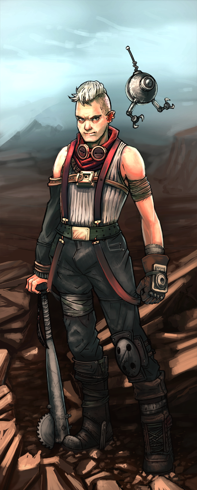
Buzzsaw Bat Soldier
#1
Hello,

I'm new here, and I was looking through this section at all the great help, advice, and paintovers that people get, and I thought,"hey, why don't I post what I am working on..."

So yeah, here it is...
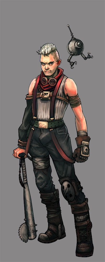


I would be really thankful for any advice, suggestions, and critiques that anyone could offer.
Also, I would like to put this guy in an environment, but I am not really sure what direction to go with that, so any thoughts on that would be awesome.


Thanks to everyone in advance!
Reply
#2
I cant do better myself but will point out what I can. The anatomy looks a tad off- for example his forearm is wider than his bicep and shoulder. There also seems to be a strange jut coming out of his right arm that I dont understand.
Apart from that its looking really good so well done there. I would add that the skin is mainly the most saturated when the blood vessels are close to the skin, or where skin is stretched, such as neck bones and cleavage ;) so I think the saturated pinky red tones you have running down his arms are a bit out of place, especially the one running down his forearm.
There again I may be spewing utter garbage so I wouldnt take my word on it
All in all its looking really good but just a few little tweaks may help it along :)
Reply
#3
Hey, thanks a bunch!

Those are some really good points.
I didn't even think about the pink on his arm, that makes a lot of sense!
The arm could definitely use some anatomy work, you are very right about that.

Thanks again!
Reply
#4
(06-04-2013, 08:23 AM)greyskill Wrote: Hey, thanks a bunch!

Those are some really good points.
I didn't even think about the pink on his arm, that makes a lot of sense!
The arm could definitely use some anatomy work, you are very right about that.

Thanks again!

Glad that helped :)
Really looking forward to seeing it all finished, it looks great now anyways :)
No worries
Reply
#5
I don't mind the forearm being wider than the upper arm, sort of as a stylistic thing. He sort of has a Popeye feel I guess, and you've also done it with the calves vs. the thighs, so you're consistent. The way his left (our right) forearm is rendered, there is kind of a weird crease running vertically down from his inner elbow. That kind of bothers me a little. I agree about the saturated red tones on his arm, but the ones on his ear, hands, and face are good. I might even throw a little on his nose. Good work!


Sketchbook  :::  Site

Reply
#6
Thanks to both of you for your input.

Here is my current version of the character.
I decided to go with the popeye sort of look with the limbs, because it just looked like it worked for him. I did tone down the reds on his arm though, and I added some more red to his face.
I fixed the crease in his inner elbow, and I fixed the weird part on his right sleeve.


Reply


Forum Jump:


Users browsing this thread: 7 Guest(s)