03-12-2012, 07:46 AM
Started a portrait of an orc
My drawings are always too light
My drawings are always too light
|
Nimao's Sketchbook - things and stuff
|
|
03-12-2012, 07:46 AM
Started a portrait of an orc
My drawings are always too light
03-12-2012, 08:43 PM
Orcs looking good so far.
Try adding a layer above, fill with flat colour, set to multiply (decrease layer opacity to suit), and erase away areas of light. helps give a piece a more 3D feel. Keep it up!
03-13-2012, 07:48 AM
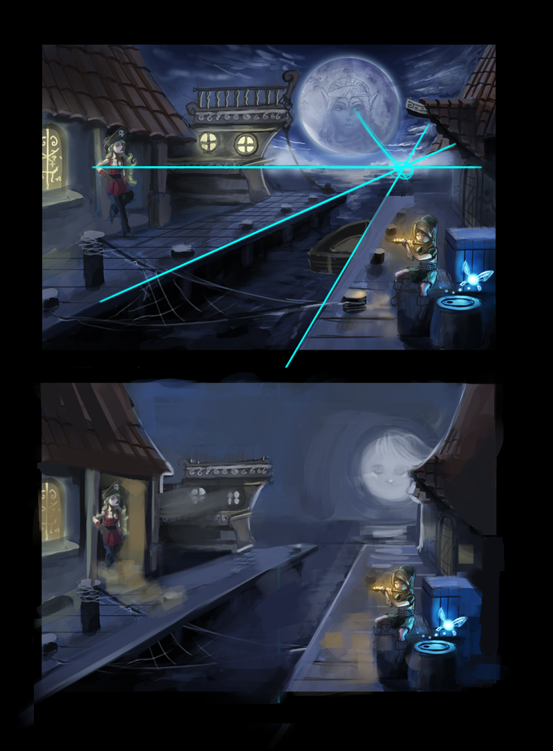
 Did a quick paint over. Right now the very bright moon is against the dark sky, causing to moon to look like it is farther forward than it should be. Check your perspective lines on the house and the docks too. Hiding the moon a bit and making it a bit less dramatically contrasted moves link back to the front of the comp on the front half of the sleeve design. One the left side, check out the door that the lady is standing in. The window to her left is lit, but the door is completely dark. Light up that door way and let the light spill out into the dock area a bit.
03-13-2012, 08:19 AM
(03-12-2012, 08:43 PM)Tooth Wrote: Orcs looking good so far. thaaaaanks this reallly helped me alot =))) here is the result for now: (03-13-2012, 07:48 AM)Samothrace Wrote: Did a quick paint over. Right now the very bright moon is against the dark sky, causing to moon to look like it is farther forward than it should be. Check your perspective lines on the house and the docks too. thanks for the advice :D i will keep that in mind the next time i continue working on it.
03-16-2012, 06:22 PM
03-18-2012, 11:16 AM
These last ones are pretty nice, just dont forget the studies, but you are doing great, go for it.
03-19-2012, 12:22 AM
(03-18-2012, 11:16 AM)AJCC Wrote: These last ones are pretty nice, just dont forget the studies, but you are doing great, go for it. yeahh but it makes so much fun i cant stop 8[
03-24-2012, 11:18 AM
gul'dan from warcraft
and a sketch for the new bloodsport challenge but i think i have to make a human because he have to be young
03-25-2012, 09:37 PM
Here is a update of my sketch. i'm going to clean the forms and the shadows and then make some studies for the textures and try to apply them to it. I already started a studie for the forest.
03-26-2012, 06:22 AM
Started with the Loomis Figure Draw Book.
i know it makes no sense to post pictures that i copied from a book. but i just want to show that i do something. The copying helps me to understand things better. last thing before bed
03-27-2012, 02:57 AM
drawing from books is good man, nothing wrong with it. just do some from memory afterwards to make it stick. keep it up man.
03-27-2012, 03:21 AM
Oh God this Book is awesome! oo its like BÄM here i have everything i wants to know. =O.. Im so exited to learn more from this book.. i hate it to have such less time to practice.
|
|
« Next Oldest | Next Newest »
|