Help!
#1
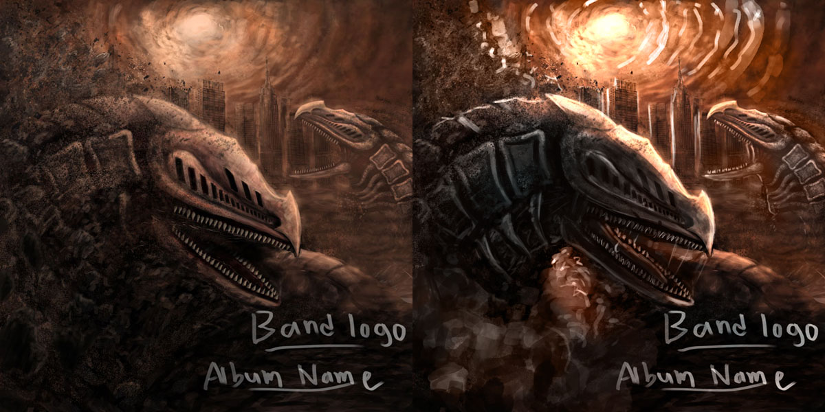
Painted this album cover for a band but I got this message from them after i send them the picture. " Hi! Everyone liked it. But there was a unanimous thought about the head of the serpent at the front: There is a bit of a difference between the body and the head - the head looks more polished than the body. Also the perspective isn't 100% right. It might be the contrasts on the drawing or the fact that you can see the second row of teeth on the lower jaw. That makes it look as if the lower part is tilted while the top part is straighter. But these are just details."

I've painted many pictures for these guys and I finally painted something they liked but I'm really tired and busy at the moment. Can anyone help me? draw/paint over it or tell me anything I can do to make it better. please don't nitpick it too much..


Attached Files Image(s)


Reply
#2
Heyya,

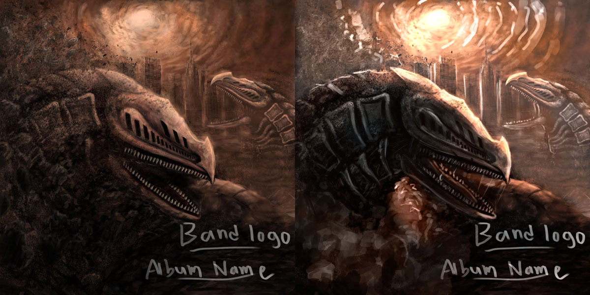
I did a paintover for you because it is easier than explaining what I would do.
Basically, I used a hue/saturation layer to get it to gray scale so that I could just concentrate on tone. Tone is where the major problems were with your illustration.

The head was not being effected realistically by the light in the background, it was too light, and the body was too dark to see any of the details. I added details to the body mimicking the other worm, and I darkened the core of the head and added rim-light from the sky to everything. I also added lighter dust to frame him better so he pops.

When I got to recoloring, I added some cooler tones to the shadows. This really helps to add interest and mood to a piece. You have a lot of different options for the cool tones, but I chose a blueish color.

I also upped the contrast with a levels layer. Contrast is your friend if you use it correctly!

I hope this is helpful! Good luck, and post back here with progress later! =]


Reply
#3
i think greyskill is spot-on, but i though of giving you another option just because


Reply
#4
So the band wanted the second Wurm in the distance out and wanted to see more buildings. So I painted over it (cause i accidentally merged all layers, seriously don't know how that happened). I showed them this but they said they wanted to see me use the same "effects" i used on this older Wurm thingy i painted, don't know what they mean.. can someone help?!?!


Attached Files Image(s)


Reply
#5
Hey man, when you say "I showed them this but they wanted me to use this" ..remember the images you are talking about are just posted after your text so we don't really know which one you are talking about. :) I guess you mean the second image in your post is the one they want you to have it look more like? I agree that one is cooler in terms of design and rendering etc.

We can't really help with figuring out what your clients want so I think you should go back to them and ask them to clarify exactly what "the effects" are they like specifically. Don't second guess them, that will just waste your time and their time. Sometimes you have to babysit clients through to what they want because they don't know the language to be able to tell you what they mean.

 YouTube free learnin! | DeviantArt | Old Folio | Insta
Reply
#6
(07-18-2013, 11:14 AM)monkeybread Wrote: Hey man, when you say "I showed them this but they wanted me to use this" ..remember the images you are talking about are just posted after your text so we don't really know which one you are talking about. :) I guess you mean the second image in your post is the one they want you to have it look more like? I agree that one is cooler in terms of design and rendering etc.

We can't really help with figuring out what your clients want so I think you should go back to them and ask them to clarify exactly what "the effects" are they like specifically. Don't second guess them, that will just waste your time and their time. Sometimes you have to babysit clients through to what they want because they don't know the language to be able to tell you what they mean.

Sorry, I'm just stressed out and tired. By the effects they meant: "The shine and contrasts the other picture has". They seem to like the design (i designed a ton of stuff for them).
Reply
#7
It sounds like they want the lighting from picture 2 on picture 1, is that correct?

If it is you may need to sit down with them and ask for more money, because a change like that is almost alter the entire piece.

You client doesn't know how to communicate about the visuals, here is something you have to do wit h them from now on: Take the band member who is the best at conveying information to you and make him your contact. Stop listening to all of them and get them to tell your contact everything you need to know that way you only have to communicate with one person.

"Shine" means nothing because your picture 2 has no shine, they must mean the rim lighting.

Livestream Crits/Paintovers: www.twitch.tv/mike086
Loomis Study videos: http://www.youtube.com/user/mike086


My Facebook page: MCIII
Reply
#8
So I changed the position of the creature and the design.. but any idea on how i can make the creature more "brutal" and the texture on the creature rougher..


Attached Files Image(s)


Reply


Forum Jump:


Users browsing this thread: 7 Guest(s)