I really need help
#1
Hello!

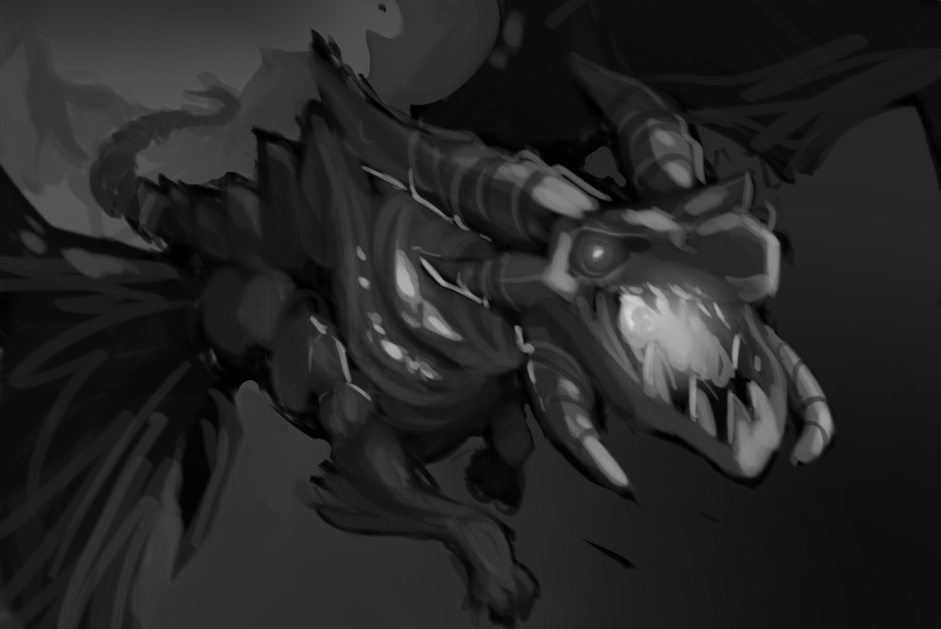
This is my first time posting here and I was really looking for some helpful critiques/paint overs on this "Frost Dragon" painting. Some details: his underside is made up of an ice/crystal formation with some icicles jutting out, he's standing on a cliff higher than anywhere else in the area, and he's surrounded by snowy mountains. Any help (especially paint overs, even fast ones) would be greatly appreciated!


Attached Files Image(s)


Reply
#2
hey there! the concept is very cool, but i think you're rendering too soon. try experimenting more, looking for different angles and ways to enhance what your trying to say.

here's some minor suggestions, but you should consider rebuilding your composition. you are trying to show the entire dragon, that is not needed, you can hide parts of the dragon or crop them out to enhance scale

i tried to respect your original composition, but i think another angle would be more effective. think http://i1153.photobucket.com/albums/p502...agosa2.jpg or http://i1153.photobucket.com/albums/p502...ragosa.jpg


hope this helps!

Reply
#3
Thank you very much for replying, I'm going to rework the composition and I'll repost when I have something!

(06-27-2013, 10:35 PM)warmics Wrote: hey there! the concept is very cool, but i think you're rendering too soon. try experimenting more, looking for different angles and ways to enhance what your trying to say.

here's some minor suggestions, but you should consider rebuilding your composition. you are trying to show the entire dragon, that is not needed, you can hide parts of the dragon or crop them out to enhance scale

i tried to respect your original composition, but i think another angle would be more effective. think http://i1153.photobucket.com/albums/p502...agosa2.jpg or http://i1153.photobucket.com/albums/p502...ragosa.jpg


hope this helps!
Reply
#4

So I basically started over again but I'm already liking it a lot more! What do you think?

(06-28-2013, 01:58 PM)TheNeal Wrote: Thank you very much for replying, I'm going to rework the composition and I'll repost when I have something!

(06-27-2013, 10:35 PM)warmics Wrote: hey there! the concept is very cool, but i think you're rendering too soon. try experimenting more, looking for different angles and ways to enhance what your trying to say.

here's some minor suggestions, but you should consider rebuilding your composition. you are trying to show the entire dragon, that is not needed, you can hide parts of the dragon or crop them out to enhance scale

i tried to respect your original composition, but i think another angle would be more effective. think http://i1153.photobucket.com/albums/p502...agosa2.jpg or http://i1153.photobucket.com/albums/p502...ragosa.jpg


hope this helps!
Reply
#5
woah! very nice! much much better! now you can see this thing is huge and menacing. this is leaps and bounds more interesting than its previous incarnation, well done!

Reply
#6
(06-28-2013, 10:23 PM)warmics Wrote: woah! very nice! much much better! now you can see this thing is huge and menacing. this is leaps and bounds more interesting than its previous incarnation, well done!

Thank you very much! Will post more as it comes.
Reply
#7
Whoa! that's a huge leap! I like the second one way more.

Reply
#8
(06-29-2013, 01:43 PM)Rognoll Wrote: Whoa! that's a huge leap! I like the second one way more.

Thanks! Still feel like it needs something though.
Reply
#9
Whoa that is amazing progress :D Good job!

Reply


Forum Jump:


Users browsing this thread: 3 Guest(s)