Maya Pirate
#1
Hey guys!
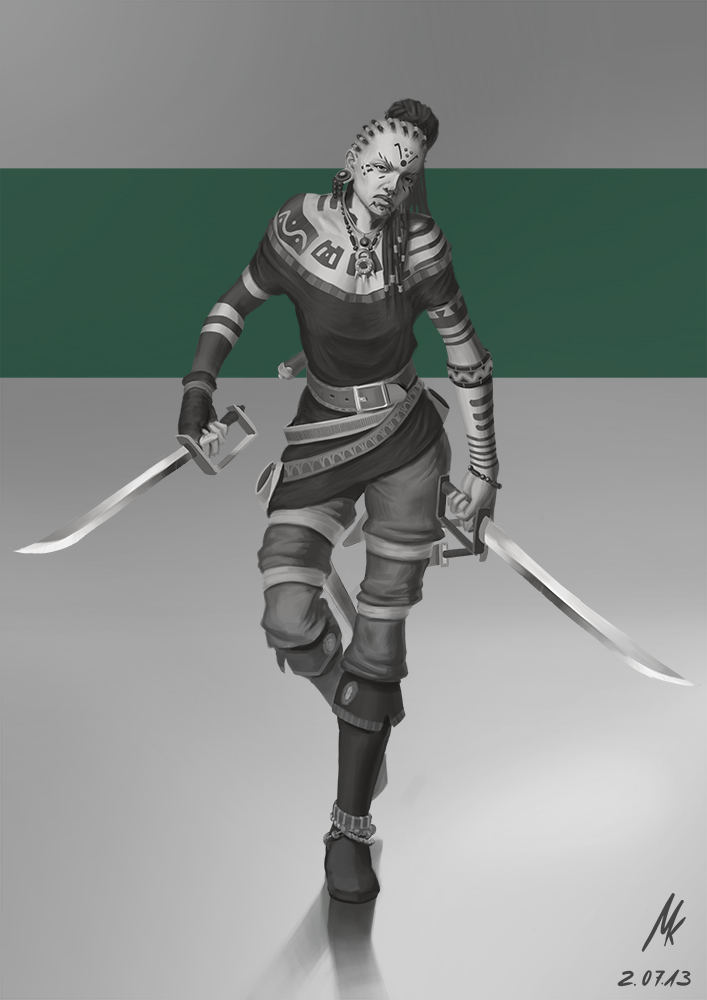
Here is an image I have been working on really a lot in the last couple of days. It´s a rendering of the characterdesign I did like two weeks ago or sth. I learned really a lot in the process where I tried to improve it as much as I could in the limits of my patience. I´d really love to hear your opinions about it. What do you guys think about the presentation? I really like a graphic design like use of color in presentations but I don´t know if it comes of well in my image.
Any crits, comments and opinions are highly appreciated.
Hope you enjoy!


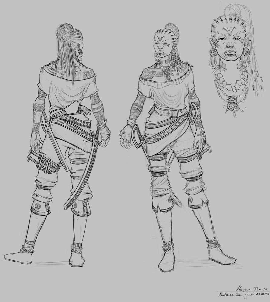
And here the original design

Reply
#2
I think it looks great!

if I HAD to say something I'd say her face in the original designs looks more correct, as in she looks more like a mayan woman. The face in the final presentation looks more western. Maybe it's the sharper jaw line? I however, get why you'd make it that way.

Would love to see a colored version!

Reply
#3
I agree with DoubleThink. Also, be careful of the placement of her bun vs the direction of her braids, it looks like it's too far to the right (our right). The drape of her shirt also was better in the original design, it looks a bit mushy right now, and her arm position is a bit awkward, but it could work, if she was the type of person always standing in weird positions being creepy. That said, I'm just nitpicking. This is great work.

Reply
#4
Be careful with the length of her torso, comparing the rendered version to the initial drawings it is very long. I realise she has her shoulders hunched up a bit but I think the distance between the top of her shoulder and her armpit is a bit long. Other than that there isn't much to fix. I love how you've presented it with the block of green behind her.
Reply
#5
Thank you guys for taking the time to stop by and leave feedback! Seriously appreciate it!
DoubleThink: Thanks, happy to hear! :) Thank you for the thought! I understand what you mean. Probably no colored version though I´m sorry ;)
Chantal: Yeah she definitely is that kind of person :D I get what you mean, thank you very much for the crit! Happy that you like it all in all! :)
Lilly: Thank you for the feedback! I intended to make her lean towards the viewer but I wasn´t really able to work it out too well. Thanks for the opinion about the presentation because I´m very interested if people think it´s dumb or not. Thanks! :)

Reply


Forum Jump:


Users browsing this thread: 1 Guest(s)