04-04-2013, 10:11 AM
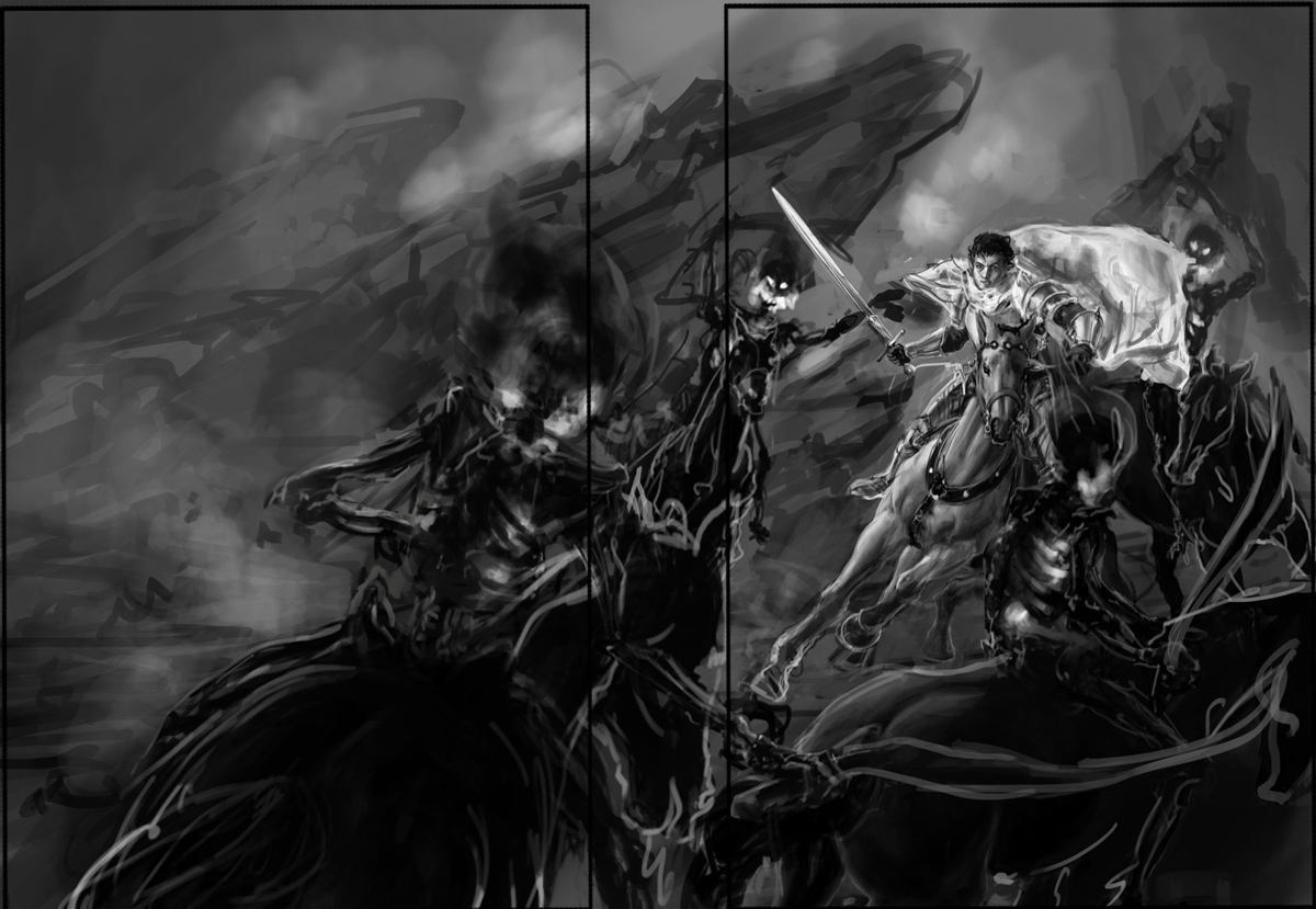
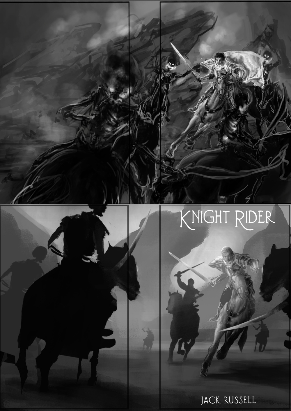
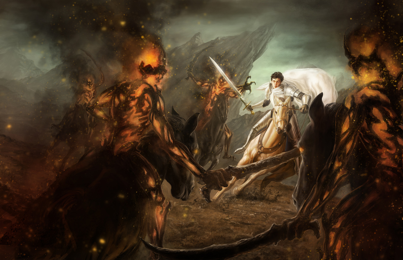
I've finished a value rough of my current piece. This illustration is pretty straightforward- a knight on horseback fighting against a bunch of shadowy-skeletal guys chasing after him, in the format of a wraparound book cover. Two are following behind him, and another two have run in front of him. I wanted to have a piece in my portfolio with a lot of action (and horses) since that's something very common in fantasy art. The edges on the shadow guys are going to be more blurred and shadowy when I get closer towards the final, but I left them sharp here so you can see them better. They also have flames/fire coming out of their skulls and inside the ribcage area, in case it wasn't clear what the bright spots on them were.
What I'd really like everyone's input on so far is the composition. There's a lot of stuff going on and I want to make sure its fundamentally strong. Do you see any awkward tangents or anything like that? I tried to get the eye to follow the curvature of the skeleton swords leading towards the knight, who is the focal point of the piece obviously.In particular I wanted to know what people thought of the horse in the foreground on the front cover (not the larger horse from behind on the back cover side) Do you think the placement of the horse is awkward at all? Like the way the head or legs are cut off? I've been having a tough time finding a good position for that figure without covering up too much of the knight.
Thanks for taking a look!


