07-14-2013, 01:29 PM
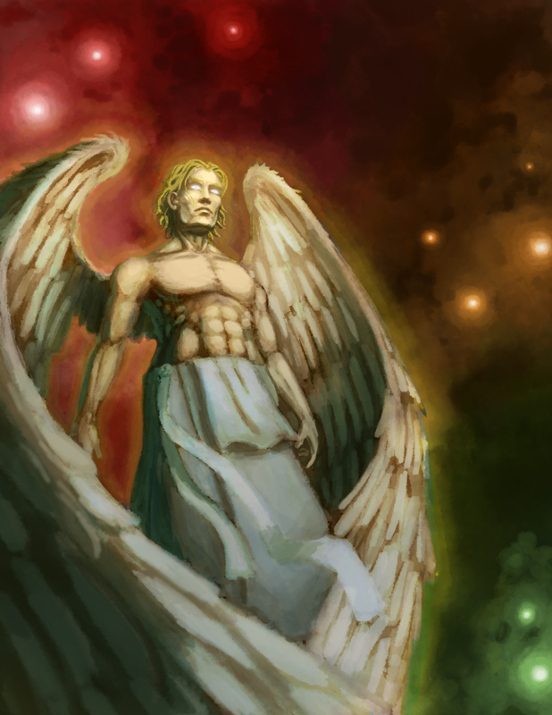
I have 2 passes on this, hands and feathers left to render. What I need help with is the colors. It feels muddy every time I open it fresh, it slowly grows on me as I work, but I want the initial reaction to be good.

|
Trudging through mud
|
|
07-14-2013, 01:29 PM
I have 2 passes on this, hands and feathers left to render. What I need help with is the colors. It feels muddy every time I open it fresh, it slowly grows on me as I work, but I want the initial reaction to be good.

07-14-2013, 09:47 PM
Hey man, I did a little paintover. I guess with colour vibrancy you want to really play with focused saturation and colour variation to get things to look a bit less muddy. So you should restrict the most saturated areas for the focal points, and dull down the rest. Adding small variation to "flat" areas of colour will help make things more vibrant (you could experiment with a colour dynamics option on your brush if you don't want to constantly be colour picking) You also should think about adding complementaries of light colours into shadow areas; even a small amount will really add some depth to the shadow colours. Becayse of this the lighting scheme and smart use of shadowing is important to control colour values across the painting for best effect.
Paintover below. Hope that's useful 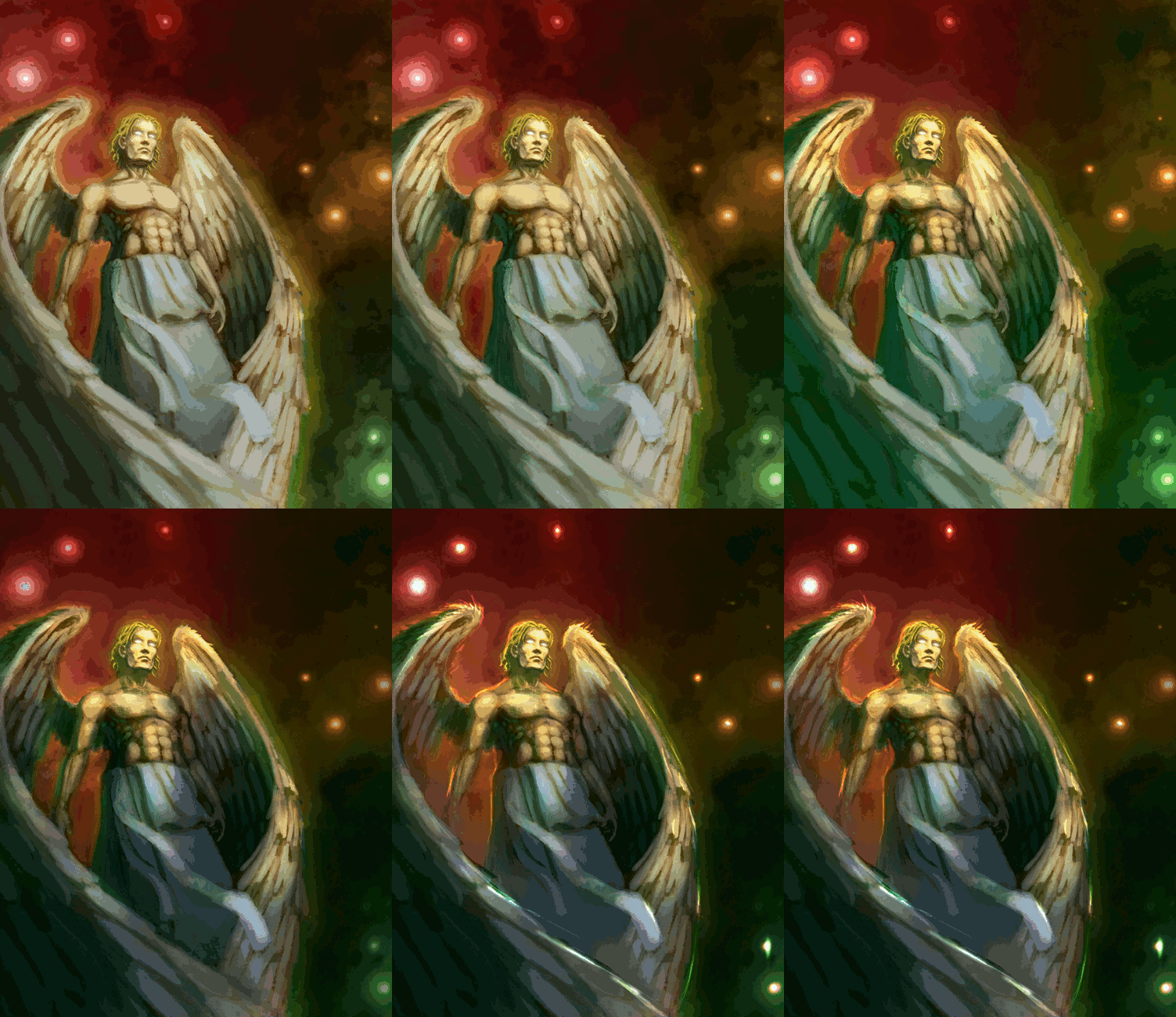 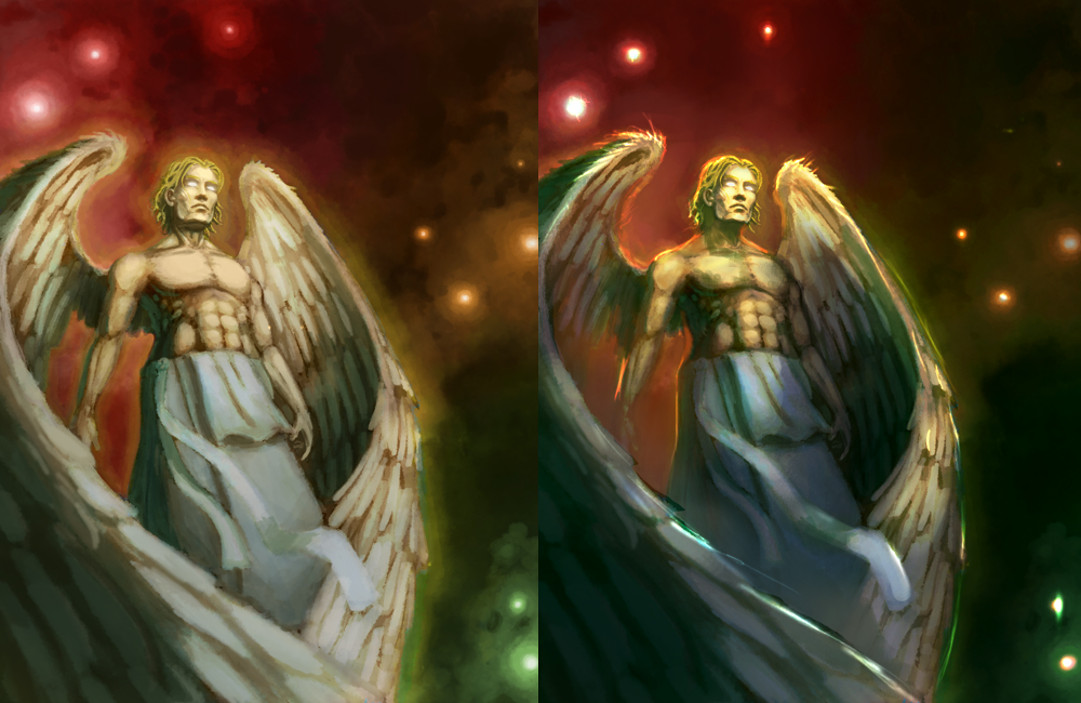
07-15-2013, 01:48 AM
Dude... you nailed this. You can see I kind of took down the vibrancy on the edges to focus it a little bit, but what you did is drastic, and needed lol. Thank you so much. The highlights do so much to bring him out of the background too.
I can't say that I have EVER used color variants in brush controls. Is this something I should just screw with until I get good results or do you have any recommendations? Invaluable. Thank you.
07-15-2013, 07:29 AM
No worries. Emmm I'd say just screw with it. I use Gimp, so I couldn't even tell you settings in PS off the top of my head. I sometimes use an option that puts down a tone selected randomly from a gradient between my selected foreground and background colours. So by picking your colours wisely you can get some control within the randomness. Maybe give something like that a go. I sometimes will use that at the start of a painting to get some really rough colour vibrancy going in the base painting, or in specific areas that need it later on, it's definitely not a use-always tool.
07-16-2013, 09:59 AM
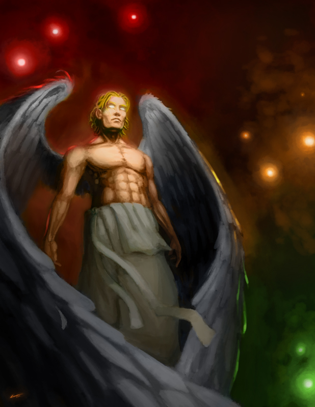
It's a lot less muddy :D I didn't go quite as misty and ethereal as the paint over suggests, but you, sir, helped me isolate and change everything that was bugging the piss out of me lol. Thanks for the help with this!
07-16-2013, 10:43 AM
All good man, it's looking better ;)
07-16-2013, 02:47 PM
Please forgive my shatty paintover. Lots of things to do here. First and foremost...take a look at bird reference to see how the wings - particularly the feathers open up with they are curled forwards. Not saying that what I have presented here is the be all and end all...just an idea to add more to the piece. I would play around with it though, and work with those feathers, cause my solution with giant neon blue seems out of place ;)
Second: There are anatomical errors in the head plane and the arms particularly. The right hand side of the head is skewing off and up to the right, while the main torso of the body is in a diagonal set of parallel lines going up and to the left (does this make any sense). The left half of the face seems to be more in line with what the body is doing though. Also, anatomy wise, the left arm would not be protruding out so far from the body unless he was extending his arm away from himself way more. As is if it is just resting by the side then the musculature would be closer to the rib cage than you have shown here. Thirdly: Watch your use of negative space, as well as depth via the use of atmospheric perspective. If all the stars are of the same brightness then they are pretty flat and lack depth. Play around with brightness...as well as saturation (closer more saturated and more contrast...farther the opposite). The negative space around the wings - particularly the right wing could use some sprucing up (hence why I had the wing furl forward more with feathers splayed out - just an example of breaking up the space...I feel mine still isn't the best solution..merely an idea). Also you may want to move the entire figure to the right slightly to help break up that negative space on the far right. Again, play around with this. Sometimes (though not always) a symmetrical piece works well with the figure closer towards the center...again sometimes. Hope this helps a bit...this could work out nicely if you tweaked a bit more.:) -TeT-
07-18-2013, 08:40 AM
Tetsuoooooo!
Thank you, man. I will go back to the anatomy on this immediately. I'm probably going to run through some bird studies as well as per your suggestion. I may implement that later, but I'm pretty sick of looking at this painting lol. Every piece of advice on this was spot on and I will make sure to keep the negative space bit in mind in the future! :D
07-19-2013, 07:00 AM
No worries man :) I know how it is to paint until you are sick of the piece. Take a break, do something else and come back to this one :)
|
|
« Next Oldest | Next Newest »
|