Everything I do is unfinished
#1
So the sketchbooks seemed to be a good place for me to post stuff since I rarely finish things. (I'm trying to break that bad habit) I started painting digitally about two months ago and I think I'm getting better.
Feedback is encouraged. Help me be less bad.

Ok, note to self scale down images

]I will need to resize a lot of the stuff I did because they are apparently much larger images than I initially thought. In the meantime here are a few more recent paintings


I'm still getting used to using threads since I've been living under a rock for the last 10 years..


Attached Files Image(s)


Reply
#2
not so bad at all :p you may use harder brush when you study it will help you to prevent smudgy muddy colors and it easier to see and check what you are actually doing. But it's up to you :)
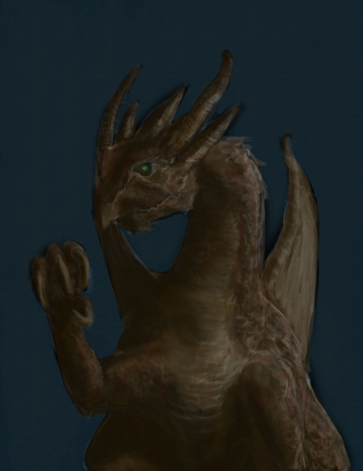
the dragon looks ..unfinished ;). looking forward for what you gonna do with it :)

Reply
#3
The dragon was the first thing I attempted to paint. For some reason it appears after the other images. I've only been digitally painting for about two months now, trying to study in between my two jobs. I will put some work in on the dragon and see if I've learned anything.
Reply
#4
Spent about an hour and a half repainting the dragon. I'm not very happy with it but it's improved.. I think
Reply
#5
I did this about a month ago
Reply
#6
Hello!!!

First don't be so hard on yourself :3 I have plenty of pieces that end up 'shelved' some times I leave years before coming back too but that's not a problem.. so if you feel you can't finish everything though then perhaps look into that..

Let me see, you have a brilliant foundation of works to build on with great concept and design. One thing you'll probably get sick of hearing is about lighting and values. I'm perhaps thinking you might be best watching some videos on values and then doing some black and white value pieces. These can be based on mark making they don't have to be fully rendered pieces. Here's something I did recently while practicing values and using mark making... http://missimoinsane.deviantart.com/art/...-393925467 ...first I went out of my comfort zone and decided rather than doing the same humanoid forms I'd try for a bird. But that's your choice. I also decided to work from several references despite the fact I know what sparrows look like... But the point of this exercise was to think of a bird like an object and paint that how the light would hit it. I think that would be a great next step for you - especially if you're anything like me and think "well there is lighting... what are these people talking about" ...

Perhaps also try and strip it down to basics. While dragons, robots and such are fine perhaps try working from reference for a while (like you would with life drawing) as that really homes in and teaches simpler things such as muscle memory and creating form. Traditional work does help.. even if you really only want to do digital stuff too.

As for not finishing pieces... is that 'cos you're stuck? lazy? board? ...I know with 99.99% of my works I get to a point and I'm like "it's finished" and my number one comment is about lighting... and how it looks off!! Or how the background looks like the character is pasted on top of it. etc etc.. I think as I said that if you look more into values and form and THEN try rendering some pieces up a bit more.

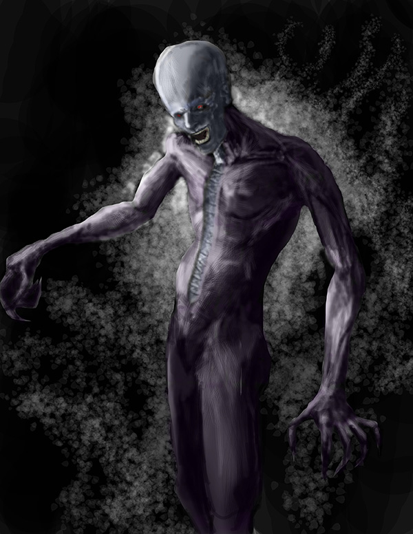
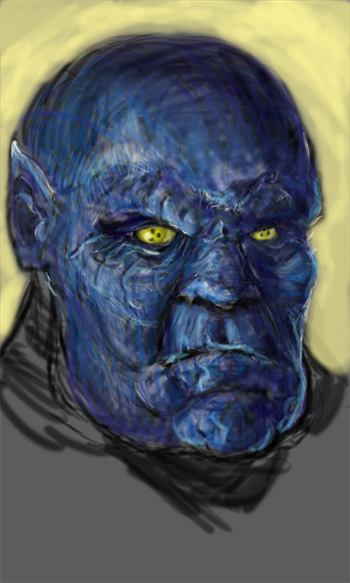
The last piece you posted here (vampire monster guy thingy) looks great but it's a prime example of "where is the light? and making sure all your lighting and shows match - it looks like he should be lit from the left side (or his right) but you only did the lighting on the head, arm and torso... but what about the legs? The right side of him (his left) would be much darker in contrast. And other parts of him would be less bright. ...but I am still learning!! I'm sure other artists would tell you the same though!!

But perhaps try sticking on some music and thinking less... Sometimes you can simply over think these things and then they don't happen. Remember to take constructive breaks. But most of all remember to have fun. Look at what others have done or other reference images. Just because he's not a dragon or a fish doesn't mean you couldn't look at scales or other textures. He seems very smooth... and very sharp.

I do like what looks like metal going down his chest but metal being metalic and generally shiny (or rusty) would have higher values... I think it's meant to be like it's stapled together? So it would have very high shiny points along with harder lines and contrasting softer lines to make the staples seem more metal. Perhaps have a look at painting metal...

Anyways I type too much.

Here's a lighting tutorial which covers a number of things: http://www.floobynooby.com/ICG/artvalues.html it does take a while. I'm still struggling with it but now I at least understand it. Before (last week) I thought light was light end of. Oh no... it's not. The lovely JonHop (on here) did a value piece on one of my works where I was failing at values and he does a very good explanation of lightest lights, darkest lights, lightest darks and darkest darks and basically what he was saying was in values your darkest lights never want to be darker than your lightest darks. hah. Here's the video... http://www.youtube.com/watch?v=lKvPiV-41yc

So I hope that gives you something to think about :) But do let me know what the reason is that you tend not to finish a piece :) ~ mii
© missimoinsane:  Daggers Sketchbook  |  deviantART  |  Facebook Page  |  Personal Webpage 
Reply
#7
~Miss: Thanks for the critique! I have noticed my forms look rather flat after I try to render them. I need to go back to the fundamentals. I appreciate the links and I will reference them and try to apply them to a study.
As for why I don't finish, it's mostly due to poor work ethic in the past and loss of motivation through the process. Also I work two crappy jobs and I'm a single parent so I don't get to practice and study as much as I would like. I'm a parent first, artist second.
I did get to look at your sketchbook; you've made improvements. I hope I can do the same! Again, thanks for taking the time to give me feedback. Off to crap job #1!
Reply
#8
It's ok. I just hope it might help you find your feet. I've found taking some time out and going back to basics has helped. But people on here have helped most. I'm doing better now.. still not where I want to be, but are we ever lol. Sorry about your crappy jobs... and single parent-hood. I can't say I know what that's like I'm disabled and so don't work and well it's not ideal for having a family - though I'm working hard on getting better. So for now I can only envy that you're able to work and have a family even if it isn't ideal. But its nice to see you have good morals (parent first, art second). Thank you for taking a look at my work though (appreciate that and what you said). Hope your job went ok and you're most welcome for the feedback just wish I could help more :)

© missimoinsane:  Daggers Sketchbook  |  deviantART  |  Facebook Page  |  Personal Webpage 
Reply
#9
Can already see improvements dude, keep it tightening those strokes and clearing up those forms. Well on your way to great paintings man

Reply
#10
~Miss: I wasn't trying to give a sob story, it's just how it is. I'm pretty lucky really.
~Corey: Thanks man, I'm trying.
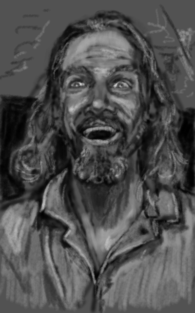
Anyways, had the day off so I actually got to put in some work. Tried to do a self portrait from life. I noticed I stretched some features and had a hard time keeping the lighting consistent. All in all, not horrible but lots of room for improvement. Spent about 1 hr 45 mins working on it then I became tired of sitting.
Reply
#11
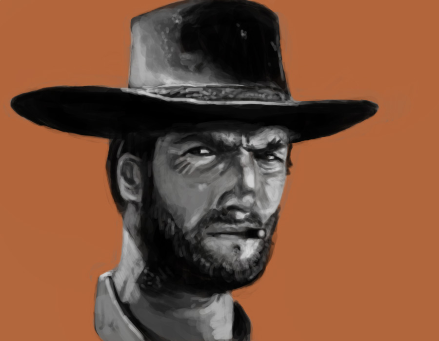
Value study. Brush opacity at 100%. All on one layer. Experimenting with warm vs. cool background colors to see if it brings things forward in the picture plane. Warm this time.

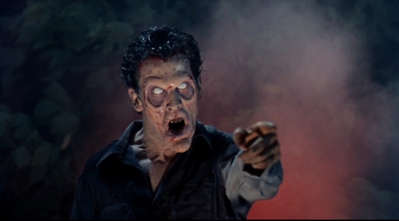
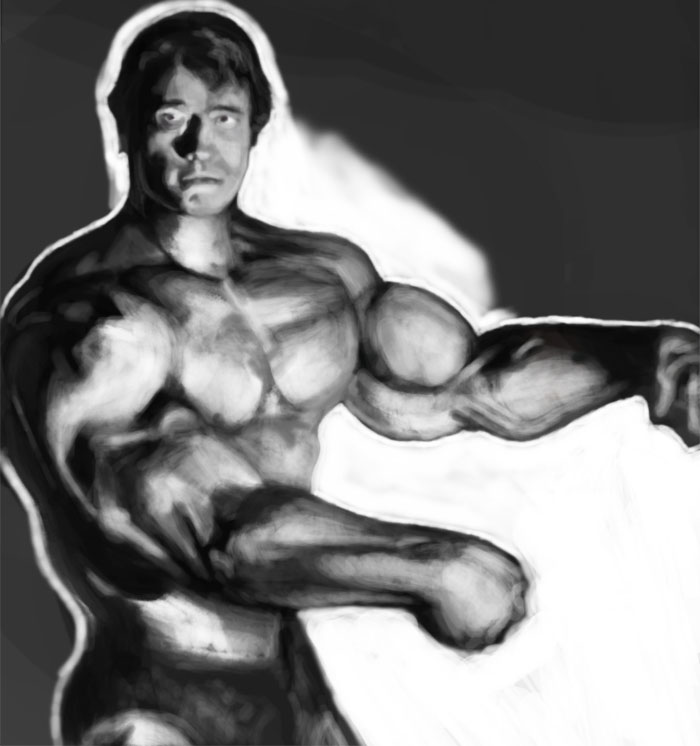
Also attaching a painting from a few weeks ago. The one that gave me the confidence to post. Study from a film stile. Motivated by the last Bloodsport. The color paint ove is a WIP.
Reply
#12
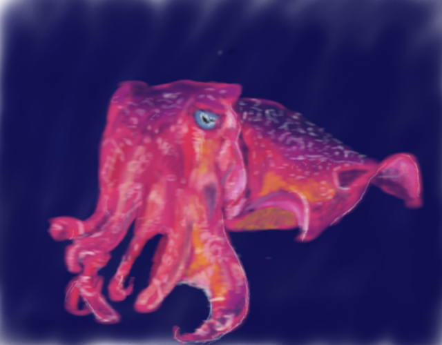
Trying to paint from reference without color picking or using opacity or layers. Here's the study
and original
.
Reply
#13
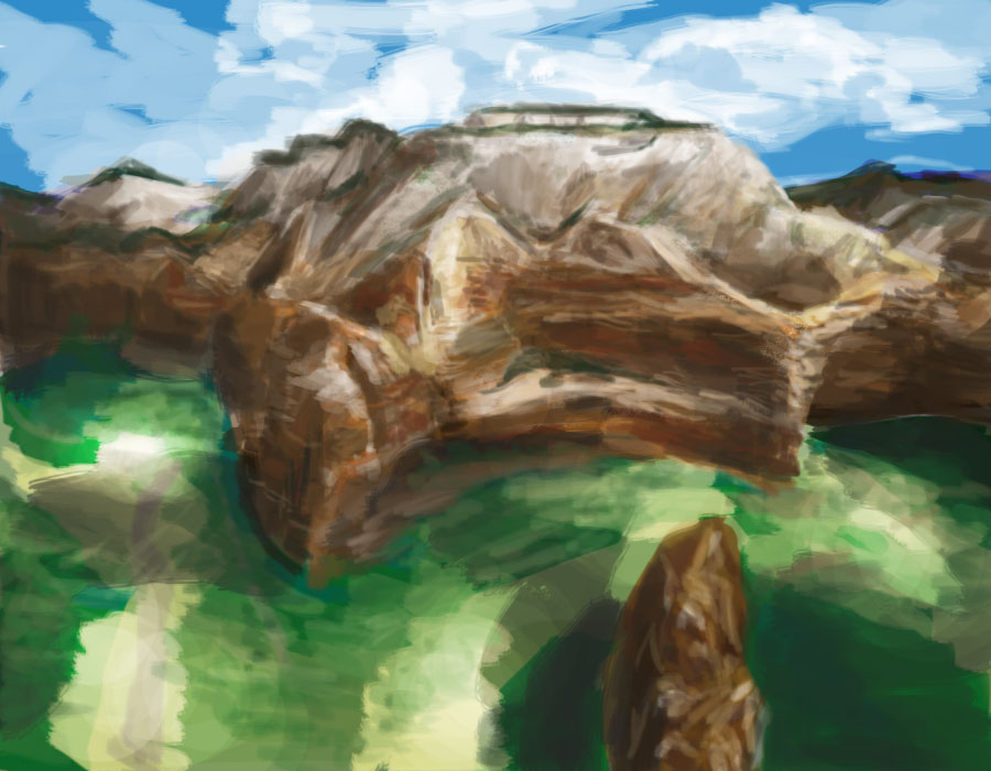
Landscape study. I need to improve a lot with environments.

Reply
#14

Boring, ugly, free paint that annoyed me. Failure is how you get better.
Reply
#15
I see you've been improving on your 'unfinished' issues. And your works are looking great. And as for your last piece. It's great. Don't get yourself so down. Try not to over think it. And we don't learn from failure we learn from our mistakes. Keep it up. And your film studies are awesome especially "the last Bloodsport". Keep it up. ~mii

© missimoinsane:  Daggers Sketchbook  |  deviantART  |  Facebook Page  |  Personal Webpage 
Reply
#16
Ok, it's been about a year since I was on here. Life is a mess, but I finally have devoted some time to practice again.
I did a couple portrait studies from references online, not much in terms of conceptual stuff. I realized though I have tons of bad habits to break and I'm basically starting over. Back to value, form, and composition. I've been spending about 4 hours a day working on stuff, here's what I've done since I started back up about 3 weeks ago.
Also, I'm working on GIMP and still learning the interface.


Reply
#17
hey there over! hum i don't want to point the obvious or either redirect your style but i was wondering watching your paintings have you tried using some hard edges painting techniques? ^^
obviously it depends if you want a cleaner style!

Reply


Forum Jump:


Users browsing this thread: 2 Guest(s)